Tall cabinet on legs

UKworkshop.co.uk

Help Support UKworkshop.co.uk:

This site may earn a commission from merchant affiliate links, including eBay, Amazon, and others.
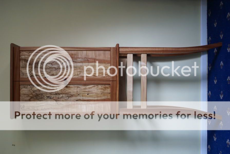
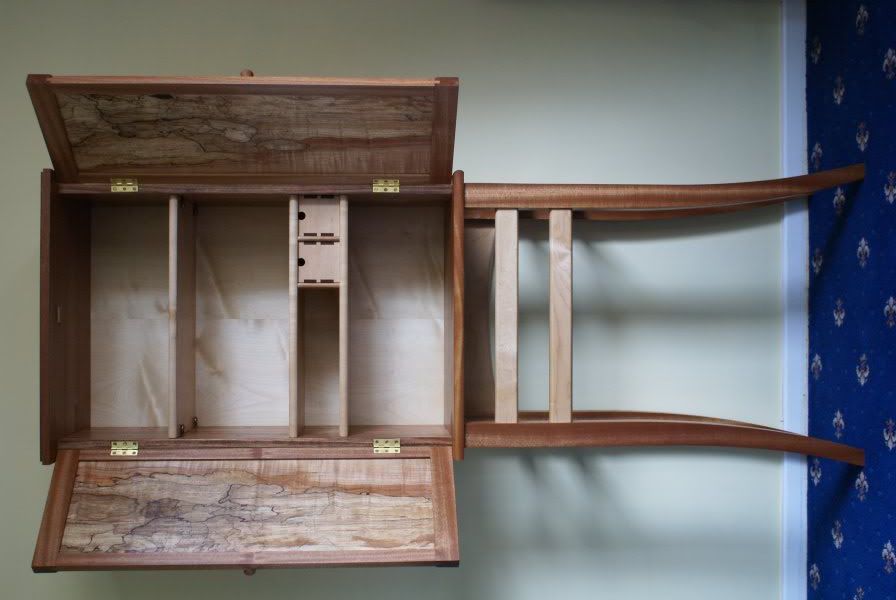
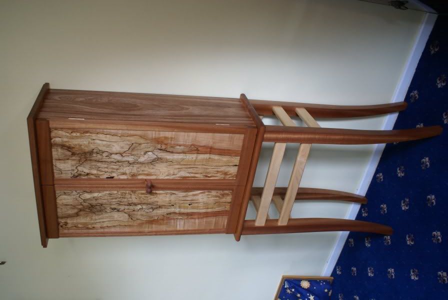
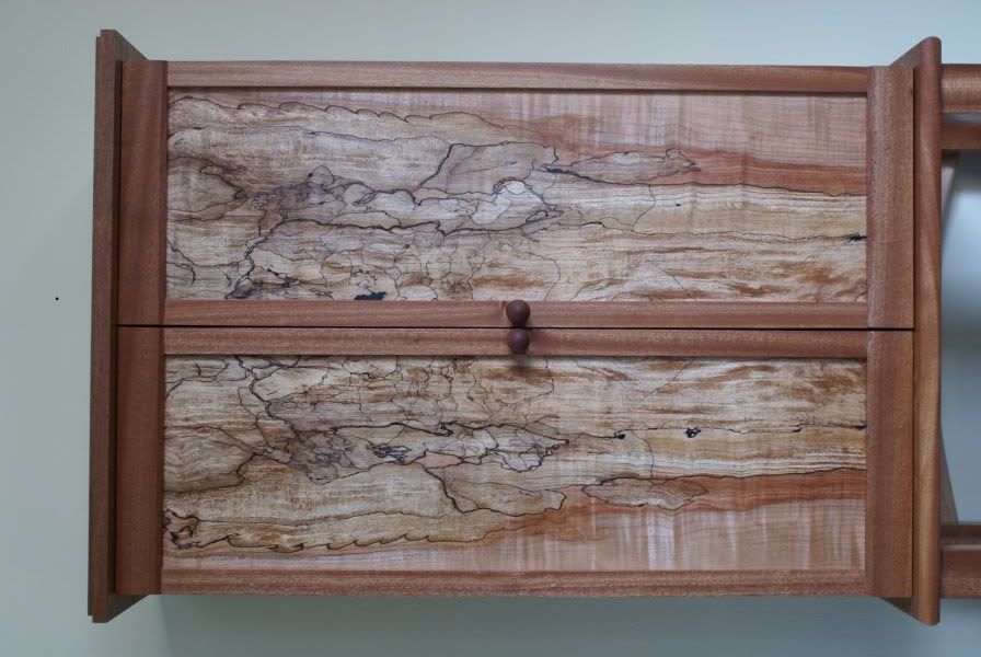
Well, got it finished just after xmas. Hope you like.

dsc03312.jpg


dsc03313.jpg


dsc03316.jpg


dsc03320.jpg


dsc03321.jpg


dsc03322.jpg


dsc03326.jpg


Personally i'm pretty happy with the result. The designing was quite a learning curve and getting the design into Sketchup was even a steeper learning curve :lol:

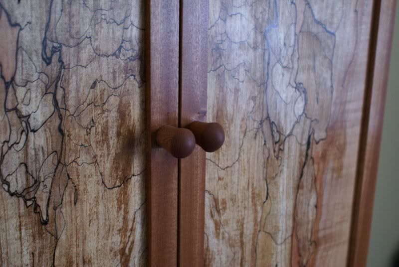
So my criticisms of my own piece are the (stand) legs are too fat (cheers woodbloke) and they are obviously too big and you highlighted that for me. Although i did not make them thin enough! I realise now that the stiles on my door should have been wider and the legs on my stand should have been thinner, enabling them both to line up together to create a continuous line, from the bottom to the top of piece. Also knobs on the door don't quite work i think.

Please give some constructive comments, thanks very much. :D

PS. If you want to see the piece in the flesh, go to Mansfield museum from 11 Jan for the next month. There is this piece and another console table i made, along with many other young artists, painting, graphics, textiles, etc. Hope you like.
 
Erm Sean the legs don't look too thin to me. Infact I think that's the main thing that draws me to this piece. I have said before that I don't like these cabinets the teeter on thin spindly legs. But this one sways me. I like it a lot. Well done, the craftsmanship is outstanding. You have a fruitful career ahead of you.
 
Sean

Absolutely top drawer - real quality. Well done.

Cheers

Karl
 
Sean - here's my assessment of this piece, which is meant to be positive view of what you've achieved, which is a great deal.
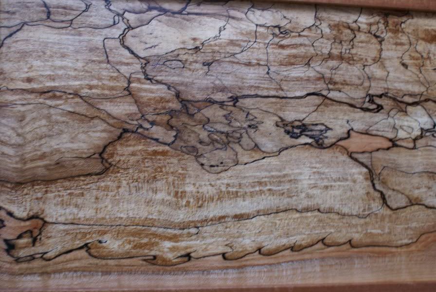
The overall finish applied (oil I think) has darkened the figure and spalting on the frame and particularly the panels...I feel that a simple shellac finish would have been better. The vertical stiles as you say are are too narrow and should run from the top to bottom, in other words the mortices should be in the stile and not the rail which would have given a more continuous 'flow' to the feel of the piece. The interior is great, very Krenovian and I like it a lot, handles are good but too large. The stand though is as I said a while back, is a little bit too chunky, particularly at the top of the legs and the cross rails ought I think to be in the same material as the rest of the frame, or at least the same colour. The top of the stand seems also to be too large in that there is an overly big overhang t'wixt the stand and cabinet proper which again spoils the line somewhat. What is good tho' about top of the stand is the grain figuration which may have been arrived at more by accident than design...the downward curve in that piece of timber is really good and is exactly the correct piece for that situation.
I've been very picky here in my critique of this piece. My feeling is that you're a bit like me in that you want to push boundaries and make the next piece better in all respects than the last one...hence the reason for this detailed critique. Simple and subtle is generally always better.
I hope you won't be offended by my thoughts but use what I've said here to make the next project even better - Rob
 
Sean, you are one man who will definitely make a living out of your trade, it's so pleasing to the eye, but more importantly, it's a ONE off, nobody else in the world has one like that, you must be, and SHOULD be very proud of yourself, take a bow that man!
Regards, Rich.
 
Philly":hyyo7d23 said:
Wowsers, Sean! Wonderful - love the doors, fantastic figuring :shock:
Nice one,
Philly :D

Cheers mate :D However give us a kick in the teeth please, give me your real thoughts like Rob :wink: I want to know what a world class plane maker and someone who has knowledge of making something of a Krenovian design thinks?? Cheers :wink: :lol:
 
Absolutely beautiful, Sean. I agree with what's been said about the stiles and the width of the legs. I don't think they're too thick at all, but next time (and I'm sure there will be a next time! :wink: ) you should definitley look at trying to line them up with the stiles.

The door knobs don't stand out irregularly but I think, personally, you may have been better off turning some that weren't quite so long? The diameter is fine, I just think something more "traditional" (?) may've been better.

How did you get your work in to a museum then? Did they approach you through the college or did you use your own initiative to start making name for yourself? :wink: If only it were a bit closer to home, I'd love to come down and take a look for myself. Congratulations all the same! :D
 
WiZeR":1lti49b8 said:
Erm Sean the legs don't look too thin to me. Infact I think that's the main thing that draws me to this piece. I have said before that I don't like these cabinets the teeter on thin spindly legs. But this one sways me. I like it a lot. Well done, the craftsmanship is outstanding. You have a fruitful career ahead of you.

Thanks for the kind comments Wizer. I think i have some 'energy' left from my 14stone coffee table, therefore my legs are biggish :lol:
 
Sean
Only thing I'd change is the rails on the stand - slightly darker maple to match the doors. Apart from that full marks - love the thru dovetails on the drawers. The Man himself would love it :wink:
Cheers
Philly :D
 
I agree with whats been said about the rails & stiles. But I don't agree about the legs being spindly, I think they might have looked better either thinner or even much longer.

It's still a very nice piece though. =D>
 
Great stuff - looks fantastic - those panels are stunning.

I would agree with Philly and say that the rails contrast too much. I personally would have made the legs lighter to match the rails so that there was a tone of the panels picked out in the rest of the piece.

These are personal preferences and you should be very proud of a super looking cabinet.

Bravo! =D> =D>

Cheers


Tim
 
woodbloke":1fyiv2vd said:
I feel that a simple shellac finish would have been better.

in other words the mortices should be in the stile

.the downward curve in that piece of timber is really good Rob


Thanks Karl, Chris and Rich :D Very much appreciated.

Who the **** does this Rob guy think he is? Does he think he can teach :lol: :lol:

Rob, i thought shellac was like (is) a french polish? I would like to know more about this, as i have done a little test piece at college which we 'french polished'.

Mortices in stile? ok, but that would be less Krenovian? yes.mmm?

The grain direction, im always thinking about :wink:

Many, many thanks for the input, Cheers. :D
 
Sean

Just some further comments in light of what has been posted above.

I think that the cross rails on the stand work great - particularly when the doors are opened - ties the piece together. And with the doors closed, they add a bit of intriguement to the piece, and also seem to work well with the door panels

I'm not sure if you've had some movement on the doors, but the gap doesn't appear even - may be the photo.

Not much for the handles - something more delicate would be more suited.

And would agree with the comments about the door rails/stiles.

HTH

Cheers

Karl
 
OPJ":37irg4i2 said:
The door knobs don't stand out irregularly but I think, personally, you may have been better off turning some that weren't quite so long?

How did you get your work in to a museum then? Did they approach you through the college or did you use your own initiative to start making name for yourself? :wink: If only it were a bit closer to home, I'd love to come down and take a look for myself. Congratulations all the same! :D

The handles 'knobs' had me thinking hard. I think they went wrong in the end to be honest. No one has commented on this yet, however my personal feelings is, no knobs! little, long thin handles, like Krenov would be better? ahhh :lol:

Well, the museum, my mate is the curator, i finished a 'Visual Arts' Degree, and decided to go into woodwork! So here we are! :shock:
 
Overall a fabulous job, Sean =D> =D>

My main criticism would be about the doors. The top and bottom rails tend to look very heavy and the upright stiles are too narrow. And I know that Krenov usually puts the mortices in the rails and the tenons in the stiles, but it always looks wrong to me.

But that's all nit picking. A great piece of work.

Cheers :wink:

Paul
 
seanbaby wrote :
Does he think he can teach
Does 20 years teaching woodwork and then design and technology in the state system qualify?

Regarding French Polish, there are various grades of polish available, all of which will colour the timber to a different extent. I don't have a lot of expertise on the different sorts of polish though I understand button polish is very dark and white polish is well...quite pale - Rob
 

Latest posts

Back
Top