hello all,
an interesting piece & thanks for posting it.
Perhaps the way to learn from looking at it is to try to get at why each of us likes or dislikes it.
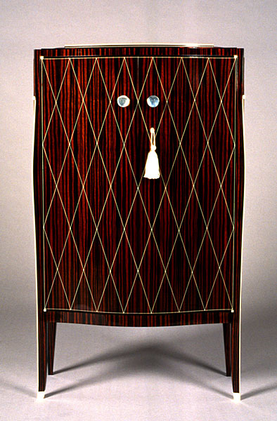
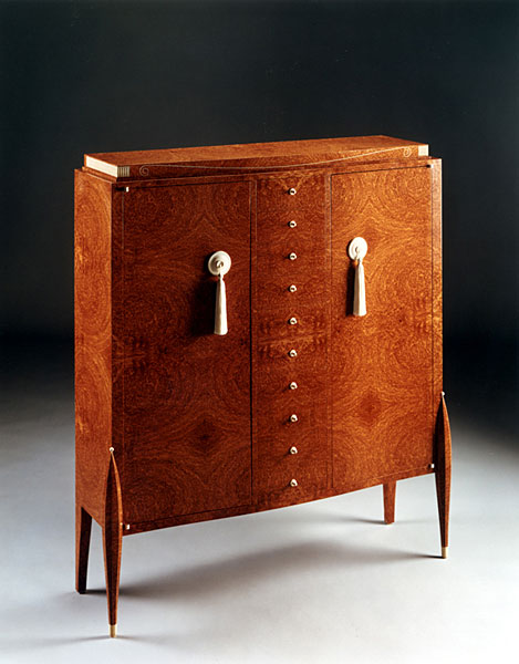
For myself, I like the colours and don't mind the chosen woods - the colours do go together ok.
Form wise its a bit odd but obviously been designed as a showy / elegant rather than (purely) functional / storage piece. That's not a criticism - the client may well have asked for this. In my own house I don't have the space spare to have arty pieces which don't hold much stuff & need acres of space to show the piece off properly - but there's nothing wrong with having this kind of stuff if you do.
One effect of the legs being different front to back is that your eye tends to look at the top of the front leg where it joins the carcase. Presumably that was the designers intention - bringing your eye to a point where all ofthe piece is readily seen from to start with.
Workmanship wise its hard to tell from the picture, but the work appears to be all of a good standard, which I like & admire. Most of us like things to be well made (even if simple).
What don't I like ? well, the finish is high gloss - a bit like covering it all over with plastic. I like to be more aware of the grain and feel of the wood. Otherwise why use wood ? Indeed this is an important question - why do WE use wood ; and in this case, why did this designer use wood rather than (say) plastic. Plastic could produce the same shapes, same colours as the finished wooden item. But plastic wouldnt have the same feeling of weight to look at or when touched. Wood is used in other things like piano's because, looks aside, piano's made from other materials, (indeed from other woods) don't SOUND the same - use of wood relates directly to the function of the item. No cabinet NEEDS to be made of wood, so the reasons for choosing wood relate to convention / customer preference ; and aesthetics (our love for wood). And if we love the wood, why hide it under full gloss like plastic, which makes it look like plastic ?
Probably because the (uneducated wood wise) client thinks this is what a good cabinet SHOULD be like ie. wrongly equating highly polished surfaces with quality of workmanship in general. (go on , admit it , we all did this as beginnners didn't we, - looked at some french polish, had a go on some scrap, looked again at the real thing and went "wow" ; then we learnt the "wow factor" of some of the alternatives we never even knew existed, & started to educate ourselves about wood in general & cabinetry in particular, & discovered a whole world of different but good stuff out there).
Then there's the design in general. It strikes me as a bit showy - a bit "all fur coat and no knickers" - the design doesn't in any way seem to reflect the construction which is used to make the piece. And this latter criticism is the carrying point in why I don't like the piece, even though its well made.
A good piece of cabinetry makes the joints an integral part of the design and not a showy add on (like the pedestal top is here). You can hide the joints if you want to or show them if you want to. To do so makes such joints appropriate to the piece ; but why use joints which aren't appropriate for the kind of junction ? The top here has no reason to be inset all round so this is done for looks alone, not function or constructional reasons. Nor does the top appear to need these finger joints in preference to some other form of construction. Which is what makes it all bit tarty as a design.
So no, its not my kind of cabinet, because although the workmanship and finish appears excellent, the design doesn't reflect the construction of the piece, so it is purely for "show".
Wow ! Hope you're still awake at the back there !
regards, Catface.
