A new design for a backsaw

UKworkshop.co.uk

Help Support UKworkshop.co.uk:

This site may earn a commission from merchant affiliate links, including eBay, Amazon, and others.
Filing the spine was pretty easy, at least compared to the fact that I started with a 8x50 mm brass bar and shaping that to a spine took some time to start with :)

selanmuotoilu.jpg


As you can see I cheated a bit and sawed it with a jigsaw. :wink:

What caused more problems was the transition from oval to square. I could not decide the handle angle and there was a problem getting the transition to the correct place and angle. But when I got that sorted out I did some more cheating and took an angle grinder to rough shape the oval. Then it was time for some filing with a rough mill file. Some polishing with a handheld power grinder (abt 16 000 rpm), still some further filing and some polising with a buffing wheel.

After I got the back shinning, I took several grades of wet-n-dry paper and dulled the surface. I also added a sulphur mixture to patinate the brass and then polished it a tiny bit with steel wool. I love old tools, so I wanted this to start as an "old tool" instead of a shiny, new one :wink:

selka.jpg


Pekka
 

Attachments

  • selanmuotoilu.jpg
    selanmuotoilu.jpg
    73.1 KB
  • selka.jpg
    selka.jpg
    65.8 KB
Hi Pekka

The saw is great. I like everything except the screws. They appear to bulge and affect the streamlined look you have been after. I would remove them, flatten their domed faces, and then reinstall.

What do they look like from the other side?

Regards from Perth

Derek
 
You are right Derek, they are almost as awful on both sides. I have a set of larger saw screws (for a handsaw), I could maybe turn new ones from them.

I don't particularly like the screws either, so that could be a good idea. I may have to fill the gaps under the screws with a drop of epoxy, but that would definitely be worth trying...

Something to do tonight (hammer) :D

Pekka
 
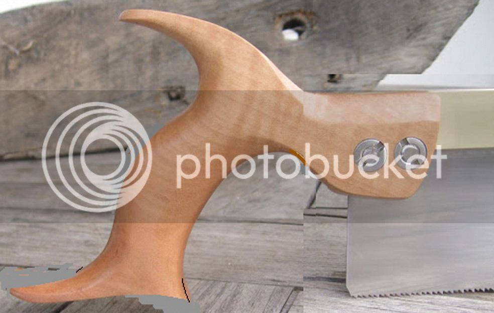
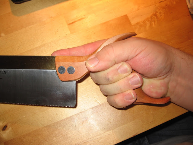
Derek, you were right about it: the screws still look a bit too large for the saw, but the look is far more streamlined now.

I "turned" the extra large screws to correct size by chucking them on my drill and filing them against the direction of rotation. They were a bit thicker than the oriinals, but I think they fit the saw quite nicely.

Pekka
 

Attachments

  • valmis1.jpg
    valmis1.jpg
    81 KB
  • valmis2.jpg
    valmis2.jpg
    71.7 KB
Hi woodworker,

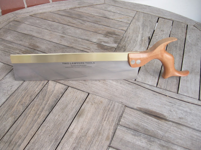
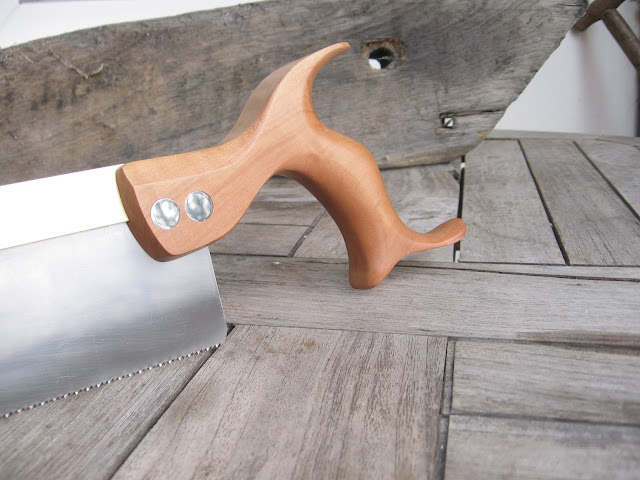
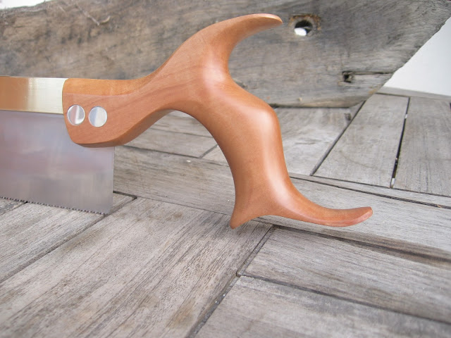
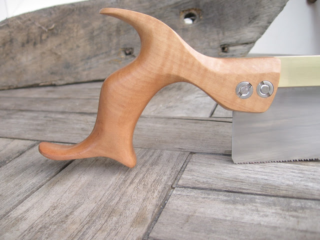
I post my entry here, becaus it fits and this thread was a big inspiration.
On the german forum we've talked about making a new design for saw handle.
Modern without all these little curves an hooks and pins.

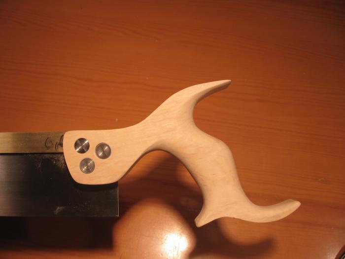
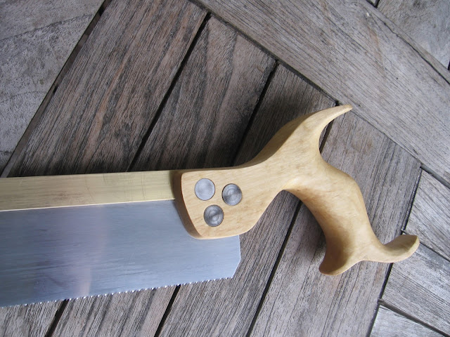
This is my last try and I am so happy with it, I have to share it with you.

IMG_0071.JPG


IMG_0072.JPG


IMG_0073.JPG


IMG_0078.JPG


This design is inspirated by a lot of saw handles, I've seen in my live, but the one from Pekka and one of Stewies designs (Can't find it at the moment.) are heavily viewable.

More pictures on the blog http://two-lawyers-toolworks.blogspot.de/2016/02/modern-mk-ii.html

Cheers
Pedder
 
Hi Derek,

Thanks!

I don't understand your question. Comments esp. critics are allways welcome,
even though, I'm pretty pleased with this design.

Cheers
Pedder
 
Lovely saw, I especially like the top part and the transition in the top forward section of the saw. And the horns of the handle are as beautiful as always.

It's interesting to see how the designs evolve: I had your saws as the benchmark for mine when I started building my saw and now this saw is again "third evolution". In a funny way you are in fact taking inspiration from your own saws, just filtered and modernized by me in the middle :)

pedder":pmuje8mb said:
Hi Derek,

Thanks!

I don't understand your question. Comments esp. critics are allways welcome,
even though, I'm pretty pleased with this design.

Cheers
Pedder

I think that Derek referred to the fact that I posted my original saw as unfinished product for comments and suggestions for improvement.

Only thing I would change would be the front of the handle, and I am not sure how. It looks quite nice from some angles, but somehow there could be a bit more defined form and mass in it. Now it looks slightly "molten" or un-defined from some angles. Probably feels great in your hand anyway.

Brilliant saw!

Pekka
 
phil.p":379kmukt said:
Pedder - I hope you meant it was your latest try, not your last try. :D

Hi Phil,

thank you for that correction. It might have cause the question wether or not I'd like to hear critics.
It is my youngest try and sure not my last.

Cheers
Pedder

English was the soft spot in school.
So thanks for any cost free extra tution.
 
I was not sure if Pedder sought critique, and so hesitated to say anything. I emailed him to find out what he wanted, and he said to write my thoughts.

I still hesitate to comment since design is so subjective and, as they say, everyone is an expert. My gut feeling is that Pedder has the beginnings of a great design, but there are a few factors I would do differently ... however that does not make the design better, only different.

Pedder, as it stands, the saw handle has three separate parts, and these do not integrate to my eye. There is the top horn, the lower horn, and the "neck" (link to the blade). I absolutely love the top horn, and I like the concept of the neck - however it is too long. The "stretch" is graceful but it disconnects from the saw back and plate, and I also wonder how this would affect feedback when sawing. The lower horn is the weak area. It reminds me of a spoon (more bulbous than graceful). It is different from the top horn. The last area is just one of preference, and this is the projection at the rear of the handle. I never make mine as pronounced as you make yours.

So, shortening the neck and changing the lower horn (very roughly done on a very basic drawing program) ...

Pedders-saw-mod_zps8jae8spr.jpg


Now you can critique my critique :)

Regards from Perth

Derek
 
Pekka Huhta":19yp8jws said:
Only thing I would change would be the front of the handle, and I am not sure how. It looks quite nice from some angles, but somehow there could be a bit more defined form and mass in it. Now it looks slightly "molten" or un-defined from some angles. Probably feels great in your hand anyway.

Brilliant saw!

Pekka

Hi Pekka,

first of all many thanks for sharing the original design with us. The step from your design to me was short. Since this thread (and that it the reason, I'm posting here) I thought about using your design and change it top my wishes. (the lower part) then Stwie came up with the sinus curve (sine wave) at the lower horns. So I'm more a design composer than a designer.

I think your critic refer to the lower front horn? On my first try the front horn was longer:

69034_9.jpg

IMG_0034.JPG

69034_6.jpg


But it was disturbing. But I'll take you tipp on the next saw.

Cheers
Pedder
 
I

So, shortening the neck and changing the lower horn (very roughly done on a very basic drawing program) ...

Pedders-saw-mod_zps8jae8spr.jpg


Hi Derek, that is a nicve saw, too and your and Pekkas point to the lower front horn will be obyed. If I'd shorten the neck, my index finger would overlap the cheek. I wouldn't want that. And the buckle I love.

But over all your critics make the saw more mainstream. So maybe I will take some more oft it. But not the neck and the whole buckle. :lol:

Cheers
Pedder
 
pedder":2fvtzv5q said:
If I'd shorten the neck, my index finger would overlap the cheek. I wouldn't want that. And the buckle I love.

Hi Derek, I can't shorten it. It is already too short.
IMG_1432.JPG


Cheers
Pedder
 
Hi Pedder

That helps. The photo offers a fresh perspective. I like the long neck better now that I can see it works. It adds a gracefulness to the lines of the saw. Don't change this aspect. I wish I could add it back into my reconstruction that I posted. The combination could be a killer.

Regards from Perth

Derek
 
Being a bit of a Traditionalist, I was having reservations about the look but having seen the saw in action I now think it's great.
Another 30yrs and that will be a Traditional style. :)


Rod


Hi Derek,

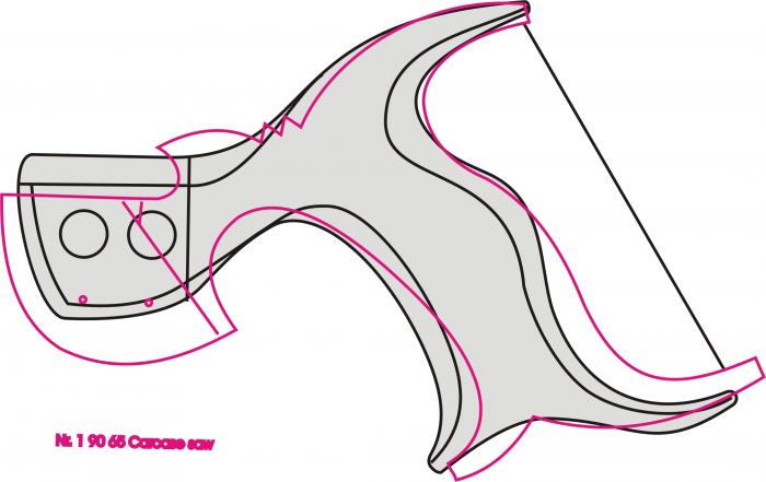
the length of the neck shouldn't be changed. Pedder showed it already. In fact the handle isn't longer than our "traditional ones at all. Here's a comparison to our Carcass saw handle:

69293_1.jpg


The main reason that this modern styled handle loooks to be longer is caused by the fact, that the blade is positioned a bit more forward than it is on our other saws.

Aside of this your design sketch is inspiring. Specifically the change of the bottom horn is very appealing to my eye. It looks very harmonically and matches the overall handle design very well.

Klaus
 

Latest posts

Back
Top