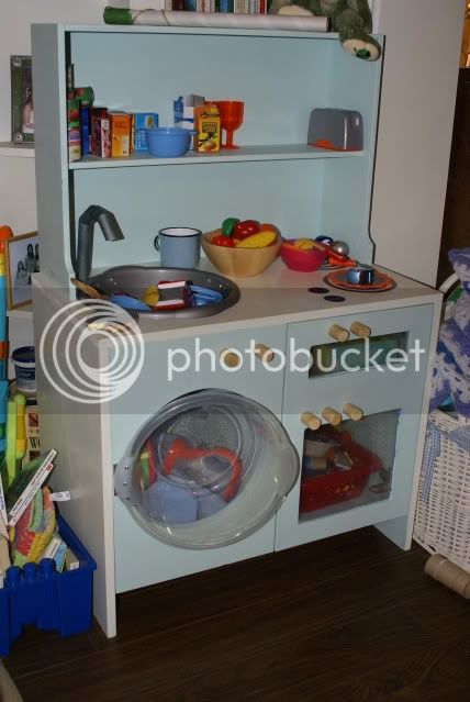
Old job I'd forgotten about...

UKworkshop.co.uk

Help Support UKworkshop.co.uk:

This site may earn a commission from merchant affiliate links, including eBay, Amazon, and others.
Alan Jones":1gz8508l said:
Anyone is entitled to an opinion, but to simply call something awful is a worthless opinion unless the detractor knows what they are talking about. All I suggested was that the critics show us something better, and the most genuine way to do this would be to show their own kitchen

I did.
 
Bloody hell, put the handbags away fellas.
The design is not really to my taste either. But I accept that it is to the CUSTOMERs taste.
I'm not a big fan of salt and vinegar crisps, but they're my wifes favourite flavour. I still love and respect her though :wink:


Anyway, here's another kitchen I DID design (and make), for a MUCH more important customer.....


EDIT: It does still require some details painting on.


[img
DSC00003.jpg


Adam[/img]
 
RILEY":2zblaow0 said:
Bloody hell, put the handbags away fellas.
The design is not really to my taste either. But I accept that it is to the CUSTOMERs taste.
I'm not a big fan of salt and vinegar crisps, but they're my wifes favourite flavour. I still love and respect her though :wink:


Anyway, here's another kitchen I DID design (and make), for a MUCH more important customer.....


DSC00003.jpg


Adam[/img]

nice especially the washing machine door - i'll remember that one for when my brother in law has kids (we arent planning to ourselves)
 
jlawrence":27ulebbo said:
SWMBO looked at it and all she actually said was 'I hate those handles' - I hadn't even really noticed them.
I had noticed those handles but didn't comment...again something which is out of context (in my view) with the overall theme of the kitchen. I've said many times that handles can make or break a project and an inappropriate choice can totally ruin an otherwise excellent job. There are other elements at work here (choice of timber, fluted columns etc) though and the poor choice in handles just adds to the general dismal picture - Rob
 
Love it Adam. To every one else, with the exception of the handles (which are of little relevance ) I stand by my earlier comments . So my offer still stands , show me your kitchens if you think they are better ( and you must think they are or you wouldn't have chosen them)
I must say that I'm rather disappointed that Aiden is the only one to put his money where his mouth is so far :wink: or is it a case of the sekonda wearers not liking the swiss watch
 
Alan Jones":1195rli5 said:
Love it Adam. To every one else, with the exception of the handles (which are of little relevance ) I stand by my earlier comments . So my offer still stands , show me your kitchens if you think they are better ( and you must think they are or you wouldn't have chosen them)
I must say that I'm rather disappointed that Aiden is the only one to put his money where his mouth is so far :wink: or is it a case of the sekonda wearers not liking the swiss watch

It's a wierd standard to set. I think that this http://wallpapers.free-review.net/wallp ... Geiger.jpg

is a car which is driven by someone with no taste. It is no doubt far more expensive than I can afford. Does that disqualify me from thinking that the person who drives it lacks taste and any (real) style?
 
Not if you were driving something stylish yourself,(not necessarily expensive ) but if you were driving something equally naff wouldn't it be a case of the pot calling the kettle.
So what stylish motor do you drive then :wink:
 
Love your kitchen Adam, don’t know how you could forget that one! The workmanship and Pippy Oak look very good.

The design is an interesting mix of modern proportions and details with not quite traditional details. A purely personal thought is, having decided to depart from a purely modern style why did the designer choose that simplified pattern of cornice with dentils and the fluted rolling pin column details when the room has an attractive Gothic style cornice which he or she could have picked up on to make the joinery a unique complement to that room?

I can’t get out of my mind that the columns look just like the feed rollers in my thicknesser!

I bet the customer loved it and that’s all that matters in choice of style. I would be very pleased to have made anything as good myself.

Regards

Graham
 
Alan Jones":1349gwj6 said:
Not if you were driving something stylish yourself,(not necessarily expensive ) but if you were driving something equally naff wouldn't it be a case of the pot calling the kettle.
So what stylish motor do you drive then :wink:

YAWN.
 
Alan Jones":3jl8mwzq said:
Not if you were driving something stylish yourself,(not necessarily expensive ) but if you were driving something equally naff wouldn't it be a case of the pot calling the kettle.
So what stylish motor do you drive then :wink:

I don't. I don't care about the look of cars (or the way people might perceive me by reference to the car I drive) enough to pay to drive a stylish one. I can still tell the difference between well styled cars (even if not to my taste) and gauche tasteless ones.

Equally, I am hopeless at drawing, let alone painting, and none of the little artwork I own approaches the cost of either of these, but I can still recognise the first as being quality and the second as being trash.

wvm+auvers+van+gogh-eglise.jpg


Jack-Vettriano-The-Singing-Butler--medium-size--205025.jpg
 
Woodbloke, the reason I indicated that the handles were of little relevance is because they are so easily substituted for an alternative .I'm sure any one ordering that kitchen could have their choice of handles
 
Alan Jones":2m3z10es said:
Woodbloke, the reason I indicated that the handles were of little relevance is because they are so easily substituted for an alternative .I'm sure any one ordering that kitchen could have their choice of handles
Agreed, but then you could end up with a lot of additional holes to fill if the handles were changed. With that timber though, any screw holes that were filled wouldn't be too conspicuous - Rob
 
Whether they can be replaced or not is beside the point, they are part of the design of the kitchen.

The doors could be replaced as well, so can the worktops etc if someone wanted to, but that's beside the point as we are not talking about the design of the kitchen as it might be if it was changed to something different.

The design of this kitchen (as opposed to Riley's fine work) includes the layout, the appliances, the handles, the choice of worktops, etc, and it just has too much contradiction to be stylish - it is a ill-considered muddle of modern and historical pastiche.

Looks very well made though!
 
Jake we seem to be heading off at a tangent here. The initial point I was trying to make was that surely the items chosen by a person would be a more honest indicator of their taste than their critisism of someone elses work .If I was pulling something to pieces I would be quite happy to show I could do better and was hoping that the design critics would do likewise. Wonder how many fabulous kitchens we would see ?
 
Jake I can only assume you have never worked in the kitchen industry. The DOOR is the kitchen , when punters choose a kitchen they dont choose a handle and then pick a door to go with it. THey look through a brochure or samples and choose the door they like and then pick from a range of handles worktops etc
 
Woodbloke its not like a b+q kitchen with preset handle holes, a kitchen like that would be fitted with your choice of handle
 
Alan Jones":30p4v9yh said:
Jake I can only assume you have never worked in the kitchen industry. The DOOR is the kitchen , when punters choose a kitchen they dont choose a handle and then pick a door to go with it. THey look through a brochure or samples and choose the door they like and then pick from a range of handles worktops etc

This kitchen was produced by Riley and his firm to a design by the developer's designer - it's not an off-the-peg product.
 
I bet the guy who just wanted to show a picture of something he's made wishes he never bothered now.

Ed
 
Back
Top