Let's discuss furniture design and fine work

UKworkshop.co.uk

Help Support UKworkshop.co.uk:

This site may earn a commission from merchant affiliate links, including eBay, Amazon, and others.
A few years ago I visited Hill House, the home of Rennie Mackintosh. I was completely taken by the designs he created and as a lockdown diversion sought to make a copy of one of his coffee house chairs (apologies for the rubbish photo).

Rennie Mackintosh.jpg


As a very amateur hobbyists I am very aware that if I made another it would be rather better - but I was quite pleased with the end result.

But reading this thread forces the question - what is good design. There are a range of opinions from those who would furnish their home with Victorian, or 1950s Ercol and utility derived, or Scandinavian simple, or Shaker, etc etc. Is there a common thread running across all design or are they only capable of judgement within their particular group.

It also seems that joinery skill is necessary for all quality design. But if approaching design from a joinery perspective there seems a risk of adornment as proof of craftsmanship rather than a fundamental design attribute.

On a more personal level - I am very appreciative of what I would call the "4 star hotel" school of design. General attributes - simple lines, functionally effective, robust, easy to clean and maintain, good quality materials - and if aesthetically pleasing gets a tick in the box!
 
A few years ago I visited Hill House, the home of Rennie Mackintosh. I was completely taken by the designs he created and as a lockdown diversion sought to make a copy of one of his coffee house chairs (apologies for the rubbish photo).

I think your chair looks great.

This reminds me, many moons ago, when my dad would come and visit, he would make some furniture for us to pass the time. He made Mackintosh and Charles Rohlfs reproductions at our request. Not the most comfortable chairs, but they are nice to look at.

This is the Mackintosh chair, not the one he made, I don't have a picture of it with me, he made it in white oak. Each horizontal piece is curved, all the joints are mortise and tenon.

CRM_Hill_House_292_Chair_Angled_800x800__56425.jpg


These are the Charles Rohlfs chairs he made, in purpleheart.

IMG_0186.JPG
 
Well if you look at Jorny's first and last photo they both show very simple elegant designs with absolutely minimal joinery skill involved. And Ttree's Sligo chair.
Conversely there's some horrible stuff made with very competent joinery. Good joinery doesn't guarantee good design.
In some traditions the mere appearance of simplicity requires quite sophisticated joinery to put together - Japanese, arts n crafts, etc which is a bit of a contradiction.
I agree often good design is a encouragement to simple woodworking.

Something like the adirondack chair for instance.
Or the simple farmhouse table.
 
Interesting thread.

It's a bit like the same\other gender - some like them slim, some like them round, some like them short & some like them tall. :)

And then there's the other "category" - "it's nice, but not for me." LOL

On a serious note - whilst design and execution are 2 things, sadly no one remembers who made\built a whole host of things, but many remember who designed them.

Keep the post coming - nice to see stuff I may not normally see.
 
I really don't see how there can be any absolutes for what looks nice or what looks hideous. I find all the pieces Derek Cohen pictured earlier pleasing to look at, except for the coffee table, which I find distinctly unpleasant. Functionality, for me, is paramount, good craftsmansship is slightly more debatable, I suppose, but beauty is totally subjective. As I said somewhere else, I believe certain forms that resemble nature are often perceived as attractive, and that, I guess, includes the golden ratio, but it's hard to take fashion out of the equation.
Not that I actually make anything, but I still get to have an opinion.
 
I really don't see how there can be any absolutes for what looks nice or what looks hideous.
There never have been any absolutes.....

Golden ratio is a bit of a myth too.

The main reason for studying design is that if you don't you may be trying to reinvent the wheel as it were. Whatever you are doing the chances are someone else had similar thought processes so it could be worth having a gander to see how it went.
Also copying is a basic learning technique and always has been.
If in doubt copy; avoid attempting to be creative unless there is no alternative.
 
I agree often good design is a encouragement to simple woodworking.

Something like the adirondack chair for instance.
Or the simple farmhouse table.
But even Adirondack chairs vary in design, all tend to look similar but some are more comfortable than others - so 'form over function' comes to mind. However, I would offer that if you really like the look of a piece of, basically impractical, bordering on unusable, furniture that looks like a work of art e.g. the chairs above, then both it's form and function are satisfied.

On the other hand I have always liked original Shaker furniture, which are designed to be ultimately practical but also beautifully designed and made.

I can just as easily covet a piece of furniture that has been designed to be usable and is well made, as much as a piece that sits in a room, unusable, but looking beautiful in it's design - a work of art on par with a painting.
 
Or Denmark.
Cycle touring a few years ago Rotterdam to Ejsburg and the first town in Denmark was Tonder - instantly distinctive sense of design and colour compared to Germany and discovered it was home town of Hans Wegner (if my memory serves me right!). Then spotted a furniture shop with a Rietveld Red & Blue chair in the window, which I'd never seen in the flesh before!
Another occasion we dropped in on the Copenhagen Finn Juhl house with the Zara Hadid gallery attached. Brilliant stuff.
I've got some snaps I'll dig them out.
I'm told it's the Sloyd craft training which helps make Scandinavian design what it is
https://en.wikipedia.org/wiki/Sloyd
Spotted this in street market in Tonder

tablelegs.jpeg
 
I really don't see how there can be any absolutes for what looks nice or what looks hideous. I find all the pieces Derek Cohen pictured earlier pleasing to look at, except for the coffee table, which I find distinctly unpleasant. Functionality, for me, is paramount, good craftsmansship is slightly more debatable, I suppose, but beauty is totally subjective. As I said somewhere else, I believe certain forms that resemble nature are often perceived as attractive, and that, I guess, includes the golden ratio, but it's hard to take fashion out of the equation.
Not that I actually make anything, but I still get to have an opinion.

John, I agree that beauty is subjective. Also that there is no formula. But this indicates that we are doing something with our eye and brain to decide what is "right" or desirable.

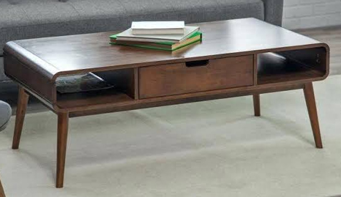
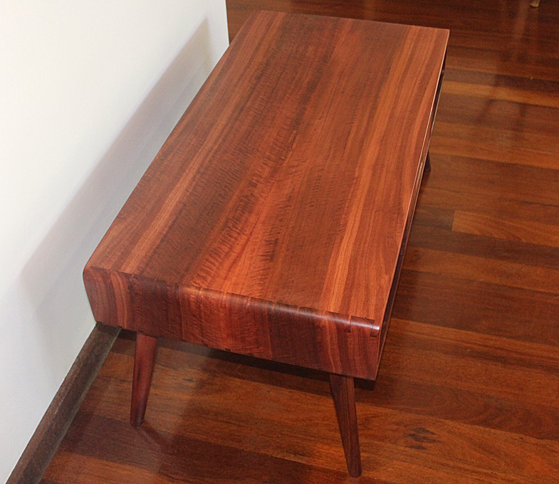
Let's take that coffee table (No offence taken on my side). There is a back story that is relevant in the context of this discussion as what you saw was my interpretation of a design that was given to me. The request came from a nephew to build a particular design as a wedding present (I offered to make him something). This is what he and his (now) wife requested ...

AnotherCoffeeTable1_html_m7fcab0c6.jpg


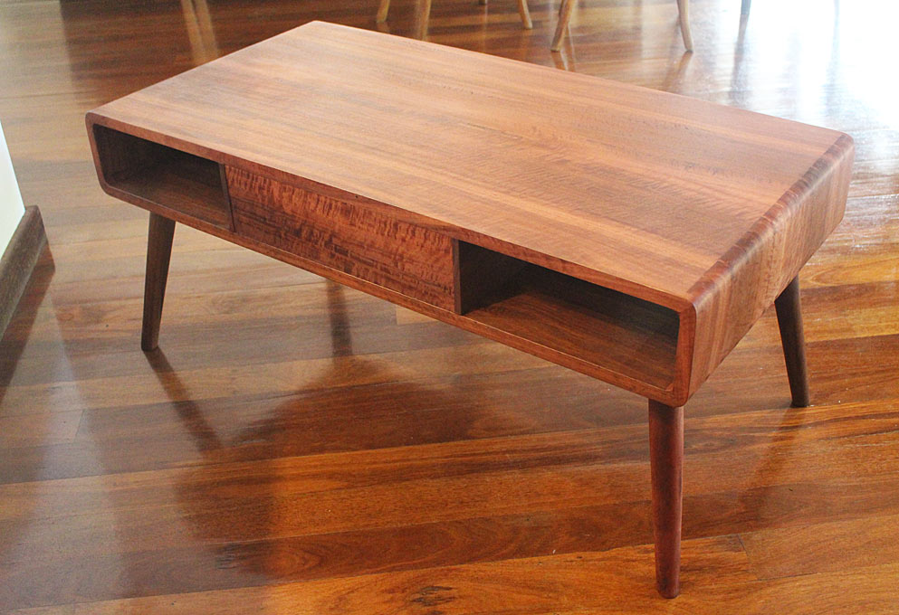
They understood little about materials and construction. They just liked this design. My reaction was "ugh" (privately), and I responded that it was build from plywood and veneer, and they really would prefer solid wood if the piece was to last. Also, while not obvious (to them) in the photo, the rounded corners were separate sections, and the result was discontinuous and fussy to my eye. We agreed that I would find a way to build the rounded corners (which they liked so much) using solid wood and turning them into a feature (without this being dominating).

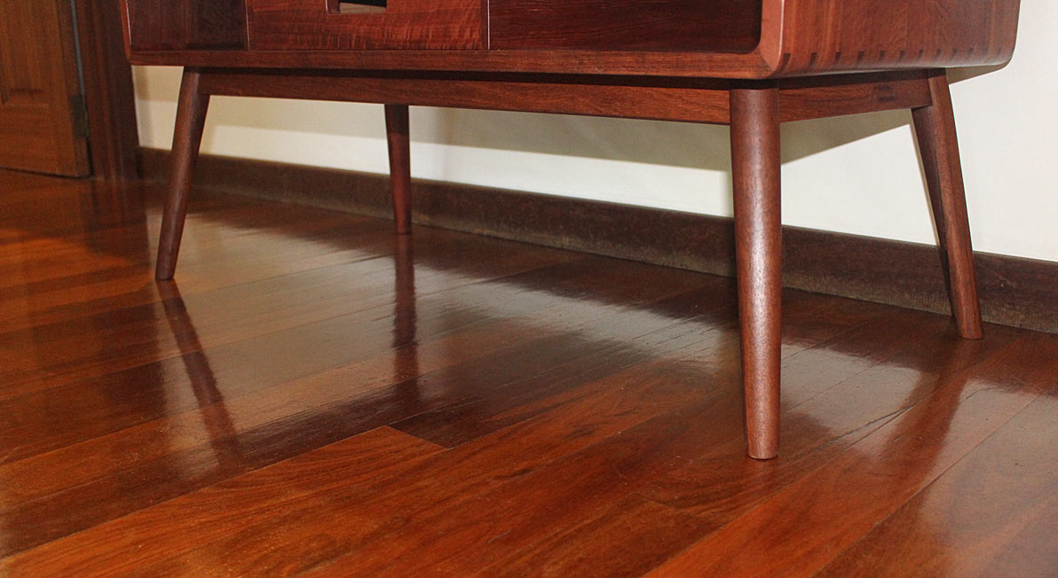
Design and construction come together. This is another view angle ...

AnotherCoffeeTable9_html_5394772.jpg


AnotherCoffeeTable9_html_m63d7982e.jpg


I should add that I do not generally build with dramatic figured woods. It is too busy for my taste. I like interesting figure, but it needs to fit with the piece, complement it, and not dominate. The timber here dominates. They loved this as it emphasises the waterfall design.

... Functionality, for me, is paramount....

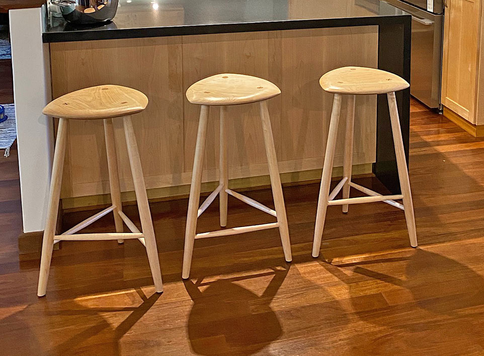
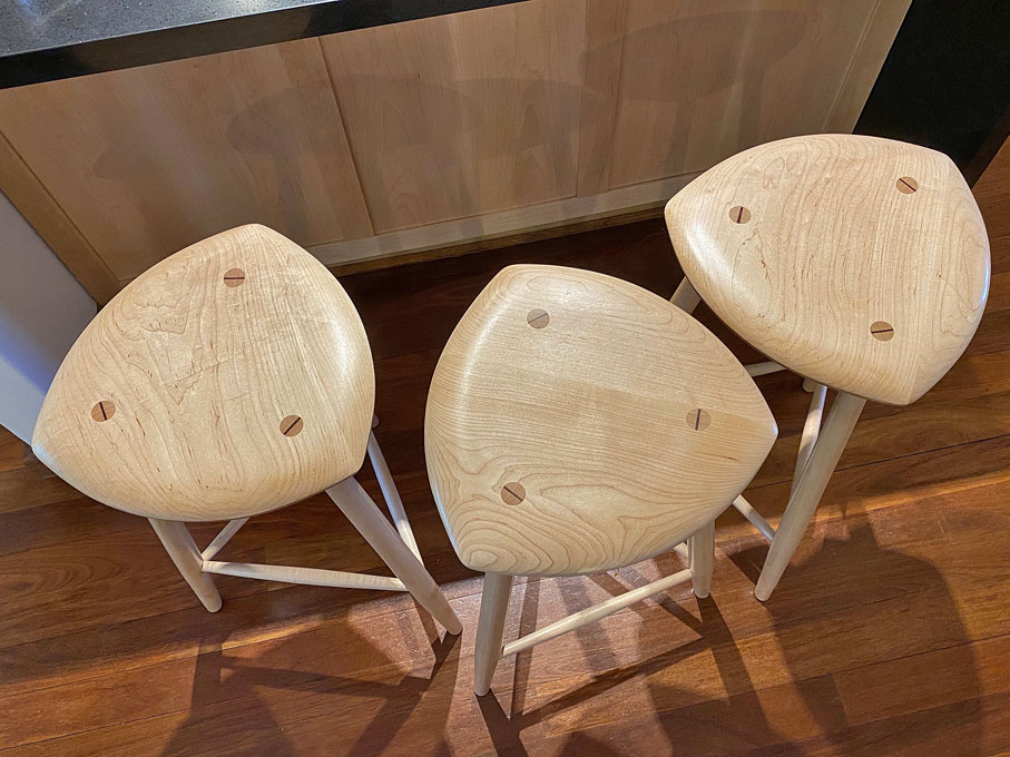
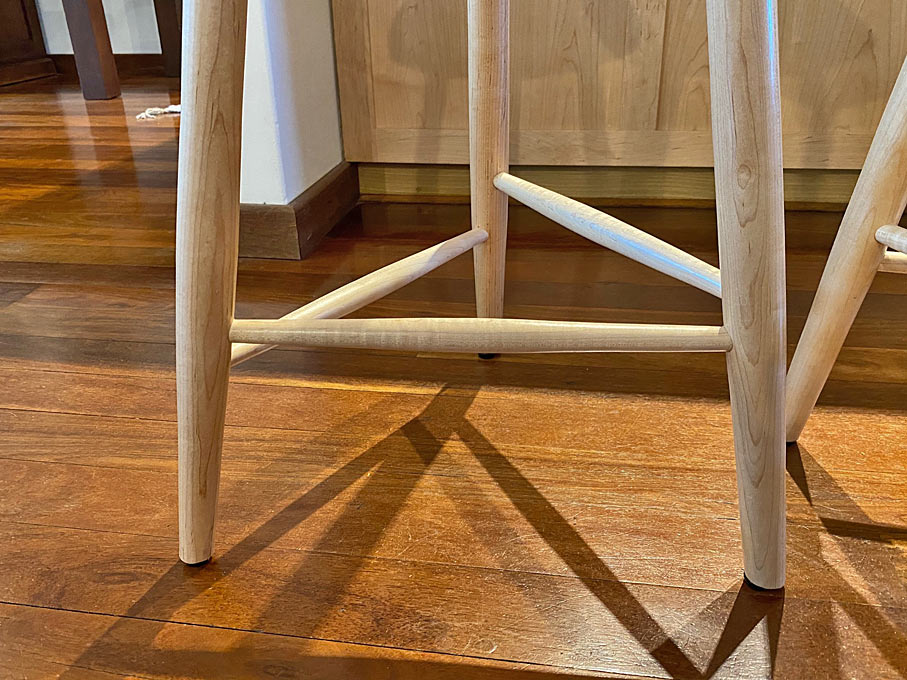
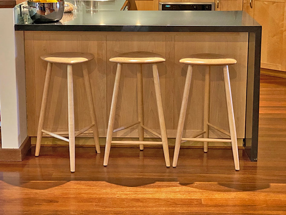
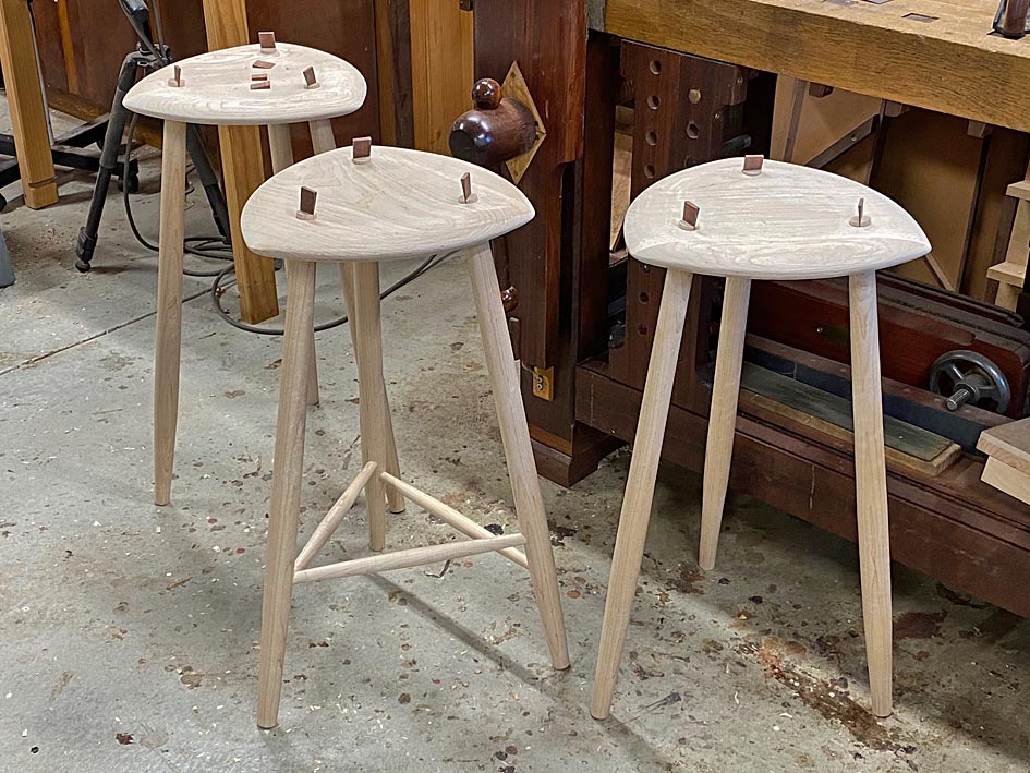
Here is a set of three stools I designed, influenced by Wharton Escherick. I just love the free-form seats he made. In my design I also focussed on the rungs. Escherick just saw them as supports. I chose to set them at different heights to match the leg length of all those using the seats. The seats became three-cornered to link to the rungs ...

ThreeCorneredStools_html_27c1b362.jpg


ThreeCorneredStools_html_5f74c2a3.jpg


ThreeCorneredStools_html_mf7b2747.jpg


ThreeCorneredStools_html_545901c9.jpg


The timber chosen is USA Hard Maple. This was to match the Maple kitchen I built.

Regards from Perth

Derek
 
Last edited:
Design and functionality should go hand in glove. The designer should be designing for the client, whether the client is right or wrong. Both designer and client need to agree on the item (even if the designer doesn't totally agree with the client).
The first photo on the thread shows a rocking chair that several have stated they like. Me? Mmm, not so sure. How many of us would be able to use said rocking chair without a considerable amount of help to get in and out of it? It isn't practical, but if the client is happy then all is good.
I'm glad I'm not the client in this case, but again we are all different so are all allowed our own thoughts, likes and dislikes., thank God.
 
Design and functionality should go hand in glove. The designer should be designing for the client, whether the client is right or wrong. Both designer and client need to agree on the item (even if the designer doesn't totally agree with the client).
t'other way around. A designer is supposed to do what's best for the client even if he/she doesn't quite get it. Just like any other trade.
 
Last edited:
A lot of interesting posts in this thread!

Derek Cohen,
What I am trying to point out is that design is a skill that can be practised. And I think it is quite obvious that you have learned some design skills along the way! I have done extremely little furniture design, and when it comes to furniture I am an amateur. What I have learned from architecture and my training that can be applied to woodworking is to discuss design think about design, and most of all, not to be afraid of the subject. I think in a way that just figuring out what you like and why you like it is the most important part.

Your chest of drawers and the "remade" table are my favourites among the work you show. The chest of drawers has good proportions, tasteful use of wood and display of joinery. There is a show of skill without showing of. And your fathers chairs from the 1930's are good example of modernism at it's best. They have very nice lines.


Also, some of the simplest designs, such as the casework of Krenov, is misinterpreted by many aspiring makers as they do not understand or recognise the proportions. Proportion will make or break a design. Is this taught (with rules, such as the Golden one), or is it innate?
The issue of proportions is both, I think, innate and something to learn and practise. There are a lot of different rules and there are different proportional systems used in different culture (even though there is a lot of overlap). Rules can be a teaching guide, and tool in a toolbox, but if you work a lot with design I think a lot of this just becomes a part of the process. Sometimes different rules of proportions can be used to "straighten up" a rough sketch that looks slightly off. On the other hand I think the most important rule is "If it looks alright, it is alright."
I have never studied art/design, so I don't know about any of the historical art/design movements and famous artists/designers.

Of current work I have found online, I love a lot of the work of Caleb Woodard. For example this one

I like the pieces by Malmsten but the thought of sitting on a sofa with no cushions on the back doesn't feel that appealing. I really like the scandi designs of the 1900s, can anyone recommend a web site or book which shows and lists designers and their furniture from this era?

1671694964552.png

It ususally has cushions! I just wanted to show of the beautiful back. I'll get back to you If I figure out any good books on the subject.

I may be chief complainer number one about design discussions, but I think a lot of what burdens us starts with the small things.

if we're not professionally trained, design things are incremental, and it's not always trivial "oh, I know this now, so I'm good".

what's not done, it seems, is "OK, I made this - how could it look better" and a request of "please, no talk about sanding or using a different method for dovetails".

I would be chief offender number one if this kind of discussion was had going all the way down to things like moulding profiles - "anyone have any idea on how to make this moulding profile nicer for the piece?".

I agree that the Pitts furniture was a little busy - it's sort of the style for that type, though. Fancy, and not function with integrated design 50/50.

I needle over little things, like handles, and transitions of curves, and things, but learned probably 6-8 years ago that when I carefully made something, that is where it was like "OK, looks neatly made, but something doesn't look right about it".

Warren Mickley in the US, a talented carver, but also jack of all trades for any hand work when there is paying work that he can beat a larger shop on mentioned that apprentices would've been taught design in a cabinetmaking shop at the same time they were learning the physical skills of making so that both would more or less mature at the same time (at least that's what I got).

it never really catches on online. I think something people don't like is "I just made this piece and I'm OK with putting it up for praise, but I don't want any criticism" and objective looks at "how could it look a little better, which will help carry over to a lot of things that aren't just this piece" never occur.

You make a lot of tools, and then the aesthetics are of a slightly different kind. It is even more tightly connected to function. And since many of the forms are so perfected for tools it is more a matter of working within a tradition. And then figuring out the little things like handles is a big thing. Also when it comes to tools I am reminded by a quote by the Swedish engineer Birger Ljungström who in 1913 was one of the founders of STAL, a manufacturer of turbines that later was bought by ASEA (now ABB). On the drafting tables of the engineers he put notes saying: "Is your construction unnecessarily ugly?"

I think that what Warren Mickley said could be applied to most hobbiysts as well. Sadly there are very few writers and "personalities" that talk about design and encourage woodworkers to learn that at the same time as they learn the other skills. And as Jacob says in this thread, copying and working with traditional forms and types of furniture is a great way to learn.
I know that you are not fond of Christopher Schwarz, but he is one of the few "personalities" that in my mind have a good eye for design (especially when it comes to chairs) and actually tries to teach about it.
Most of us are hobby makers. I think the two go together - to be able to execute something so that it doesn't influence design negatively, and to be able to design something well so that we don't allow execution to dominate things.

its kind of like music - sometimes a song doesn't need the musicians to dump everything they can do on their instruments in the middle of it. Sometimes that's the focus.
Yes! I love both the Ramones and Prince. I think that the analogy is spot on when it comes to making things as well. It also is a good analogy to the idea that discussions about design boils down to "I like/you like". All work can be discussed from it's context, within it's genre so to speak. To speak in heavy metal terms, I hate Sabaton but love Black Sabbath. We can in furniture look at both contemporary as well as historicist work and look at them in their separate merits. River tables however I cannot tolerate as a genre...

I suppose more of an interesting design rather than super skilled,
but it does have some nice bits, but also some quite odd parts.
Some videos of various chairs , aswell as some modern takes of it, if you youtube national museum of Ireland.


View attachment 149506
Vernacular furniture is fantastic and inspiring, and it is what I would like to have more time making.

Well if you look at Jorny's first and last photo they both show very simple elegant designs with absolutely minimal joinery skill involved. And Ttree's Sligo chair.
Conversely there's some horrible stuff made with very competent joinery. Good joinery doesn't guarantee good design.
In some traditions the mere appearance of simplicity requires quite sophisticated joinery to put together - Japanese, arts n crafts, etc which is a bit of a contradiction.
Yes!
 
Last edited:
Some really interesting posts, I thought the "Princess from a frog" illustrated proportion really well. Some items like the tall ladder back chair are out of proportion but can "sit" very well in the right location and look stunning. I have actually sat on one and it feels to me more of an occasional chair and a demonstration piece.
What struck me about several posts was the coffee tables and this is why:-
2E4855CC-F3FB-458B-8784-C0E89D987668.jpeg

2E4855CC-F3FB-458B-8784-C0E89D987668.jpeg
ACD811D3-D2A8-475E-9B07-6222C4948F0C.jpeg
BD30FE34-7C0E-45F7-BF2F-1033C0062F0B.jpeg
2C79125E-4CDF-44D3-BE27-6C4B1D184CBC.jpeg


This is a coffee table I sort of designed without any prior knowledge of the pictures in previous posts. Its slightly taller than the low tables but fits where we wanted it to be. Its still a light Oak only completed in September. I read somewhere that handles dated a piece so I used cut outs for access to the drawers, which are not dovetailed. The odd grain and dovetails give some interest on the top. I added some old Bakelite self levelling feet and I think the add more interest and give extra stability. I was just taken aback when I saw the previous posts and I have no idea what influenced me to make this table in this way.
 
Some really interesting posts, I thought the "Princess from a frog" illustrated proportion really well. Some items like the tall ladder back chair are out of proportion but can "sit" very well in the right location and look stunning. I have actually sat on one and it feels to me more of an occasional chair and a demonstration piece.
What struck me about several posts was the coffee tables and this is why:-
View attachment 149578
View attachment 149578View attachment 149579View attachment 149580View attachment 149581


This is a coffee table I sort of designed without any prior knowledge of the pictures in previous posts. Its slightly taller than the low tables but fits where we wanted it to be. Its still a light Oak only completed in September. I read somewhere that handles dated a piece so I used cut outs for access to the drawers, which are not dovetailed. The odd grain and dovetails give some interest on the top. I added some old Bakelite self levelling feet and I think the add more interest and give extra stability. I was just taken aback when I saw the previous posts and I have no idea what influenced me to make this table in this way.
OK as a nice exercise in design and making.
Trouble is those screw on legs look like cheapo stuff from IKEA, which makes the carefully worked top look like overkill. Could say the same of Derek's similar offering!
I like screw on legs but I'd have them under a ply top with Formica.
If it was for me I would have done it as a trad table, 4 legs, aprons, nice top with 2 drawers.
 
...
Trouble is those screw on legs look like cheapo stuff from IKEA, which makes the carefully worked top look like overkill. Could say the same of Derek's similar offering!
...

Jacob, what screw on legs? That is not something I have used.

AnotherCoffeeTable6_html_5a91e849.jpg


AnotherCoffeeTable9_html_2cdff40a.jpg


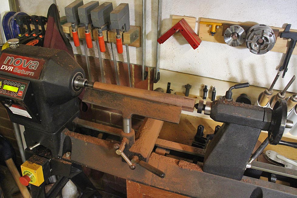
BuildingTheThreeCorneredStools_html_m24eb3146.jpg


BuildingTheThreeCorneredStools_html_m7e8174.jpg


Perhaps you would show us something you have built to contribute to the discussion?

Regards from Perth

Derek
 
Jacob, what screw on legs? That is not something I have used.

AnotherCoffeeTable9_html_2cdff40a.jpg


BuildingTheThreeCorneredStools_html_m7e8174.jpg


Perhaps you would show us something you have built to contribute to the discussion?

Regards from Perth

Derek
A finely worked coffee table in the style of screw-on leg flat-pack furniture, whereas your stools like very traditional/minimalist and made in a practical way.
Perhaps you would show us something you have built to contribute to the discussion?
Actually I'm just finishing off a pair of Reitveld Red & Blue chairs which I promised as Christmas presents last Christmas. The painting more of a problem than the making. Some clever details involved though, but zero display of craft skills. I'll post a photo later.
 
Last edited:

Latest posts

Back
Top