PeterBassett
Established Member
Hi all.
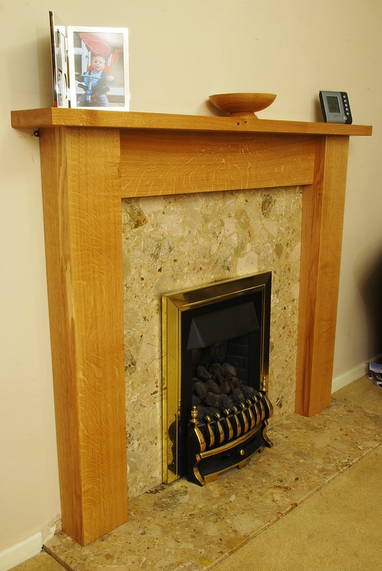
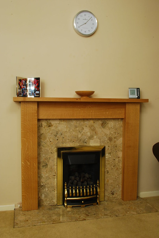
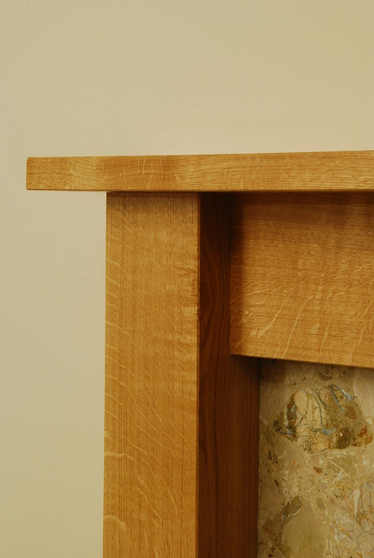
I'm taking a few days to build a new euro oak fire surround for my living room and it is starting to come together. The wife likes the chunky look and I've picked out some lovely figured wood.
Nothing is fied together yet, this is all held together with some clamps and gravity.
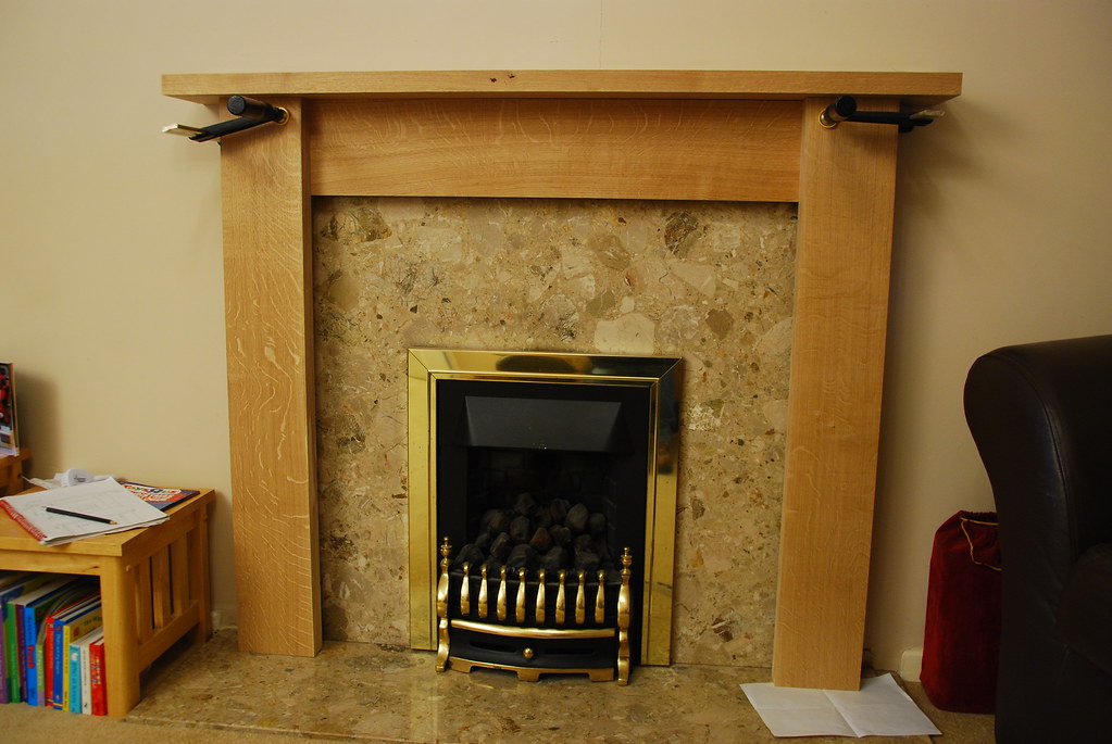
DSC_7275 by Peter Edward Bassett, on Flickr
Figuring.
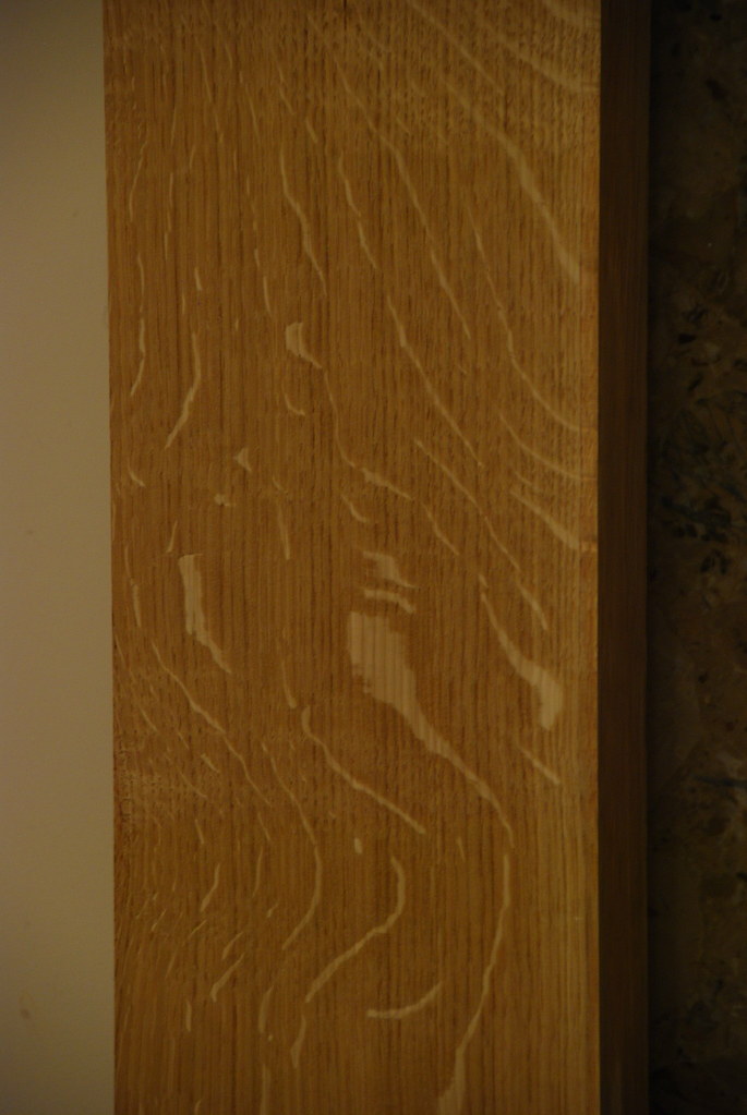
DSC_7278 by Peter Edward Bassett, on Flickr
Side shot.
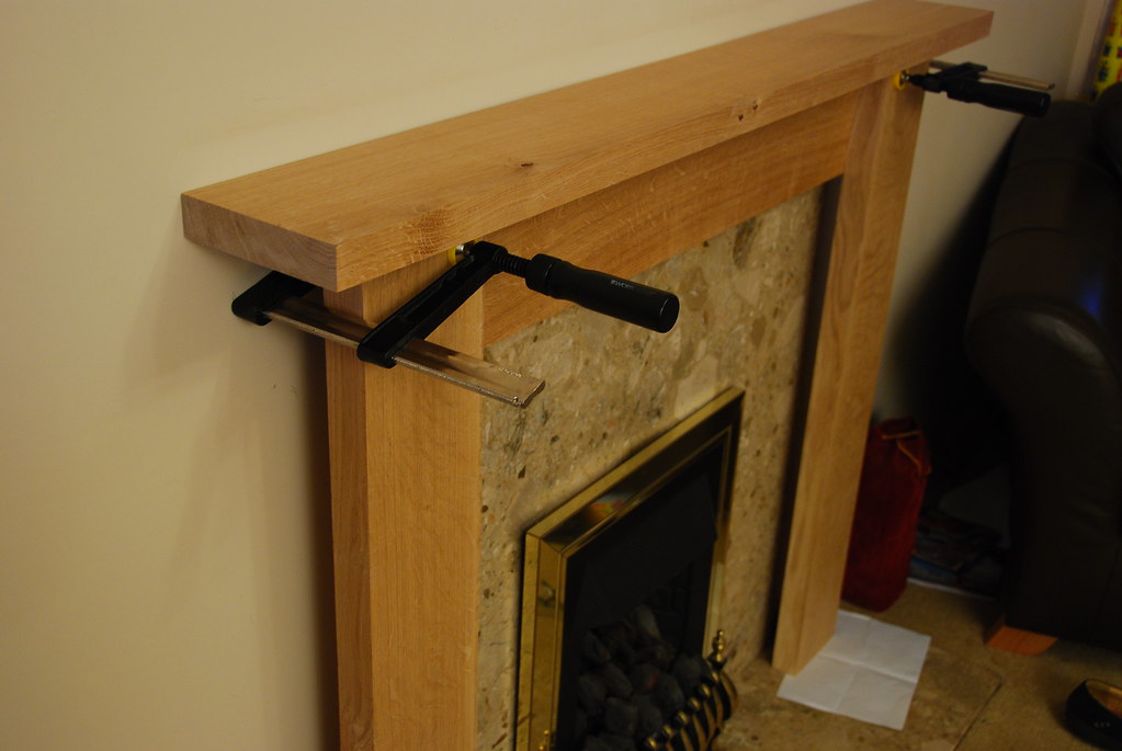
DSC_7272 by Peter Edward Bassett, on Flickr
I've still got to cut the pieces to fill the returns to the wall and marble, which'll be fun as the walls aren't plumb. Sigh.
So, to the question. Design wise it is currently a bit sparse. Chunky is good and my wife would be happy with it as it is, but I can't help thinking it could use something. I was thinking maybe a deep bevel on the underside of the mantle (the top bit, whatever it is called) and some 45 degree chamfers on the two uprights.
Thoughts? Something else entirely? Any ideas gratefully received.
Thanks
Pete
I'm taking a few days to build a new euro oak fire surround for my living room and it is starting to come together. The wife likes the chunky look and I've picked out some lovely figured wood.
Nothing is fied together yet, this is all held together with some clamps and gravity.

DSC_7275 by Peter Edward Bassett, on Flickr
Figuring.

DSC_7278 by Peter Edward Bassett, on Flickr
Side shot.

DSC_7272 by Peter Edward Bassett, on Flickr
I've still got to cut the pieces to fill the returns to the wall and marble, which'll be fun as the walls aren't plumb. Sigh.
So, to the question. Design wise it is currently a bit sparse. Chunky is good and my wife would be happy with it as it is, but I can't help thinking it could use something. I was thinking maybe a deep bevel on the underside of the mantle (the top bit, whatever it is called) and some 45 degree chamfers on the two uprights.
Thoughts? Something else entirely? Any ideas gratefully received.
Thanks
Pete


