Pekka Huhta
Established Member
I have wanted to build a new backsaw for a long time. A few years ago I was in a particularly boring meeting and started sketching a semi-modern saw handle which would have the same ergonomics as the old beautiful saw handles but would still look streamlined and modern.
Well, the sketch kept on haunting me untill I just had to start building it.
That's the progress today:
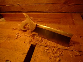
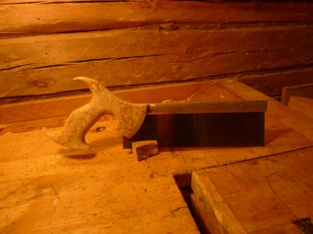
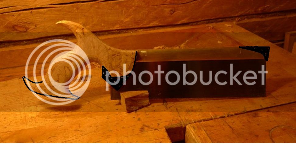
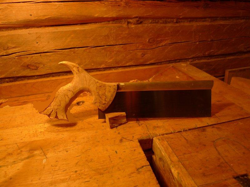
The handle has very similar curves as the back saws of Klaus & Pedder, which I like a lot. On the other hand it lacks all the ornamental features of the old back saws. I like them as well, but... The world is full of back saws and they all have quite similar curves, cutouts and other ornaments in the handles. I could have copied them all, but I just had to create something new.
Also, the spine extens all the way to the end of the handle. Originally I thought it would strenghten the handle on the narrowest spot, as karelian birch is a bit brittle. In the end the handle got quite thick on that spot so extra strength was not needed any more. Maybe it can be also considered a visual feature saying "I have just wasted a LOT of material to build something to catch your eye"
But... I am not fully satisfied about the design yet. The front part around the sawblade looks a little too big and heavy and there is something in the overall profile which bothers me, but I just can't put my finger on the fault.
Before I finalise the shape, I would appreciate all comments about the design. It looks quite good, but there's something I'm not happy with...
Pekka
Well, the sketch kept on haunting me untill I just had to start building it.
That's the progress today:


The handle has very similar curves as the back saws of Klaus & Pedder, which I like a lot. On the other hand it lacks all the ornamental features of the old back saws. I like them as well, but... The world is full of back saws and they all have quite similar curves, cutouts and other ornaments in the handles. I could have copied them all, but I just had to create something new.
Also, the spine extens all the way to the end of the handle. Originally I thought it would strenghten the handle on the narrowest spot, as karelian birch is a bit brittle. In the end the handle got quite thick on that spot so extra strength was not needed any more. Maybe it can be also considered a visual feature saying "I have just wasted a LOT of material to build something to catch your eye"
But... I am not fully satisfied about the design yet. The front part around the sawblade looks a little too big and heavy and there is something in the overall profile which bothers me, but I just can't put my finger on the fault.
Before I finalise the shape, I would appreciate all comments about the design. It looks quite good, but there's something I'm not happy with...
Pekka


