Wall Clock (loads of pics)

UKworkshop.co.uk

Help Support UKworkshop.co.uk:

This site may earn a commission from merchant affiliate links, including eBay, Amazon, and others.
big soft moose":3ap5t2zh said:
just throwing a cat into the works and a spanner amongst the pigeons , have you considered not using numerals at all ? or maybe just at 12 , 3 ,6, and 9.

most people can tell the time just from the position of the hands and the clock looks so good that it might be a less is more type situation
I did consider other options and did sketch it up but this seemedto be the best looking (to me anyway)

I like the idea of carving or pyrography but my skills don't go that far yet.
 
richburrow":2vqfo2iz said:
What a great looking clock :lol:
Your routing set up is really nice!!!!!!
Thanks Rich, it would have taken me a lot longer than 4 hours a clock if it weren't for the router table :D Iplan to make afew more this week as well as finish these Two, I am also considering making some out of Black Walnut and Oak.
 
Nice design and great craftsmanship, I have a question about the aesthetics though. For me you have a conflict between the sharp geometrical shapes and then the rounding on the outside edge, they're at odds with each other. I would have left the edges crisp or perhaps added a chamfer, maybe even a form of bead on the face near the outer edge.

My opinion only and will look forward to seeing the finished article as sometimes a piece doesn't resolve itself until complete

Cheers

Damian
 
Ironballs":1aq244l0 said:
Nice design and great craftsmanship, I have a question about the aesthetics though. For me you have a conflict between the sharp geometrical shapes and then the rounding on the outside edge, they're at odds with each other. I would have left the edges crisp or perhaps added a chamfer, maybe even a form of bead on the face near the outer edge.

My opinion only and will look forward to seeing the finished article as sometimes a piece doesn't resolve itself until complete

Cheers

Damian
Hi Damian, opinions are good and different opinions are great, it gives us an idea of what folk like and don't like.
When I desiged the clock I sketched it a number of different styles and the one that was most pleasing to my eye was this one but that doesn't mean it is the design that everybody will like the best, if most forum members said the same as you I would have to seriously consider changing the design if I were going to sell them to Tom, Dick and Harry.

Thanks for the feedback though, thanks to everyone for their comments, its this forum and the feedback that keep me going forward.
 
I'm afraid I agree entirely with Damien.........which is why I haven't posted on this one before.

It is still going to be a lovely project, and I have a bare spot on a wall awaiting my variation on this theme.

Mike
 
Glad you've taken the comments as intended, did hesitate offering a criticism to someone who has made the fantastic box in your avatar.

Just been looking at the pics again and for me I think there are 2 things I might consider if I was to do my variation. The first would be to reduce the segments from 12 to 6 - though that then makes it less unusual; the second is to shave out a hollow on the outer edge so where the edges meet it comes to a point, a little like a spiders web.

Keep the pics coming
 
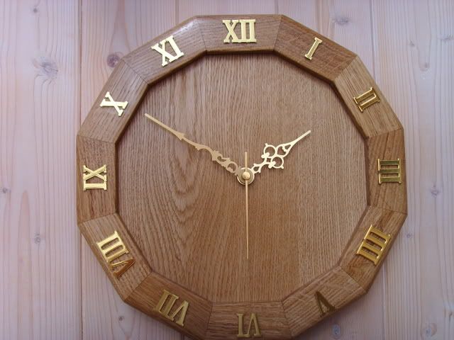
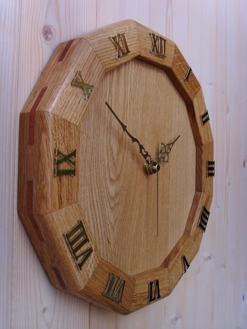
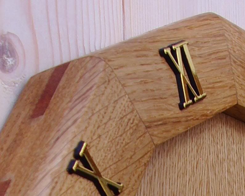
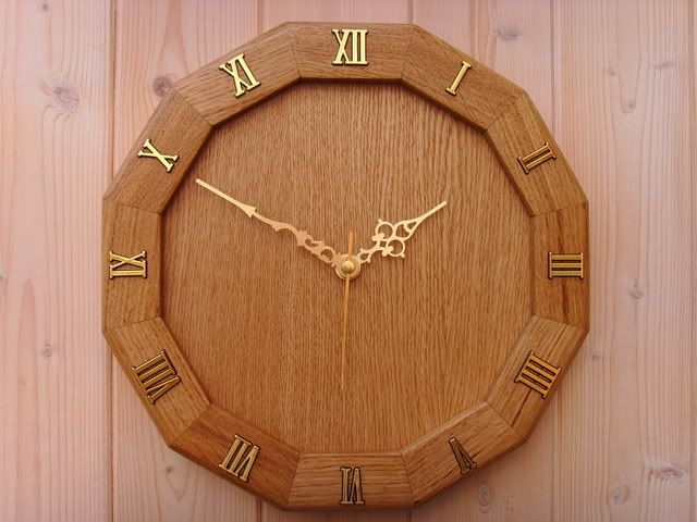
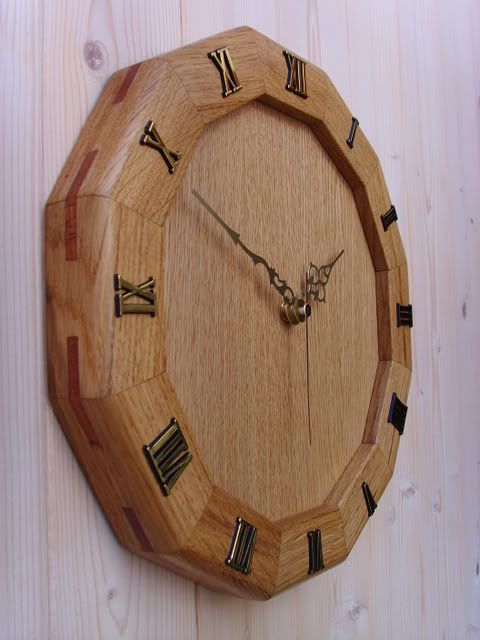
Here are the 2 completed clocked each one has the different type of numerals, hope ype like them.

SSL21079.jpg

SSL21081.jpg

SSL21082.jpg

SSL21084.jpg
 
Although I agree with some of the other comments and would've used a chamfer rather than a round-over, I think both clocks look very nice. I personally prefer the darker-looking letters with the shadow. :)
 
Agree, the darker numerals a slightly better.

IMO I think the centre could have done with something interesting. Inlay maybe?

Not to take away the skill of such a complex task. Well Done.
 
OPJ":6vgzsf00 said:
Although I agree with some of the other comments and would've used a chamfer rather than a round-over, I think both clocks look very nice. I personally prefer the darker-looking letters with the shadow. :)
Maybe but one important factor and that is the customer paid me £50 to have a roundover and the brighter numerals, if they wanted something else they would have got it, I think you have to be flexible, i'm going to make 3 more as I have some of the parts ready cut so I might do one with a chamfer.
 
Lord Nibbo":nw51q9az said:
Excellent job done. =D> I think I'll bookmark this for future reference. :D
Thanks LN,

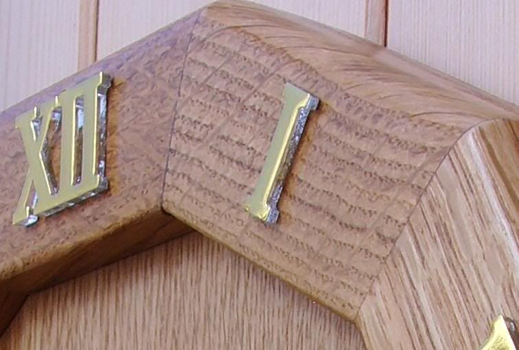
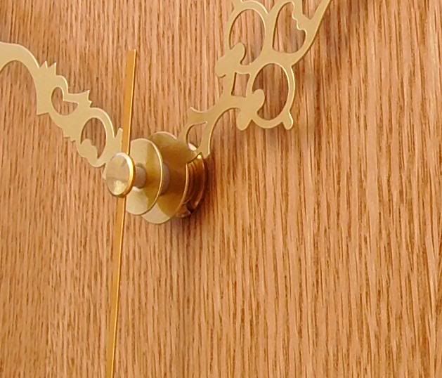
One thing to look out for is getting the inside edges to line up, I was thinking that you need some kind of spring to apply even pressure because you don't have a lot of time as the glue starts to set, its either that or trim them with a very sharp chisel, if you have a look at the second close up pic you will see what I am on about.

Any other ideas anyone.
 

Latest posts

Back
Top