two vase/hollow forms critique

UKworkshop.co.uk

Help Support UKworkshop.co.uk:

This site may earn a commission from merchant affiliate links, including eBay, Amazon, and others.

cornucopia

Established Member
Joined
21 Jul 2008
Messages
2,056
Reaction score
0
Location
Leicestershire
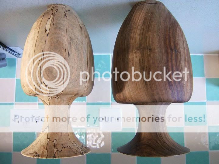
hello all, i turned these two pieces last week on seperate days, one is spalted beech and the other is walnut. the walnut was very wet which made it a joy to turn but a pain to sand :lol: the beech is semi dry.
i am not 100% happy with either piece but for diffrent reasons.
what do you guys think?
will you agree with my reasons? or have some of your own?


DSCF4290.jpg

DSCF4292.jpg


DSCF4294.jpg

DSCF4295.jpg
 
Both very nice George,especially the Walnut one :D
Are they supposed to be identical,as the neck on the Beech one looks longer,or is it the way the piccy as been taken :?
If not i prefer the shorter neck on the Walnut piece.
Also the Beech piece appears to have that dirty greyish look to it on the first piccy too,which doesn't look too nice,again it might be the piccy.
Think i would have either made the bases a bit wider or the middle part a bit narrower too,curving in more to carry the flow on into the top half.
I like the way the top curves over on the neck area on the middle section,which i think you could have made the top half into a lid giving you two useful pieces in one,i think. :?
What tools did you use george,and how tall are the two pieces :?:
 
Love the Walnut figuring George, but not sure about the overall shape.
To me the vase looks a little base heavy, I think it is the abrupt shoulder to stem transition, too big a diameter difference.

The base section would In my eyes work well as a stand alone piece.

The Beech item looks a better balance to me in the base diameter-stem transition but the top flute rim looks a little too large in diameter.
 
thyankyou chaps- very intresting comments.
no they wernt meant to be identical, they are both about 12" tall.
i used my normal hollowing tools and they are glued together at the neck.
 
Hi

I really like the walnut one, the shape suits the darker colour, and the grain shows up well. I'm not sure about the abrupt transition from body to neck, but that's entirely personal, and not based on anything but preference. I think that in my head spalted beech suits a more organic form, while the more 'sophisticated' walnut suits the more 'designed' form.

That said, classy work as always.

Pete II
 
Luv the wood George but the neck sinking into the body doesn't appeal to me... and as you know, I'm so easy to please :roll:
 
George, In my humble opinion if the neck mesurments were switched on the two pieces they would look ,in my eyes, just right. As they are now I would love to have made either of them.
When you say they are glued together at the neck ,I take it they are two seperate pieces. REgards Boysie
 
boysie39":hu6d7k3l said:
George, In my humble opinion if the neck mesurments were switched on the two pieces they would look ,in my eyes, just right. As they are now I would love to have made either of them.
When you say they are glued together at the neck ,I take it they are two seperate pieces. REgards Boysie

thaks boysie
the block of wood is mounted in one piece then rough shaped seperated- hollowed etc then re-joined.
 
Two super pieces, IMHO. As a matter of taste, would slightly prefer a smoother transition from neck to shoulders, without the re-entrant effect. Also a bit bigger foot, to make a more stable shape?
 
well my thoughts are
i dont like the curvature of the neck piece of the beech one, i prefer the walnut curve, but i do not like the join on the walnut one felling that it tucks in too much- a little tuck in is nice, like the beech one.
so a mix of the two would be perfect for me :roll: oh well theres always next time.

ever tried?
ever failed?
try again
fail again
fail better!
 
Funnily enough to my uneducated eye the overall shape does look better upside down. Sorry George. :shock:

I don't like the turn-in below the neck on each one, and would prefer to see the width of the tops a bit smaller than the body. OMO of course. I still believe beauty is in the eye of the beholder, so you will probably score high on the list. =D>
 
I think the tops of the necks are too big - they seem to overpower the shapes and look like they should be on much larger bases. I like the shape of the bottom sections - especially the walnut one where the shape seems to emphasise the grain well.

Having said all that, well done - I couldn't have made either of them!

tekno.mage
 
I personally find hollow forms a little naff, pointless and doubt if there is any commercial demand for this type of work. The spalted piece is an interesting bit of of wood but the shape isn't very elegant.
 
Soulfly":2fcdm1w6 said:
I personally find hollow forms a little naff, pointless and doubt if there is any commercial demand for this type of work. The spalted piece is an interesting bit of of wood but the shape isn't very elegant.

a) Who said that all turning had to be comercial ?

and

b) no commercial demand for hollow forms ??? Someone better tell mark hancock, tony boase, anthony bryant, melvyn firmager, tobias kaye ciaran forbes and who knows who else who regularly sell such items often for a substantial margin.

In fact there is far more comercial demand for hollow forms and other decorative work than there is for purely utilitarian items.

As far as cornys forms go - i like the wood and the general form looks okay - however imo the necks are a tad out of proportion to the bases and i dont like the shoulder which is presumably to disguise a join. my thought is that these would look better with a more flowing line thrugh the body to a shorter neck - perhaps disguising the join line with a bead or burnt line or similar.
 
I've never put up a piece for critique here and probably never will - I'm too thin skinned. I have shown some pieces though.

I really admire the people that do....that takes a lot of bottle.

I really am beginning to wish though, that Soulfly would 'put up' or 'shut up' if he/she wishes to have any credibility given to their criticisms I personally feel that we need to know a little more about them - what their work is like, how long they've been doing it, etc etc.

Chris.
 
Scrums":6ho8yr5c said:
I've never put up a piece for critique here and probably never will - I'm too thin skinned. I have shown some pieces though.

I really admire the people that do....that takes a lot of bottle.

I really am beginning to wish though, that Soulfly would 'put up' or 'shut up' if he/she wishes to have any credibility given to their criticisms I personally feel that we need to know a little more about them - what their work is like, how long they've been doing it, etc etc.

Chris.

you arent the only one to feel that way chris. I would also be most interested in seeing some pics of soulfly's work, as if he is to be believed it must be masterful in conception and execution.

btw - you are far too modest , I've just been looking at your website and i would say that your work is excellent , i particularly like the winged bowl (Ive never managed one of those without cutting my knuckles on the wings)

you can certainly walk it and talk it - it would be interesting to see if soulfly can say the same.
 
least said soon as mended chaps

as for thin or thick skin-I know my own worth- I am happy to hear any opinion on me or my work after all every one is entitled to their opinion but at the end of the day as the creator of these pieces only mine matters.
I already knew the faults on these forms i wanted to see if others agreed with me or not. plus i belive by posting up such bits everyone can benefit from the critique.

all the best
George
 

Latest posts

Back
Top