So this Dovetailing business?...

UKworkshop.co.uk

Help Support UKworkshop.co.uk:

This site may earn a commission from merchant affiliate links, including eBay, Amazon, and others.
There is a time for dovetails, and a time for not. When Krenov used dowels on cases, it was a deliberate decision to avoid adding a distraction to the flow of the figure.

You do not have to identify with his designs. There are pieces which I love, and pieces that leave me indifferent. I do enjoy the quiet and calm that surrounds his furniture. He reached the soul of many of us, and inspired a love of the wood, encouraged our passion to be expressed in our own designs and visions.

In this he was very, very different from the Paul Sellers and Rob Cosmans of this world, who teach what to do rather than how to see.

Regards from Perth

Derek

A very elegant statement. My issue with Krenov is that I see his work more as artistic sculpture than practical furniture. It certainly makes a statement. A fluiditic fusion of modern lines and unusual organic wood features. I doubt there is a true woodworker that wouldn’t admire it as a piece.

Design is an issue. There is much to be said here. I have had to work with many Pitt State University grads. These lads were trained on how to mass produce melamine boxes with modern machines. No dovetails! No traditional anything! Pure modern fitment. When we did the T-Mobil job in Vegas, it was all CNC fit solid surface corian panels.

In commercial fitment, one begins with a dry walled box. It can take on any atmosphere you wish from a surgical white Plam collection of cabinets to the rustic barn wood environment of a biker bar to the atmosphere of an English pub. The vivid colors of plam used in sushi-Rama job looked like an acid trip while the high end elegance of AUP reflected the pose elegance of a Swiss watch vendor. We didn’t do the designs but we had to make them reality. Sometimes easy, sometime frustrating. So design is a complex concept that gets to little attention in our small world.
 
I have to say I haven't used a template since we had tinplate ones in first year at technical school. I've always marked the top of the tails and shoulder line and set the work at an angle so the cut is square and vertical. This is straight forward when you mark pins from tails but I can't quite get my head around relying on cutting square if you start by making the pins first as I understand some do. But I suppose once a technique is automatic its hard to imagine an alternative?

As mentioned either way works. I like to take the time to mark out my tails for my stuff. I can look at it to see if I like it. In tool boxes made for individual tools I like to saw the lid free one the box is done. So a tail first approach allows for lid kerf allowance and proper placement. Otherwise you can butcher up a tail pin set.

on half laps doing tails first makes it easy to mark pins. Doing pins first is a pain in the buttocks to mark out the tails.
 
The biggest problem for amateur woodworkers (at least that I can think of) is the fact that design is discussed when....never? I find warren a bit too married to "doing it" the way it was describe 200 years ago in every respect, but one of the things he said that was relatively worthwhile was the difference between early career introduction 200 years ago and now - that design would be hammered into someone's head as they're learning immediately - it wouldn't be something put off until later.
I think many amateurs (I am one) are taken with the desire to make things, and relish the challenges of the joinery that enable them - the design is often a means to an end. I find the technical aspect more intuitive and struggle with design, hence looking at pleasing pieces is as important to me as studying techniques for well fitting joints.
It's worth noting that the things I have made for people have been liked for how they look and very little of that is due to the difficulty, or otherwise, of the joinery.

Note to self: Get better at designing.
 
You learn design by copying well designed work. Historically, design was the job of the foreman, not the bench joiner or apprentice who were there to bash out work as quickly as possible and make profit.
 
There is a time for dovetails, and a time for not. When Krenov used dowels on cases, it was a deliberate decision to avoid adding a distraction to the flow of the figure.

You do not have to identify with his designs. There are pieces which I love, and pieces that leave me indifferent. I do enjoy the quiet and calm that surrounds his furniture. He reached the soul of many of us, and inspired a love of the wood, encouraged our passion to be expressed in our own designs and visions.

In this he was very, very different from the Paul Sellers and Rob Cosmans of this world, who teach what to do rather than how to see.

Regards from Perth

Derek
Well yes and something made with the techniques of Sellers or Cosman is likely to be well made but things made in the style of Krenov often turn out not too good on either front!
I quite like some of Krenov's bits and bobs but they never wildly excited me.
PS as Adam says above; copy.
First rule of good design is to copy good design - forget all about creativity or self expression, they come later, if ever.
 
Last edited:
Well yes and something made with the techniques of Sellers or Cosman is likely to be well made but things made in the style of Krenov often turn out not too good on either front!
I quite like some of Krenov's bits and bobs but they never wildly excited me.
PS as Adam says above; copy.
First rule of good design is to copy good design - forget all about creativity or self expression, they come later, if ever.

Well said. I've yet to see an in the style of piece that even came close.

On a related note, I think one could probably count on the fingers of one hand the makers who were able to really integrate exposed joinery as crucial to the design and not simply a statement that the piece was well made -- more or less "here, look for yourself." It may be ugly, but it's built like a tank. This stuff almost always looks good to other woodworkers, or at least they're polite enough to say it does.

The carcase joints of a Krenov cabinet-on-stand are simply not stressed in any meaningful way. Dovetails are complete overkill except where they truly lent something to the final appearance of the piece. Seems like a read somewhere that he expressed that he'd wished he'd left them off more often than he did. I couldn't swear to it though. I'd need to find the quote.
 
Interesting. In self reflection, the work done at commercial shops had the design done when we started. In my own personal work, I have spent my time doing more reproduction work than new ideas.

A shaker chest of drawers can be adapted to fit a need but the design is still shaker. The toolchests I made were heavily influenced by Gerstners design because they work. The patterns I just finished for a new shaper fence are based on old photographs of the shaper. Nothing new.

I think it’s nice to maybe take some time and design a piece on your own. Design something in the absence of joinery skills and see what you come with.
Great just want I want to build my other Son thanks for the inspiration!
 
I think many amateurs (I am one) are taken with the desire to make things, and relish the challenges of the joinery that enable them - the design is often a means to an end. I find the technical aspect more intuitive and struggle with design, hence looking at pleasing pieces is as important to me as studying techniques for well fitting joints.
It's worth noting that the things I have made for people have been liked for how they look and very little of that is due to the difficulty, or otherwise, of the joinery.

Note to self: Get better at designing.

your note to self is mine, too - what are general design cues, and then being willing to accept once you make specific items, there is another layer there.

I think that's also what people struggle with almost across the board unless they were born able to see and draw what they see and still be willing to do iterations.

I'll show something I find useful from a design sense. Most things have to have straight lines somewhere (this is a guitar example, though). Hamer made guitars in the early 1980s, and by most accounts, they are better than what gibson was making at the time.

Here is a hamer guitar from that period, and its' worth a little less than a comparable gibson now, despite the quality from gibson in 1980 not exactly being top shelf.
ytrmbhbtm3zbbpopoeeh.jpg

The black arrows aren't exactly great labeling attempts, but they point at two toxic design items. The heel of the guitar looks like a trapezoid in a sea of curves. wf is that? It's a no no.

And when you look at the back of the guitar body , the lower bout is a bit tubby (the "belly") and the two horns aren't that inspiring, but there is a toxic design error across the back the double cutaway is curves meeting a flat line that goes a great distance across the body.

Mixing curves and straight lines in a single element is unnatural looking. There may be instances where it works, but there are few of those that I can think of. The neck line itself along the sides is straight, but it's a completely different element, so it is primarily straight.

Now, a guitar designed 30 years prior somehow eluded those (gibson spent money for designers).

xmu8mbv6b49oxp3cinvh.jpg


Notice how the curves on the body are curves - the cutaway is curved, and the only flat part is right where the neck heel meets the body (this is avoidable, but it's OK - on higher end makers like collings, they don't even abide by that, rather they make the heel fit the shape of the body instead, but collings is a better maker than gibson and their guitars are more expensive).

This is one little thing that I learned early on twice in tool handles and tool eyes. I couldn't tell why they looked bad, just that they didn't look right to me and someone who is a superb designer pointed out "that's either a curve or a straight line - not both - pick one".

In well established things (like better makes of wooden planes), the handle and the eyes are like that. more natural looking. Sometimes it seems inconvenient to incorporate the continuity of curves, but it makes a huge difference if you're not looking to take risks.
 
Wow! I see what your saying but never understood it. Thanks! Would you do us a favor and see if the Veritas planes have this issue? It would be curious if my issue with modern tool design could actually have an explanation.
 
hah...pick one Notice how the stanley planes actually have nice flowing lines and the handles on the earlier ones are artful. Even though things were made industrially, they still looked nice.

The line thing is just one little thing - I'll never have the design sense to make anything from scratch, and maybe not the desire to actually make a full original design with revisions until it's just right, but it's nice to be able to spot why things are the way they are.

it'll torture you a little making things - I cut the belly back on the current les paul guitar attempt and I think it looks horrendous. If I don't point it out, it may only look "not quite right, or slightly different" than the original, but I'll make a template next time as the lower belly of the guitar in the carved top bout is something I can't see a way to improve..

.....but the gibson company paid professional designers, so maybe I should expect that. I'm sure they didn't just draw one and say "great, let's go to the bar".
 
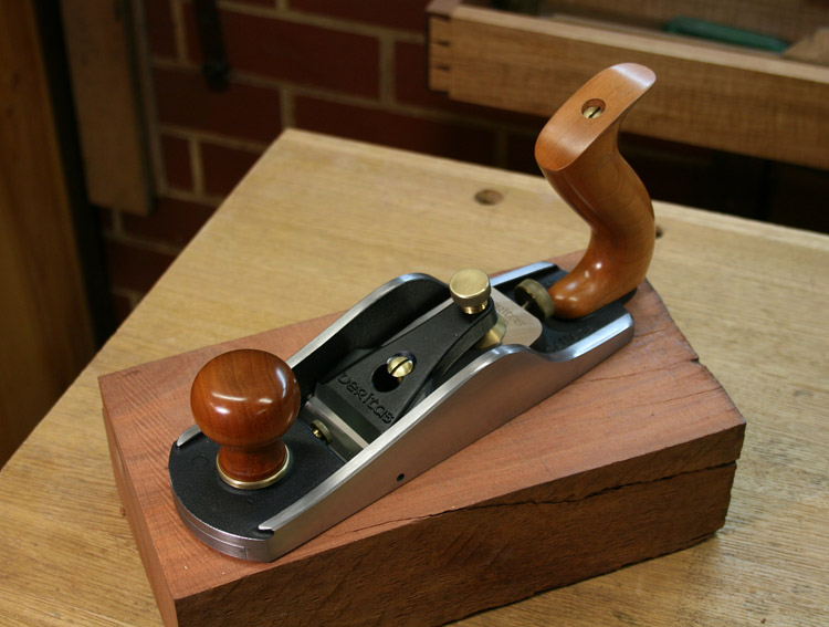
https://assets.leevalley.com/Size4/10101/05P2501-veritas-low-angle-smooth-plane-a2-f-0067.jpg
find all of the straight lines not separated from curves. There are a lot! This could've been a nice looking plane without much or any complexity in terms of manufacture.

I actually like Rob Lee and find them pretty wonderful ethically, but the plane is ugly and it wouldn't have to be. It may attract people who like ugly because it removes the burden of having to look nice (as in, the engineer type -i'm an applied mathematician, btw, so engineers can relax - who thinks any design ideas beyond functional are stupid - that's the type who will jump in and say "so what, if it's not functional, it doesn't matter").
 
Years ago Jim Kingshot pointed out an updated record plane as ugly. A plastic handle on a 044 as I recall.it was awful compared to the older o44.

I have always considered the Veritas planes well made but something just twisted my bloomers wrong. I couldn’t put a finger on it.

Many of the newer infill planes also have this awkward feeling.

what is your take on the bedrock or LN design where the plane body gets cut flat? The plane looks great but that is two curves separated by a flat line.

The A1 smoother has a ton of intersecting radi but has a single straight line leading into its tail.

In doing the pattern work for the Wadkin PK quadtants I did the initial work in autocad. While function dictated straight lines, there are many radi. Even the protractor was back flared into the body with at least two secondary radi.
 
This is a classic example of a Wadkin PK. What is your design opinion on this example?
 

Attachments

  • 01554E22-22F2-4841-9492-9B50A6FF4E0C.jpeg
    01554E22-22F2-4841-9492-9B50A6FF4E0C.jpeg
    31 KB
This is a classic example of a Wadkin PK. What is your design opinion on this example?
Doesn’t look very comfortable to sleep on so a pretty poor bed design. Also when seating people for dinner the rather poor top overhang will result in people hitting their knees on the pedestal. All in all a pretty poor furniture design.
 
Wow! I see what your saying but never understood it. Thanks! Would you do us a favor and see if the Veritas planes have this issue? It would be curious if my issue with modern tool design could actually have an explanation.

It is no secret for many of the fori that I have worked with Lee Valley/Veritas road testing planes, chisels and saws, as well as aiding with R&D for the past decade and a half. As David mentions, Rob Lee (a good friend of mine) and Company are the very best bunch in regard to attitude, ethics and desire to see hand tools survive. Design-wise, they are either love it or hate it - the designs are just so different to Stanley, that they will either jar the eye or excite it. One reason for this is Rob's desire to not step on the toes of other companies and makers and impact on their designs and sales.

The handsaws are so different from the brass-traditional with their moulded, resin-impregnated backs. However, they are superb tools ... at half the price. Personally, I want the brass back, but ...

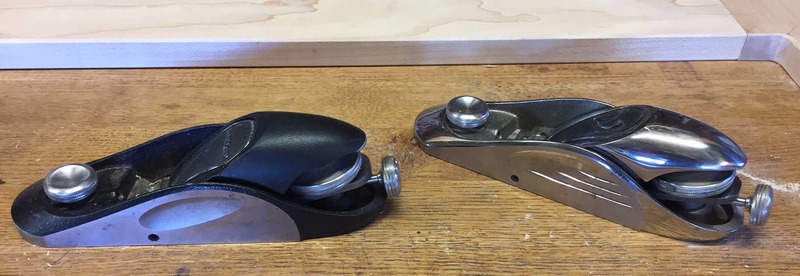
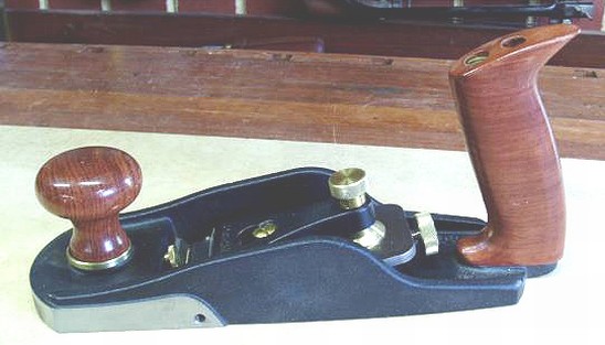
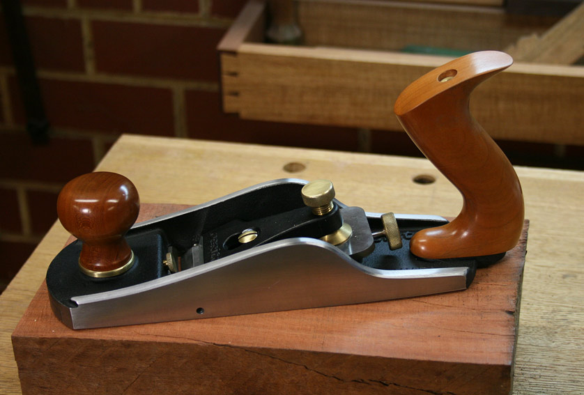
The hand planes are a mixed bag in terms of aesthetics. There are a few which are pure art, such as the block planes ..

Block3-zpseb1yzo2f.jpg


Review: Back to Tool Reviews

and this wonderful Jack Rabbet Plane ...

VeritasJackRabbetPlane_html_m402849ee.jpg


Review: http://www.inthewoodshop.com/ToolReviews/VeritasJackRabbetPlane.html

A funny story: several years ago, members of the Veritas team were touring Australia and came to Perth. They spent a day at my home, BBQ-ing and drinking beers ... and in my workshop. I showed them a plane I owned, and they scratched and scratched their heads. They knew it was a Veritas ... "but I cannot remember us building it .. was it a prototype?", they asked as they snapped many photos.

BUSMOD2.jpg


BUSMOD3.jpg


"No", I said, "It lives inside one of your current planes" ....

The%20Veritas%20Lee%20Valley%20Bevel%20Up%20Smoother_html_f8097fd.jpg


(Obviously, I had re-modelled it). Now the original BU Smoother is butt ugly, in my opinion. But, man, what a wonderful performer!

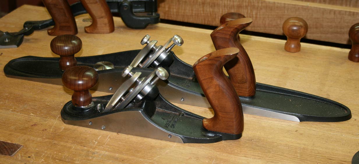
The new-ish Custom planes are excellent performers - as good as they get in planing, but I am not a fan or Norris adjusters. #4 and #7 ...

VeritasCustomPlanes2_html_aaf845d.jpg


Review (this is the best I have written. Read it!): http://www.inthewoodshop.com/ToolReviews/VeritasCustomPlanes1.html

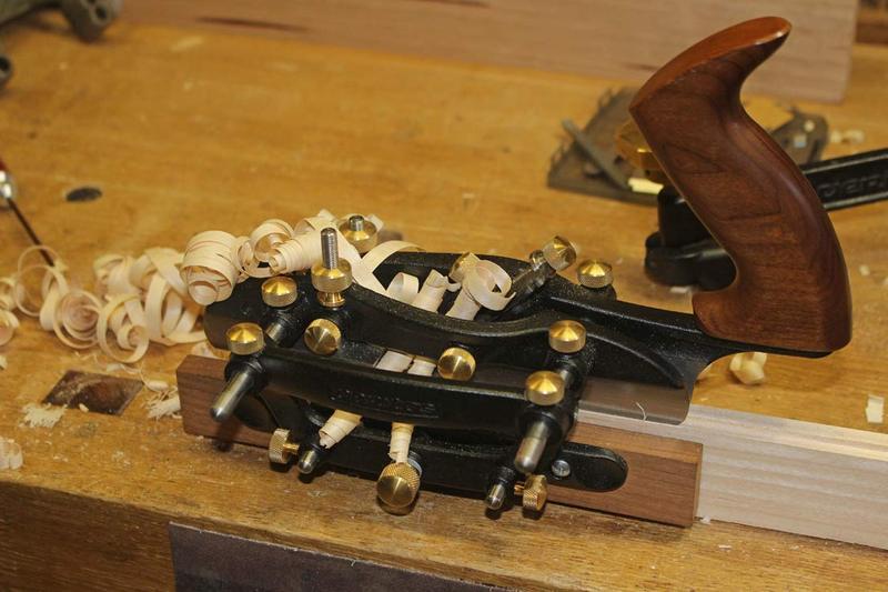
The Combination Plane is really terrific!

7a-zps4fmtxjww.jpg


Dados: http://www.inthewoodshop.com/ToolReviews/VeritasCombinationPlane-dados.html

Regards from Perth

Derek
 
I think the NX60 block is rather nice, but if I bought one 'er indoors might take me off at the knees!. Just don't tell Jacob the price!
 
I think the NX60 block is rather nice, but if I bought one 'er indoors might take me off at the knees!. Just don't tell Jacob the price!
Well it's another world! Probably more than my whole collection cost.
Not sure what they are for exactly - all the pictures here Veritas NX60 Premium Block Plane show them doing jobs which would be much easier with a #4 or #3 and quite possible with a #5 1/2 if that was all you had on hand.
I use a Stanley 220 for preference, when a block plane is really needed.
 

Latest posts

Back
Top