Skeleton vase

UKworkshop.co.uk

Help Support UKworkshop.co.uk:

This site may earn a commission from merchant affiliate links, including eBay, Amazon, and others.

johnny.t.

Established Member
Joined
29 Oct 2008
Messages
1,714
Reaction score
0
Location
Norfolk, near the sea.
This is a beech vase with the majority of the wood removed. It has been airbrushed with acrylics from black through purple to red. It was a real task getting the picture as I seem to really struggle photographing dark coloured things! It stands 4 1/2" tall and has a satin laquer finish.
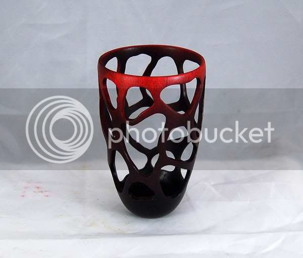
skeleton01.jpg


Comments and critiques welcomed.

JT
 
johnny.t.":2tapj1ej said:
This is a beech vase with the majority of the wood removed. It has been airbrushed with acrylics from black through purple to red. It was a real task getting the picture as I seem to really struggle photographing dark coloured things! It stands 4 1/2" tall and has a satin laquer finish.

skeleton01.jpg


Comments and critiques welcomed.

JT


Looks like you had quite a few catches Johnny

It is different BUT :-k ,

I will look again tomorrow before commenting :wink:
 
I really like this.

It has a little more removed than I might have expected!! This is the sort of thing I have in my images saved away to copy at some stage. I rather thought of making the cut out more representational of something (I know not what) but this does it for me.

Like the colour too. I have now found that the pics work best without flash but using LED lamps. They give a lovely white light. I have been using one but intend to get two more so I can light all round to get rid of shadows. That might solve the dark bits on yours.

When I read the subject I sort of expected something else!! :shock:
 
Thats going to leak!.....
I like it a lot, I think the colouring transforms it.
Chris.
 
I like the idea (although not keen on colouring wood) and it has given me an idea to try something similar with a glass insert so it can hold flowers so thanks for showing it.
 
I really like it, I like it when I can just look at it and keep seeing different things each time. With this I can look at it, look through it, look round it, look into it. Lovely work, well done, it inspires me. =D>
 
I like it quite a lot. Very different and slightly "Modern Gothic". The colouring is good too. I do like to see the wood but the effect you have used is good. Like Gus this is something I would like to do once I can.

For the photo's if you have a point and shoot camera then using lamps etc as mentioned instead of the flash is a good way. Using photo editors to edit the light levels can work also. Also have a look into Gary Fong's diffusers for point and shoots. Other brands maybe available. You could also use the manual mode if you have one and slow the shutter down while its on a small tripod.

If your using a DSLR use a flashgun with a diffuser pointing at the ceiling or a reflective surface. Never point the flash directly at the object. If your not using a flash and/or a tripod you could increase the ISO.

Something I can tell is the colour isn't correct (photo colour). Getting the white balance correct can increase the visibility of the darker parts in under exposed photo's.
 
I like it very much. I could see a whole series developing from it - alternative forms, smaller/larger spaces with different shapes, varying colours.
It does look like it would be a difficult piece to photograph to show it off to best effect.
Well done!

Ian
 
Sorry I'm the philistine. It's not for me.

I was told if you've got nothing good to say - then say nothing ....

The contribution I offer you is that perhaps you could collaborate with a stained glass glazier. I think it looks like it is ready to have the glazing put in. Complimentary coloured glazing would in my opinion make it very interesting.

As it is it leaves me cold
 
I love the skill involved but not the end product, sorry, no reflection on anything but my personal taste. I really like delicate pierced work but this one, well executed though it is, just isn't my cup of tea. Now if the holes were natural .... :lol:

Pete
 
Hi Johnny,

Ignore that miserable bunch above, i thinks its a good effort, and the fact you are trying new things is cool. Wish i had the time,

However have a look at Richard Kennedy and Terry Scott's pal whose name escapes me at this time for pierced work. All the pierced items that "work" seem to have a theme - rather than be random.
 
HI Johnny

I keep coming back to this because although I like it there is something just not quite right and I think I know what it is, It has a satin finish I think it would look better with a gloss finish.

I was visiting one of my sons yesterday and his girlfriend is at university doing an art class and her and a couple of her friends were talking about sculptures so I was showing them some photos of wood works and one of them was yours, they all loved it.

john
 
Hi all I do not often comment on postings but having held this piece in my hand I for one like it very much.

We need to remember this is the first pierced piece Johnny has made and I see it as a great first step and would like to see more and feel the individuality that he has will shine through as his work continues to evolve.

Colured work is not easy to photograph and when the piece has negative space it is even harder, I do agree with the coments regarding the background as it does little to help display the piece, I have seen much worse on here and other forums.
Nick Arnull.
 
Well thanks for clearing that up Nick.
Unfortunately we can only comment on what we see in the photo,which in this case i think is a poor photo of Johnnys piece,so i have refrained from commenting.
I am sure the piece is a lot better in the flesh than it is shown here.
 
Johnny

I have viewed this piece several times over several days

and I cant come to terms with the amount of piercing

I have tried to imagine the top 1/3 being pierced the same way and the lower 2/3 being coloured and can see a way forward with that as in my eyes it would not be as overpowering

But then again I did not design it , its a vision of yours

Thanks for showing us

Allen
 
This just shows how much beauty is in the eye of the beholder. Personal preferences do apply. Its a good thing I suppose or the world would be a very uniform and boring place.

When it comes to quality, only the technical aspect applies really. I seem very much in tune with what JT produces, whilst a lot of more generally accepted forms leave me cold. I've been involved with 'design' for most of my life and for most of that time have made a successful living at it but there were still people that looked at my stuff and clearly thought it revolting by their reactions.

Vive la différence.
 
Back
Top