new piece's/ UPDATED

UKworkshop.co.uk

Help Support UKworkshop.co.uk:

This site may earn a commission from merchant affiliate links, including eBay, Amazon, and others.

cornucopia

Established Member
Joined
21 Jul 2008
Messages
2,056
Reaction score
0
Location
Leicestershire
hello folks

i've been busy updating my website today with allot of what i've been up to over the past couple of months- i've tried my best to improve the photographs and would appreciate any feedback if you get a minute to have a look.
www.fromthetree.co.uk

here are some new bits aswell
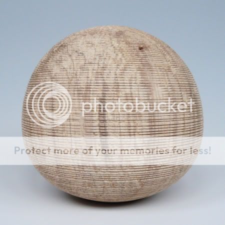
textured h/f
P1030802.jpg


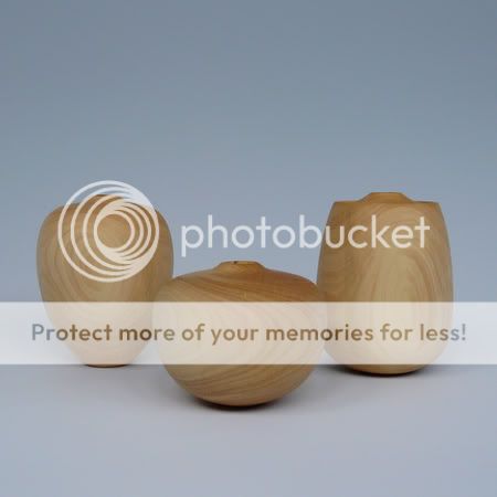
3 miniature (for me) h/f in boxwood
P1030844.jpg


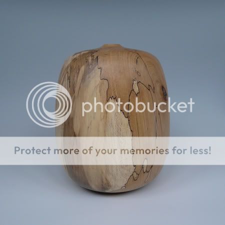
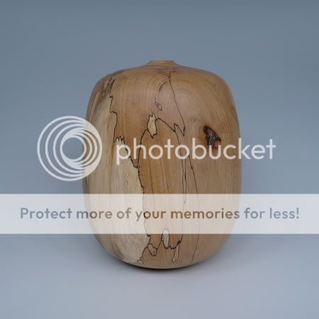
And a new form in spalted beech with a new acrylic finish i'm trying out- its meant to be matt but as you can see there's a slight sheen- but it's hardly altered the colour of the wood (which is nice) but it has given the piece a slightly false to the touch feeling- which i don't like
P1030858.jpg

P1030863.jpg
 
I love, love, love that textured piece !!!,

but just adore the spalted Beech - one of my favoutate woods, I like the sheen, ( i like high glosses also ! ) if its really, really upsetting you i'll PM you my address to ship it to! ;-)


Re the site - the cocobolo pair on the main page look even better on the larger pic - think i only saw theumnails last week.

All the best

Laurence
 
Hey George, Love the new pieces and the images on your website are lovely.. but the design.. :whistle: How about a web design for tuition deal... :whistle: O:)
 
All very nice george :D
I like the slight sheen,it's just enough for me.
Piccys are 100% better George.What have you done to improve on them :?:
 
Hi George,

My favourite have to be the set in Box. Love the shapes.

The website and pictures are all great. The only think I would try to improve on the website is that I don't seem to be able to view the entirety of a picture, I have to kind of scroll through it. If there was a way to view the hole piece it would be better, otherwise, great!

Richard
 
The new pieces look great George, my favourite being the spalted beech.

I also think the web site looks fine, a plain format which IMO shows off your work to maximum effect, with really good photos.


Cheers,

Doug.
 
Hi George,

My favourite piece is the burr oak box!

I looked at the website from the point of view of being a novice turner who takes the occasional photograph and who is a user of, rather than designer of, websites.

I found the website very easy to navigate, and uncluttered by irrelevance that is sometimes found.
The photos are pleasing to the eye, but I would agree with Richard that it is a pain not to be able to view the whole photo in one go.
Certainly a website I would revisit.

Hope that helps

Malc :D
 
Thank you for all of the feedback and kind comments.

Richard and Malc: which way do you have to scroll? up and down or left to right?

Tom:I'll give it some thought :lol:

Paul: the main thing i've done is invest in a graduated background (£20 of e-bay) but i've also moved the place where i was taking pictures- i now take them with my back to the bay window- i also found out a little bit about white balance and iso settings- so i can get a better picture straight from the camera without having to edit it and potentially mess it up.
 
If I try my hardest not to look through my developer eyes, it's a perfectly functional website. I just feel it could look better.
 
You always turnout great work...love the mini boxwood..
Went on your site and it looks good, You have a fully functioning website.
Hope it go's well for you..
 
Excellent changes to the site George, much better.

I love the new work (the dinky sets of forms are pretty cool and very cute!).
Pricing structure seems a bit more sensible too.

The site could maybe be prettied up a bit, but is easy on the eye and very functional.

Anyway, good stuff!
 
Hi George,

I think that's better. I still scroll down to view the pictures but I now seem to get the whole of a picture in the screen. I guess if I had a bigger screen it wouldn't be a problem though.

Richard
 
thanks everyone

I had a look at my site on my mum's laptop this week and i could just see the whole of the picture from top to bottom- on my screen i can see all of the pic and the info and the start of the pic below
 
George, how about changing it so you have a grid of thumbnails of about 200x200 that link to a page with the full size image and it's details. That way no scrolling as to take place.

Just an idea.
 
My monitor is 1680 x 1050 and I see similar to Chas except I also get your name on the bottom of the image - I don't see anything below that.

I use Firefox and have the Google toolbar in addition to the standard Navigation and Bookmarks menus displayed.

I see more in IE since I just have the standard toolbars

HTH

Duncan
 
Back
Top