Mystery iron, stamped MONK, any info appreciated

UKworkshop.co.uk

Help Support UKworkshop.co.uk:

This site may earn a commission from merchant affiliate links, including eBay, Amazon, and others.
AndyT":1mp7k0kk said:
I thought you were going to say you thought it was an owner's name, using commercial, individual letter stamps and a big hammer.

I didn't think that, because the horizontal alignment between the letter of MONK is excellent, and ditto for the stars.

AndyT":1mp7k0kk said:
An asterisk would be an easy thing to include in a set. I guess the iron is soft enough at the top to mark like that, though I've never tried.

Anyone want to do some experiments? It could sort of fit with the name not being recorded elsewhere and being over the top of a fainter maker's mark.

I suspect heat - I don't see how the original mark could be smeared away without it, and the MONK and stars
are extremely deep.

BugBear
 
I think I can convince myself I see Mr Punch as Pete suggested, and the W of "WARRANTED" just inside the zigzag bit. In which case the heavily overstamped stars and MONK probably obliterate "I SORBY", "CAST STEEL", "SHEFFIELD".

My guess is hand stamped, with individual letter punches looking poor because of the very heavy stamp. To stamp that deep with a single hand punch would be hard. My guess is the stamp is heavier at the bottom because the original text was harder to obscure (or it was deemed more important to obscure it completely. Actually, if reading top to bottom, left to right, it looks like Mr MONK got gradually more heavy handed as he worked !
 
bugbear":1v6s4o2r said:
I've looked again, closely, at the "MONK" stamp, full size / closeup on photobucket.

it doesn't seem good enough to be a factory done stamp; in fact it doesn't look good enough to be
done with a factory made stamp.

Look at the faceting on the 'O'', and the very strangely shaped serif at the lower right of the 'M', and the strangely bulbous right hand side of the 'N'.

Sheffield made tool stamps are the work of very skilled men, and the marks they leave are gorgeous.

e.g. (not at random...)

LS.jpg


Monk%20Iron%20Double%20Stamp_zps3nxrapx4.jpg


I also note that the line between the row of 3 stars and the "MONK" is tapered; they're not parallel.

This leads me to suspect that the "MONK" and "3 stars" are separate stamps.

All this speaks (at least to me) of home made stamps, on a home re-forged blade.

I Think :)

BugBear
My theory:
The top one is from a hand-embossed punch so the letters come out raised. This is very common and quite easy to do.

The Monk one is embossed directly - probably with a handful of filed pieces of hard steel (broken files?), and so come out sunken and irregular, and is the owners own mark. Probably took him half an hour or so.
He could have used the same technique to make a punch for re-use in which case the letters would be raised rather than sunk, and he would probably spend more time to make them neat an tidy.
To make a complete raised stamp to emboss the Monk mark, would be very difficult, somewhat pointless and would look very different.
Nor does it look like several punches (letters, stars) as he would only need one star and they would be identical
 
Thanks for all the contributions gents, including the foil-hat stuff on the previous page :lol:

I hadn't thought about this being an owner's mark but it does make some sense. Seems a lot of trouble to go to but maybe he had problems with stuff being nicked in the workshop, there's other evidence that this was fairly commonplace.
 
ED65":1kcoe4e5 said:
Thanks for all the contributions gents, including the foil-hat stuff on the previous page :lol:

I hadn't thought about this being an owner's mark but it does make some sense. Seems a lot of trouble to go to but maybe he had problems with stuff being nicked in the workshop, there's other evidence that this was fairly commonplace.

The faceting on the 'O' is the clearest clue; the irregularity is perfectly clear.

The most obvious way for this to happen is a big strike with an imperfect stamp - created by hand filing,
by someone who was a decent metal worker, but not a skilled stamp maker. The large size of the letters
also speaks of someone "having a go". Filing tiny letters is hard.

A proper letter-and-number set of stamps would have neater induividual characters than this, but the spacing
would most likely show errors.

Whereas we have imperfect characters, nicely spaced.

EDIT; Ashley Iles book has a coupla' pages describing stamp filing.

BugBear
 
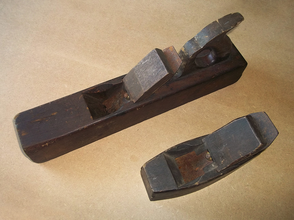
Sorry forgot Andy asked for a pic of the plane. The jack in this photo:

mAbNWdE.jpg
 
I wouldn't pretend to have half the knowledge of you guys but to me this looks like some fella called Monk anti thefted his tools or he wanted to put his stamp on for the same reason we all like making stuff ours. He just did it in a heavyhanded way, maybe he heated the blade? I reckon personally he used a brand style name punch and he was a little too right handed in banging it in. Then again, it might just be the Lizard Overlords making us think that. :shock:
(Glad you took the joke as intended Ed :wink: )
Regards as always
Chris
 
bugbear":2xmyuusp said:
....
The most obvious way for this to happen is a big strike with an imperfect stamp - created by hand filing,
by someone who was a decent metal worker, but not a skilled stamp maker. The large size of the letters
also speaks of someone "having a go". Filing tiny letters is hard......r
An embossed stamp would leave raised letters. Embossing direct (no stamp) leaves sunken letters.
He didn't file "letters" or stars even - he filed pointy ends on scraps and made up the letters and stars bit by bit. I'd guess some of those (cunieform?) shapes are identical - made with the same bit of metal.
I've done the same (many years ago) making stamps for a leather worker, from bits n bobs. Brass best as it leaves no mark but steel reacts with a vestige of a stain. So a daisy flower would have separate petals each one punched from the same filed 6"nail, and so on.
 
Raised stamps (the normal kind) are made with counter punches for the recesses (only the middle of the 'O' in this case)
and simply filing away the accessible outside of the letters.

The technique (or the tool marks thereof) are quite obvious on this example:

old punch on eBay

This was how the original typefaces for printing were made from the 16th century onward, in very small sizes.

Compared to that, a carpenter's (or toolsmaker's) name stamp is crude, simple work.

Here's a cool video:

Punch cutting

(on typefaces, the counter punches sometimes themselves have hollows; these are, of course, made with counter-counter-punches :D )

Moxon has a chapter on all this.

BugBear
 
The Monk stamp doesn't involve typefaces at all - it's been picked out (or bashed in) in bits.
Raised stamps aren't the norm at all - all those old Nicholson woodies have impressed stamps making raised letters. This is the simplest way to make a stamp (for leather, wood, steel etc) but no good for printing.
Raised typefaces were for printers - having the techniques sorted they would then go on to make raised stamps for tool makers etc resulting in the more modern impressed lettering.
I've just checked out "embossed" and might have had it the wrong way around!
 
Anyway, though I'd love to have a chat about various die sinking techniques,
you seem to agree that this blade was marked using a one-off technique,
so it's likely to be a one-off blade, which is what the OP needed to know.

BugBear
 
bugbear":2vp7q86q said:
Anyway, though I'd love to have a chat about various die sinking techniques,
you seem to agree that this blade was marked using a one-off technique,
so it's likely to be a one-off blade, which is what the OP needed to know.

BugBear
Yes I think you've got it - except it wasn't a one-off blade as you can see from the nearly obliterated stamp of the maker (or somebody)
 
Jacob":198ki53q said:
bugbear":198ki53q said:
Anyway, though I'd love to have a chat about various die sinking techniques,
you seem to agree that this blade was marked using a one-off technique,
so it's likely to be a one-off blade, which is what the OP needed to know.

BugBear
Yes I think you've got it - except it wasn't a one-off blade as you can see from the nearly obliterated stamp of the maker (or somebody)

Yes - as the thread has already said, a one off, but using an existing blade as "stock".

BugBear
 
Jacob":ofs1lnpt said:
Raised stamps aren't the norm at all

IMG_2315_mirror.jpg


Here's an eBay search for:

name stamp (carpenter,woodworker,carpenters,woodworkers)

All these stamps are raised, made by the traditional Sheffield process Asley Iles decribes, which was derived from techniques developed in the printing industry.

"Die Sinking" is another spin off trade.

BugBear
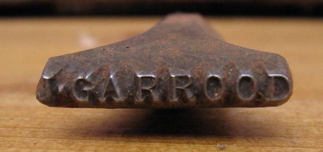
 
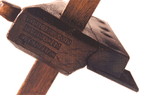
Stamps like this Nicholson below were most common as they are easiest to make - and still are if anyone wants to have a go. No filing just punching, resulting in raised letters when applied. Sometimes filed around the edge where it's easy to get at, leaving a decorative edge. Either a complete stamp like this one below or done in bits like our Monk +stars - punches filed but applied direct without a stamp at all.
Your raised letter stamps would be later and a more refined product of the printing trade .

Che3_sm.gif
 
MIGNAL":k0gabxsb said:
There's something odd about BB's stamp.
Well spotted that man its back to front, you should not be able to read it normally but I think BB or some one else took a picture of it through a mirror.

Snap CC.

I think every Carpenter had one of those stamps made when they were Apprentices you had to pay for every letter and full stops but you were allowed two free empty spaces.
 
I always get completely lost when looking at stamps. Somehow my mind doesn't like mirror images.

Jacob and Bugbear, I think there is a slight miscommunication. Jacob is talking about makers stamps, Bugbear about owner stamps. One is raised, the other not, or the other way around. It makes my head hurt just thinking about it.
 
Back
Top