Interesting pieces of furniture - 8

UKworkshop.co.uk

Help Support UKworkshop.co.uk:

This site may earn a commission from merchant affiliate links, including eBay, Amazon, and others.
A

Anonymous

Guest
The eighth piece of furniture in the series.

This one was another suggestion I received from a member in my 'inbox' - and yet another chair :D

Here's what they like about it:

Hans Wegner's Moller Chair - because it updates and pares down a classical form with such ease, elegance and simplicity, to the extent that I can't see how it could be improved on. It just looks so right. The pinnacle of a great designer's career, I reckon.


pp114_315.jpg


HANS J. WEGNER 1990

The chair was drawn for the Møller Centre at Churchill College in Cambridge, and produced by PP Møbler on special request from ship owner, Maersk McKinney Møller, who wanted a cross between PP 105 and PP 240.

Without Møller's request, the chair would probably never have been drawn. And it therefore seems only natural to name after him - the Møller Chair.

PP Møbler produced the chair from 1990 to 1996 in ash with strawbottom seat.


All are welcome to comment on the pieces and please pm me with links to any photos that you would like featured here and a few lines explaining why


I will copy all items of furniture I post here into a single sticky thread in the Design Forum, thus creating a pictorial 'list' of interesting furniture here
 
I quite like it (from what I can see). Its clean looking, nor overly fussy - just looks a little "wide" somehow. It looks wider than a normal chair - but perhaps thats an optical illusion caused by the position the picture is taken from.

Shame there isn't a side on picture. As the one shown doesn't really allow "proper" comment.

Adam
 
I thingk Adam has a point, but wonder if it really is too wide, or if the back is too low. It is a very nice, clean form though.
 
Not my all time favourite Wegner chair (which is the pp 501) but not too bad, could live with this one - Rob
 
I like this one. Can't quite put my finger on why, but I think it's something to do with it being understated while at the same time having a sort of authority. I don't mind the fact that it seems wide - some people are wide and must feel uncomfortable in narrow chairs.

Cheers :wink:

Paul
 
I'm a bit of a chair geek/fanatic. I like this one a lot, don't love it but would be pleased to have it in my home.

...but it doesn't quite say," sit on me"....

BUT I wouldn't neccessarily want to sit on it. There's just something about the form of chairs that makes them beautiful to look at (whilst sitting on your very un elegant comfy sofa).
 
I like this particular example of what is a traditional chair form. Its founded in the ancient scandinavian post and rung throne tradition, yet has a modern uncluttered feel to it. Wegner had a great eye for detail (or rather how to avoid too much of it) he pares the form down so its minimal but not sterile either. I suspect its mass produced but hand finished. I like seeing what different designers do with the basic spindle back post and rung form, so simple yet so many variation's, genuine cultural diversity.
The best yet of Tony's series in my opinion, I reckon because it doesnt try too hard to show itself off as "happening design" -It doesnt need to because it is anyway :lol: Does any one know what price did they sell for? Classic elegance, I could live comfortably with a few of those around the house. Interesting they were designed with a specific architectural space in mind, a pity there isnt a picture of the chairs in situ.

Cheers Mr S :D
 
Get's my vote for the apparent simplicity of form and design overall - clever.
That could sit (ha ha) in a room, amongst other items, and a large number of folk would just see 'a chair', and use it so - now that's what I'd define as 'fit for purpose'!

But having said that, there's something else about it that I can't identify, but it isn't quite right somehow. Maybe the 'sterile' photography? Maybe it's best seen in situ? Does it really look that pale and uninteresting in real life?

But again I do like the lines - 'elegant' would fit, unusual word for a chair, but somehow it suits - for me anyhow!!
 
greybeard":2nrfhitt said:
a large number of folk would just see 'a chair'


And that's all I see, really.

The angle of the photography is dreadful; a chair needs to be pictured from slightly above and from an angle to give a good three dimensional view.

In this photo however, the front rail looks too square and clunky. I would have curved it in a mirror image of the back.

As to price, these could be knocked out in beech in Croatia for around £20 each and in rubberwood in Malaysia for £15.00!! ](*,)
 
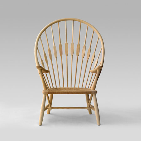
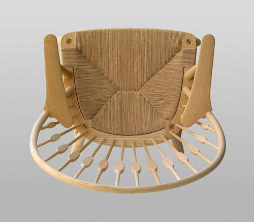
Whilst I like the apparent simplicity of many of Wegner's chairs, I agree that this isn't really one of his best. I think some of his earlier chairs, such as the Peacock chair

pp550_02_sq.jpg


pp550_34_b.jpg


hold greater visual appeal. One thing it is impossible to convey with a photograph is the subtle tactile "feel" of a Wegner chair - something which would probably be lost if the design were knocked out in the thousands in rubberwood.

Scrit
 
Funnily enough I prefer the Peacock chair too, although again I think the pics in that link were taken at angles that absolutely kill it (although from a woodworking perspective it's more interesting!). Prefer this shot:

hans-wegner-peacock-chair.jpg


The Peacock makes me want to sit in it; the Møller much less so. Although even then I'm not entirely pro-peacock - the arms don't quite gel with the back for me, but the back's so nice I don't care so much. :lol:

Cheers, Alf
 
Have to say that i like this one, the simplicity wouldn't tire me over time. However it doesn't inspire me to go out and make something like some of the other pieces have. Not sure if that makes sense.
Owen
 
Love the back of the peacock chair, but that seat! Doesn't do it for me at all - why go to all that effort and obvious display of woodworking skill then add a rush seat?!

The Moller chair I am ambivalent about, I think more photos may help me decide. I do not hate it, but neither do I love it immediately either :roll:

Fickle am I not!

Steve.
 
That Peacock chair is really quite stunning - until you get to the arms which, as Alf said, don't quite gel with the back.

Cheers :wink:

Paul
 

Latest posts

Back
Top