Interesting Pieces of Furniture - 3

UKworkshop.co.uk

Help Support UKworkshop.co.uk:

This site may earn a commission from merchant affiliate links, including eBay, Amazon, and others.
A

Anonymous

Guest
Hi all

The third piece of furniture in what I hope will be a regular series over a long period of time.

This one was the second suggestion I received from a member in my 'inbox'

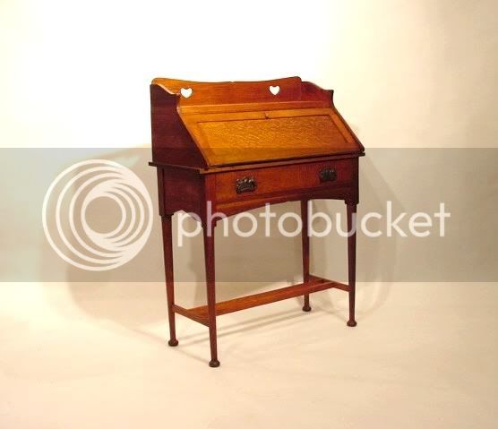
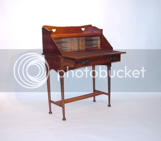
"One of my favourites is an Arts and Crafts desk attributed to EA (Ernest Archibald) Taylor - 1874-1951.

I bought it a couple of years ago and intend to make a stool to match. (TUIT)."


Closed.jpg


open.jpg
 
Ah, now we are talking nice furniture. A bit dated but in the right room will look good. I wouldn't be afraid to use it for its intended function. Nice clean lines.
 
Whilst I usually like Arts & Crafts, I find this piece to be a bit fussy for me. Dont get me wrong I like it but I could not live with it.
 
Almost elegant but not quite. Not a fan of the heart shaped holes or the whole surround thing happening at the top.
cheers Mike
 
Not one of my favourites I'm afraid. Arts and Crafts generally leave me cold. Practicality has to be some part of a piece's function apart from pure design and looks and this doesn't have it with the drawer beneath the writing top.

Simple and attractive lines and form, but I consider the hearts to be rather crass and over height - but then that's Arts and Crafts! Not for me
 
Seems like a friendly piece, I like the overall proportions - but setting/surround and actual usage would be critical. It's dated in presentation and size I think?
Too big for a ladies correspondence desk (can't think of the right term for them, a morning desk?), too small for - say - an estate desk.
Perhaps at its best with other A&C furniture, in a smallish room/house.

Can't make up my mind about the hearts and top surround, I think it may be friendly enough to just blend in?

However - and maybe this is why it looks 'friendly' to me - I could aspire to build to that quality one day, which I certainly couldn't with the 'spider' from a few days ago!
 
It just looks clumsy to me - it manages to look spindly and dumpy at the same time.
 
Well, I seem to be in the majority so far in not being too keen on arts and crafts stuff.

I have looked at this piece several times now, and I jjust can't bring myself to like it - too fussy for me.

But then that is the point of these threads, to include furniture to account for everyones tastes

So get pm'ing me with more suggestions :wink: :lol:
 
greybeard":3paqc46h said:
However - and maybe this is why it looks 'friendly' to me - I could aspire to build to that quality one day, which I certainly couldn't with the 'spider' from a few days ago!

Not my kind of thing, but like you I could aspire to build to that quality one day. The 'spider', along with most of David Savage's furniture is just so far away from anything I would ever want to own or make, that I don't think I really appreciate the maker's skill, let alone the designer's.

This piece I feel I can relate to more. Not that I like it much - it looks top-heavy to me, with spindly legs and the heavy surround at the top. The heart shapes seem rather crude. Interestingly, bearing in mind other comments, I don't think it has particularly clean lines - just shows how different personal tastes can be (which can only be a good thing, imo)

Dave
 
I've never really understood the Arts & Crafts movement or a lot of the art, such as the Pre Raphaelite movement, that was going on in Britain at that time. I can understand that they wanted to return to skill, creativity, honesty of construction and the like but so often the end result was a complete disappointment. At around the same time there was so much going on in other countries, such as the Impressionist movement in France, that was so exciting and innovative, whereas in Britain we seemed to be stuck in a sort of time warp.

For me it's a visual thing. The craftsmanship was superb but the look of the pieces was a real let-down. The desk in the picture looks very clumsy to me. The legs, the actual desk part and the tray on the top look like three pieces that don't really belong together. It looks uncomfortable in that the legs don't look up to the job of supporting the top. And I know it was a sort of 'trade mark' feature, but those heart shaped cut-outs look really out of place.

As I say, I admire the aims of the Arts & Crafts movement and their craftsmanship was superb but I seldom find that I like the end results.

Sorry :cry:

Paul
 
A top-heavy, lumpen piece of sentimentalised mediocrity that you wouldn't look twice at at your local antiques market.
 
Brad Naylor":oa8limrt said:
A top-heavy, lumpen piece of sentimentalised mediocrity that you wouldn't look twice at at your local antiques market.

struggling to put down in words what I think about this piece of furniture, then along comes Brad and takes them right out of my mouth :lol:
 
Looking at the table from a form point of view, the person who arranged it was confused and had no conviction about what they were doing. Theres too many contradictory elemets that lead to conlict and a lack of over all cohesion. EG theres a hint of gothick church influence on the arch shaped apron's, yet the lid is a simple rectangle? Why make the short apron have a point in the centre, and the long ones a curve?? Why make the top all flared and shaped and pierced in a random arbitrary fashion if a simple rectangle was good enough for the lid? The hearts are sort of austro-hungarian folk kistch. They tried to force too much unecessary formal ornament I think, fancy profiles for the sake of it
 
Agree with Brad's view on this one..doesn't do anything for me what so ever and I generally quite like the A&C stuff, well some of it - Rob
 
When I suggested this piece, I knew it would polarise opinion. But, I did think a few might like it :?

I guess I'm most surprised that so many think it is clumsy and top-heavy. It sits well in a very light room in a 1930's house with a mix of styles. The tray at the top holds a family portrait and small lamp so is a very practical feature.

People have also commented on the mix of shapes; curves and points in the apron but the simple rectangle of the fall flap. Looking at it as I type, the simplicity of the frame and panel flap really sets off the fantastic quartersawn oak of the panel.

Here's hoping I get at least 1 positive comment :wink:
 
mr":36uhbn8f said:
. Not a fan .... or the whole surround thing happening at the top.

I think the surround looks like so out-of-place to the rest of the piece that its an add-on or a modification of something else. Still, I don't follow A&C at all, so can't really comment, maybe they all look like that. For me, its just not really a style I like.

Of course, a close up of some of the workmanship might be interesting as well.

Adam
 
Jake":xpbrt3pd said:
It just looks clumsy to me - it manages to look spindly and dumpy at the same time.
Wot Jake sez. But I do like the panel flap - although that's more appreciaion of the material than of the design. Still, it could have been mucked up by the design I s'pose, so I'll count that as a positive. :lol:

To be honest I still haven't worked out what exactly "Arts & Crafts style" is. I got given a book at Christmas on various pieces (not just furniture; ceramics, jewelry, textiles etc too) and the diversity of style is extraordinary. Some I like, some I don't, so do I like "Arts & Crafts" or don't I? Who knows. :roll:

Cheers, Alf
 
The thing with these 'arts crafts' late victorian/edwardian pieces --is that they were designed to be multiples for the masses mechanization was well on the way, the spirit of the times was to give ordinary people a chance to own nice furniture,--40 yrs down the road the same look was incorporated into utility furniture for the masses.

ruskin & morris were a bit extreme as they tried to recreate a hand made look, this piece is fine for the times it came from --it's hardly a masterpiece but never the less suited the population at the turn of the century,it wouldn't be very functional these days --but back then in a small terrace house as writing desk would have been fine & fitting in with the themes of joinery around the houses being built.
 
Back
Top