Interesting pieces of furniture - 10

UKworkshop.co.uk

Help Support UKworkshop.co.uk:

This site may earn a commission from merchant affiliate links, including eBay, Amazon, and others.
A

Anonymous

Guest
The tenth piece of furniture in the series.

This one was another suggestion I received from a member in my 'inbox', and they said:
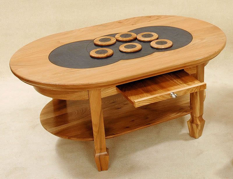
Tony - This was from one of the top UK schools - a student's work. Wych Elm table with tooled leather inlay. Slider in the side apron and matching coasters with leather. Finished with Shellac and Lacquer (unsure how many coats). It was about 4' long I believe.

I liked it when I saw it mainly for the simplicity and the 'warmth' of the piece.
You can put this in if you like - it would be interesting to hear what the others think! It was sold to a client in Oxfordshire some time ago.


Table.jpg


All are welcome to comment on the pieces and please pm me with links to any photos that you would like featured here and a few lines explaining why


I will copy all items of furniture I post here into a single sticky thread in the Design Forum, thus creating a pictorial 'list' of interesting furniture here
 
OK for a student work, for the craft work if not the design.
Must say I have gone right off this thread - don't like any of them so far except the arts n crafts desk and the cupboard with a heron. The shaker chest is nice in principle except for the gimmicky details. Oh well 2 and a half out of ten.
I think I'd give top prize to the cupboard with the bird - sorta naive and unpretentious - doesn't shout "I'm a designer" at you.

cheers
Jacob
 
It's clumpy, heavy in the making and as a piece of design work, I feel quite frankly, hideous...not worthy of this thread. Sorry- Rob
 
I like the top and the matching coasters and I like the idea of a tray in which to keep the coasters. I don't like the legs at all - they look like they belong to another table. And they seem to be inset too far, as does the supporting curved under-rail and the shelf. And that metal knob for the tray would have looked so much better in wood. A hotch-potch of design errors that spoil what could have been a very nice piece. Nevertheless, a useful piece for a student to make in that he/she would have learnt several useful techniques and someone liked it enough to buy it.

Cheers :wink:

Paul
 
Spot on Paul! Almost!! I agree with everything apart from the tray handle. I'm not convinced that the shape used is right, but I think it's ok to have it in metal.

The legs are - politely - unfortunate. But hey, someone liked it enough to buy it - that has to be a pretty acid test!, and acceptance!!
 
A touch top heavy and Im afraid I can't talk about the legs in polite society.
Mike
 
Don't like it at all clunky and not a very nice shape. It would be just about ok if it weren't for those feet!

I agree with Mr Grimsdale about these threads, as you open it with anticipation and then its not to your taste! Guess this is good though as it just shows how different people's opinions are!
 
I too think it is hideous, the parts are out of proportion for the size. I imagine that it would look better like if it were wider and longer, but with the component sizes the same - if you catch my drift. And those feet ... eurgh
 
Looks amaterish and home made - design details added for the sake of it- just to be different.
 
As other have pointed out I think the proportions are sligthly wrong as the table just looks a little on the odd/unbalanced side ......

Also with it being a student piece I think he/she was trying to demonstrate a number of different style or methods as I think the feet of the piece appear to be totally at odds with the curves of the top, rails and shelf

Again like most of the other peices in this series whilst beening nicely done it just doesn't hit the mark for me .......... must be down to personal taste ....... or I like uninteresting furniture :D
 
If it is a students work, his skills are there. The design seems rather old fashioned, I'm not sure which era it would fit in, probably the 60's, but as has already been mentioned he was probably demonstrating different skills, nice looking finish.
 
I like the top in isolation but also think the legs and base are all wrong. The legs not square to the sides looks completely wrong to me.

John
 
A horrible design but well executed.

I really like these threads - I too open them with great anticipation but unlike some others I'm never disappointed. I love to hear what everyone, especially the pros, thinks of the pieces. It seems we all appreciate the workmanship but have very different views on design... except in the case of this piece. Those legs ... #-o !
 
I don't like this. It seems like a demonstration of technique rather than design. What is the purpose of the slider in the apron? I don't wish to be over critical of a student piece, there is a certain warmth to the timber/finish.


Rgds

Saint
 
I sent this in mainly to see if others thought of it as I did. The Slider by the way was for holding the Coasters when not in use.

It's an unfortunate photographic angle, but the only one I could scrounge up. The legs are certainly different! and I 'think' they may have been changed half way through the making for whatever reason. The wood is truly beautiful and the leather inlay and finish likewise. Some real craftsmanship and time must have gone into it. The Apron for instance appeared as solid pieces and I assume the curves were built up from several laminations.

I was told that there wasn't one piece of metal in the entire piece (apart from the handle) and I certainly couldn't find one. It was only 18 or 19" high and when seen in person, it appeared very much in proportion overall. The legs however were unfortunate, but I sold it on for several hundred pounds ......
 
All that time and effort for a few hundred pounds, not my type of furniture but I certainly wouldn't put all that time and effort in for a few hundred.
 
Oh, I think it shows promise for a student piece. If I was a wood person rather than a gardener I'd consider giving someone a job on the strength of that piece. But aside from the legs it's not really all that interesting.
 
Whilst its not my favorite piece in the world, and it is a little clunky, I like the ideas shown in it.
So as a student piece it is good
 
Back
Top