Hall Table in American Cherry

UKworkshop.co.uk

Help Support UKworkshop.co.uk:

This site may earn a commission from merchant affiliate links, including eBay, Amazon, and others.

Sgian Dubh

Established Member
Joined
12 Oct 2004
Messages
3,118
Reaction score
1,076
Location
UK
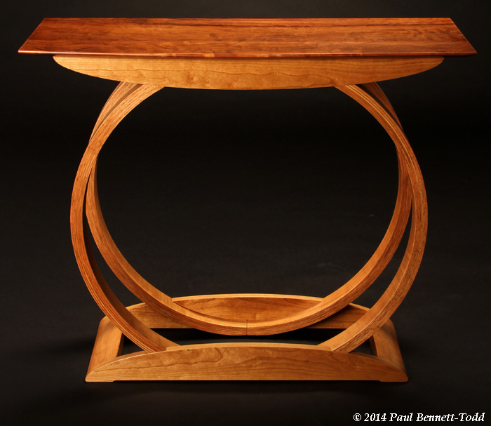
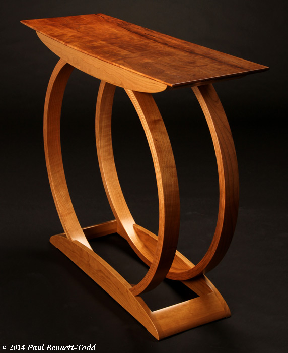
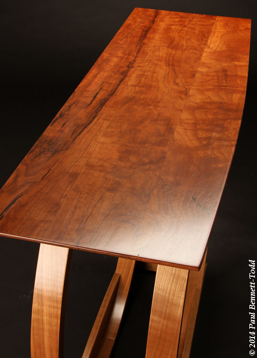
Recently off the production line is this small table, a gallery/exhibition piece.

More images available here: http://www.richardjonesfurniture.com/Ta ... Table.html

And there's a description of some of the production processes here: http://www.richardjonesfurniture.com/Ta ... -Make.html Slainte.
AD-Table-1842-700px.jpg


AD-Table-1870-700px.jpg


AD-Table-1900-700px.jpg
 
Richard, you have produced a beautiful table and I love your choice of timber for the top. I'm looking forward to reading your description of the production processes.

Thanks for taking the time to post,
Neil
 
Newbie_Neil":1k8qtfue said:
Richard, you have produced a beautiful table and I love your choice of timber for the top. I'm looking forward to reading your description of the production processes.

Thanks for taking the time to post,
Neil

Sgian Dubh":1k8qtfue said:
And there's a description of some of the production processes here: http://www.richardjonesfurniture.com/Ta ... -Make.html Slainte.
Already linked - see above
 
Very nice and to your usual high standard, nice choice of timber, if the top had been slightly rounded rather than square it would have followed the curves in the legs and stretchers? In the third picture the top right shows more what I mean, but it's just my own personal preference.

Baldhead
 
Thanks for the comments guys. I don't ever expect all positive feedback phil, so I'm not offended. You can't please everybody, and I too see stuff that aesthetically leaves me cold, but I can admire the ingenuity of the construction, or some other technical element.

Baldhead, I follow your reasoning regarding the preference for an arc (curve or rounded) at each end of the top to pick up the same motif from elsewhere. Actually the front edge of the top is an arc with a radius ~6.9 m radius: tricky to lay out with a pencil on the end of some lath cobbled together with screws! I thought about an arc as you suggest, but in the end decided straight ends would work best. Slainte.
 
Excellent Richard, simply excellent.
Elegance in an original way, beautiful colour.
 
What a lovely piece of furniture Richard, I really enjoyed the write-up too, I'm a huge fan of the more minimal style of furniture like this.

Many thanks fir sharing this with us.
 
I enjoyed looking at every link of this post, thanks for posting.

Lovely workmanship and wish you much pleasure and success.
 
Richard

Thanks for the link to the description of how you made this.

I bet the customer could not guess how involved the making was without that description.

Your workmanship is first rate.

Well done

Mick
 
MickCheese":2c23pnku said:
I bet the customer could not guess how involved the making was without that description. Your workmanship is first rate. Mick
Thanks for the comment about my ability to butcher wood a bit Mick. There wasn't actually a customer. The piece is in a gallery looking for a customer, it being one of my speculative items. You never know, a client may materialise, and items like this are out there in part to advertise what I can do if someone wants to commission something. Slainte.
 
CStanford":kf9szcbm said:
Just stunning.
Here's my last effort in American Cherry
Thank you Charles. I'm very fond of cherry. Pretty wood, not too hard, not too soft, well suited to more refined pieces rather than rustic, ages beautifully. What's not to like? Don't answer that because I realise that aesthetic preferences are frequently subjective, ha, ha.

As to your desk, I rather like the Arts and Crafts style, although it's not a style I'd ever think to work in myself for a speculative piece, although I'd bash it out if it was what a client wanted and was willing to pay for. In this case I like your desk's essential simplicity of form, and that you've kept the American A&C motifs in check, i.e., cloud lifts, exposed dovetails and the clamped (breadboard) ends aren't overdone, although I do wonder a bit about the grain direction of your drawer bottoms: will they blow the drawer sides off?

It's when people start adding different coloured woods to the exposed joinery that the American A&C copyist pieces can get a bit too shouty and in your face for me - I can tell it's an Arts and Crafts styled piece without the unnecessary bling thank you very much. Slainte.
 
CStanford":xj09ulog said:
Here's my last effort in American Cherry

I also like your table, I think had I made it I would have placed the long stretcher in the middle of the two side stretchers, just my own preference.

Baldhead
 
Excellent work, and looks similar to the greek letter Omega, just coincidence I guess.
 

Latest posts

Back
Top