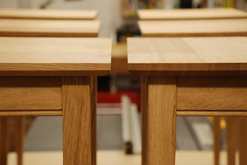
Dionysus Desk(s) W I P. Completed

UKworkshop.co.uk

Help Support UKworkshop.co.uk:

This site may earn a commission from merchant affiliate links, including eBay, Amazon, and others.
Coming along nicely matty.

I like the shadow gap around the legs any seasonal movement might muck up your precise work though. I have got a table with a similar cut out at home and the gap gets looser and tighter with the changing seasons. Doesnt bother me though.

It will be interesting to here how you get with the morells oil.

Cheers

Jon
 
xy mosian":38i6u6u1 said:
Matty, what a beautifully elegant table. I don't know who that big guy is :D but he should be chuffed!

xy

Thanks mate. You got me though- What big guy?
 
JonnyD":2mntuya7 said:
Coming along nicely matty.

I like the shadow gap around the legs any seasonal movement might muck up your precise work though. I have got a table with a similar cut out at home and the gap gets looser and tighter with the changing seasons. Doesnt bother me though.

It will be interesting to here how you get with the morells oil.

Cheers

Jon

Yeah it may well do Jonny. I had planed to fix the front edge and have the buttons take all the movement from the back.
The oil went on very nice, it's very thin and watery. We'll see what it looks like in abotu 12 hours.
 
OPJ":2nh91ibd said:
Very nice. :)

Could you not try staining the sapwood before you oil it?
I hadn't thought of that Olly. I confess though, i would probably rather either leave it or start fresh on this one. I tend to trade on selling the natural materials/look of timber and avoid stain where possible.

What stain would you have suggested?
 
Thanks for all the other comments. I do have a few issues with the build and design thus far.
It has to be a stong table due to the weight it will carry, but i'd rather some of the details where a little more delicate- the top look's heavy, i may try and increase the chamfer a little to see if it lightens the look a little. Likewise the legs look a little fatter than i'd like, but i won't be changing anything there.
 
A bigger chamfer like these;

3338582441_50b910dd07.jpg


would lighten the edges and also casts a nice shadow onto the lower edge of the top.

Ed
 
Mattty":3iibwa5f said:
EdSutton":3iibwa5f said:
I like the detail where the top meets the leg

Ed
I really like your wifes bagels :D

I trust theres no euphemism in there that I don't get... :shock: and you are referring to our blog

Ed
 
There lovely tables Ed. I remember seeing them before. With this design i don't have that kind of overhang, I only have 4mm on the sides and upto 10mm on the front. That is what i meant though in terms of making it look lighter. It's amazing the difference a simple edge treatment can make to a piece

This is a shelf/drawer i made a few moths ago with a tapered chamfered edge. It has the effect of making the shelf look curved ie higher at each end when it was mounted on the wall.
DSCF1280.JPG
 
EdSutton":2nhj3s3l said:
Mattty":2nhj3s3l said:
EdSutton":2nhj3s3l said:
I like the detail where the top meets the leg

Ed
I really like your wifes bagels :D

I trust theres no euphemism in there that I don't get... :shock: and you are referring to our blog

Ed
You trust correctly. Me and the kids made some a couple of weeks ago. The sugar/cinnamon ones where great. we made about 16. They were gone in one sitting.
 
Mattty":3akbl2w0 said:
There lovely tables Ed. I remember seeing them before. With this design i don't have that kind of overhang, I only have 4mm on the sides and upto 10mm on the front.

You could still get the size of chamfer I'm talking about, even without the bigger overhang - it looks as though theres room across the front of your table.

I like the shelf with the optical illusion curve - might nick that idea...

Ed
 
Yeah i agree, the front is where i could do it. I may have a little plane at it tomorrow.
 
I like the tapered chamfer, trying to find the right project to use it on as it's quite similar to the technique the Barnsley Workshop chaps use
 
Mattty":18m1jod8 said:
I hadn't thought of that Olly. I confess though, i would probably rather either leave it or start fresh on this one. I tend to trade on selling the natural materials/look of timber and avoid stain where possible.

What stain would you have suggested?

Fair enough. Staining can lead to all sorts of trouble! :? :wink:

Assuming this is one the underside then, yes, I'd also be inclined to leave it as it will very rarely (if ever) be seen (as much as I hate including sapwood in furniture with the risk of infestation).

As for a stain, I wouldn't really know what to suggest. Although, "walnut" would be a good guess... :oops: Again, if it's on the underside then, I suppose almost anything would do, provided it 'looks' dark enough, without contrasting against the rest of the piece. I've used Chestnut's spirit stains and they are very fast drying, which makes it tricky to get an even coverage over a larger surface area (unless you spray?). What is good about their range is that they produce a samples pack.

From the two brands I've used at home, I'd have to say I prefer the stuff from Colron (you should be able to find it in one of the DIY sheds). It is also spirit-based and dries relatively quickly. But, for some reason, it spreads more evenly and almost feels like a thin oil finish. I used some 'Georgian Mid Oak' on an oak dining table recently and the results were excellent.
 
Mattty":17arexzm said:
I've had 1 1/2 Days getting drenched on a decking job.
TBC

Hi Matty,

I sometimes have to work on the drive outside my shop. I used one of those portable 'gazebos' from the garden. As long as it isn't too windy, it keeps me more or less dry and comfy. Maybe you could find room for one in your van/boot? :)

Nice project I am watching with interest.

Regards
John :)
 
Hi Mattty

I'm enjoying this WIP, cheers.

I have a couple of comments if that's okay.

Firstly I agree with other comments on deepening the chanfer on the tops to lighten it a touch.

Secondly, I love the detail of the top around the legs but I think the 90deg corners don't seem to fit so well with the shaping of the octagonal legs. I would be tempted to knock off the 90deg corners to 45deg where the change in angle of the leg meets the 90deg of the tabletop (see the black lines on the pic as that shows better than my words...). I think this would blend the transition of the top around the legs in a more flowing way.

Mattty.jpg


Cheers

Mark
 
Thanks for the comments guys, much appreciated.
Comment away Rob, i generally share your dislike of sap and am not happy with the top. New walnut is on it's way.
 
TrimTheKing":2y0rc1w3 said:
Hi Mattty

I'm enjoying this WIP, cheers.

I have a couple of comments if that's okay.

Firstly I agree with other comments on deepening the chanfer on the tops to lighten it a touch.

Secondly, I love the detail of the top around the legs but I think the 90deg corners don't seem to fit so well with the shaping of the octagonal legs. I would be tempted to knock off the 90deg corners to 45deg where the change in angle of the leg meets the 90deg of the tabletop (see the black lines on the pic as that shows better than my words...). I think this would blend the transition of the top around the legs in a more flowing way.

Mattty.jpg


Cheers

Mark

Thanks Mark. Thats exactly what i've done.

I'll update later- gotta do the bonfire thing with the kids.
 

Latest posts

Back
Top