Alan Peters (style) Media Unit...finished

UKworkshop.co.uk

Help Support UKworkshop.co.uk:

This site may earn a commission from merchant affiliate links, including eBay, Amazon, and others.

woodbloke

Established Member
Joined
13 Apr 2006
Messages
11,770
Reaction score
1
Location
Salisbury, UK
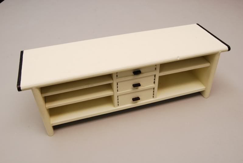
It's been a long, complicated build but the latest project has gone from this (which SWIMBO hated):
small1-16.jpg


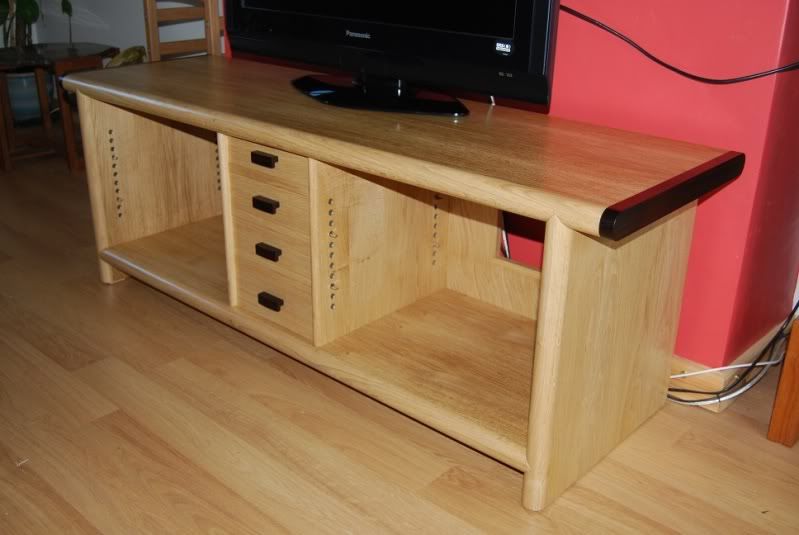
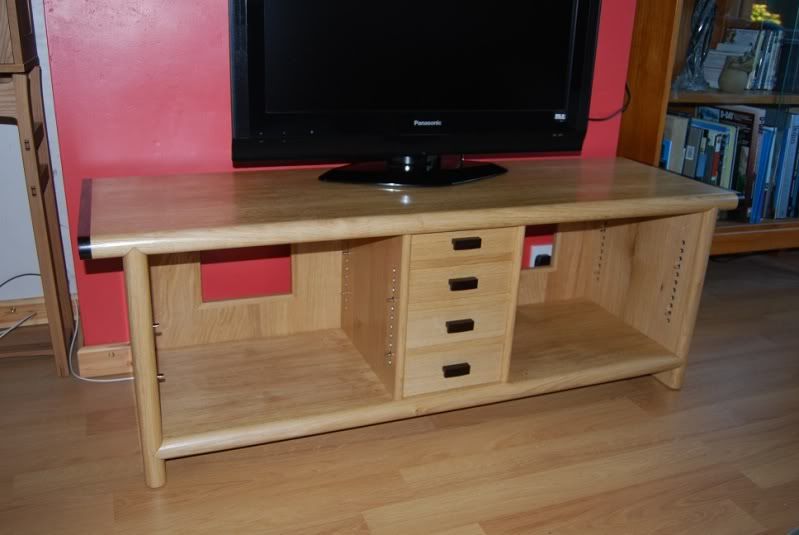
to this:

006small-3.jpg


010small-2.jpg


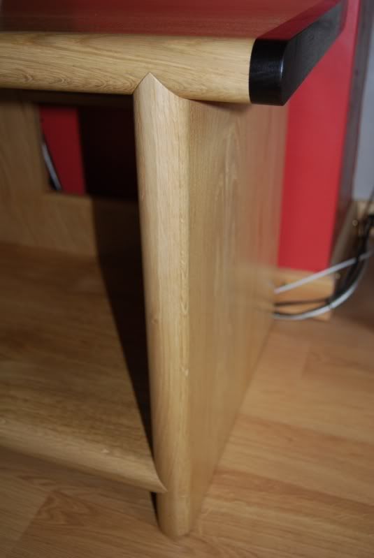
The unit is shown without the 6mm smoked glass (ordered on the 'morrow) with just the TV installed at the moment. One of the more interesting features of this project was the 'sword tip' tenons which turned:
007small-3.jpg


quite well in the end, but caused some headaches in the marking and cutting.

The drawers:
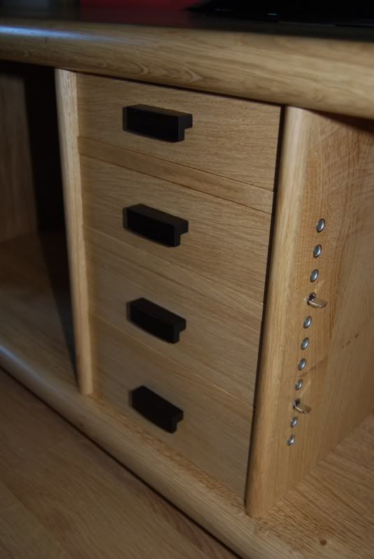
008small-3.jpg


are conventional in construction and are a piston fit...lapped dovetails at the front, through at the rear, c of l bottoms and mahogany sides. Handles are curved at the front and are built up from ebony laminates, they are deliberately on the 'chunk' side as it's in the nature of the piece...small and delicate would have looked a bit 'odd':
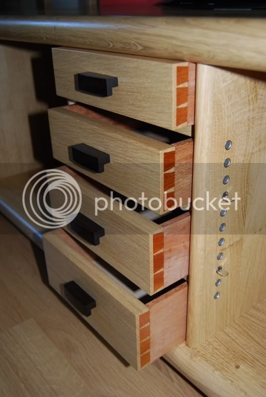
009small-3.jpg


and if each is opened 3/4 of the way can be pushed back in by light finger pressure on one corner.

As ever, comments and constructive criticism welcomed

Massive thanks to Pete(Newt) :eek:ccasion5: who twice helped glue this one together - Rob
 
Love the design & the execution, well done.

If i had to pick fault, then i don't like the color the "tails" have gone & i think there is too many sleeves in it for the adjustable shelfs.

Call me picky but those 2 things stood out at me.

really nice work though,

Woodguy.
 
Inspiring stuff Rob. Lots of ideas that I can plagiarise there. I particularly like those sword tip tenons. Very exacting works because any errors would have stood out like the dog's proverbials. Please post a photo when complete with smoked glass etc.

Just trying to work out how to do a glue up of those lovely thick veneers without a laminate press! :(
 
Yes. I would be pleased to put it in our living room, our unit is now very dated and yours looks 21st century.

Yes those horned tenons are good.
 
Very Nice. The ebony end pieces really help with the look of the piece, are they solid or veneered and how were they attached??
Owen
 
Very nice work Rob. Excellent. If you do want criticism - I've never thought that oak and mahog sit well together and I, too, think there are too many shelf positions. But that's tiny criticism in the grand scale of things. In every other respect, 11/10.

S
 
Nice build but can't get a feel for it... All seems very flat and soulless and too many sockets.

Looks like Ercol but not as we know it Jim...

Sorry
 
Excellent piece of furniture and excellent execution, well done Rob.

My only criticism is the shelf positioning and I'm not convinced with the drawer handles.
 
Excellent piece of furniture and excellent execution, well done Rob.

My only criticism is the shelf positioning and I'm not convinced with the drawer handles.
 
The problem with the colour of the mahogany drawer sides (too orange) is down the flash fotography, for the actual colour think Honduras Maghogany with a coat of BLO
The material for the drawer sides (said Mahogany) is the one preferred by AP over oak
Handles is always difficult :x but as I said, small and dainty wouldn't have worked on this piece.
The shelf spacings were chosen deliberately to give more leeway when fitting equipment. If you think about hi-fi and TV gear it's generally the same width (or no wider than around 440mm) but can vary in height quite a lot. Having the shelf spacings close together allows me to mix and match more easily
The ebony end caps are biscuited on, all othe lippings are glued straight onto the substrate
Once the shelves and gear are in position I'll post another coupla pics- Rob
 
Well, these things always look better when they're made out of real wood, like oak. :wink: Very well done, Rob.

Like you, I also struggle to make a decision with handles (I think you've done fine, here) but I also find shelf lug holes quite challenging... The trick is in giving a piece that versatility, without over-doing it. I think you're right to err on the side of caution, as electrical things and their media are always changing in size.
 
Nice work Rob

Agree that the colour of DT's is not good but if that's photography then I guess the contrast isn;t so strong in real life.

I don't think the shelf adjusters are too many, my big bugbear with shop bought stuff is that you can't get close enough to the shelf size you want, so this is perfect. And with smoked glass doors on you won't see them anyway.

But just to balance it out with some criticism, your TV is too small, I can see the screws on your skirting boards and the plastering on that red wall needs re-skimming! ;)
 
Hi Rob,

Grand job. Well done!!!

Initially I wasn't sure about all the shelf fixings but when you think about it (which you obviously have done) the versatility they add is very useful. I have no problem with the handles (although they probably should have been turned :wink: :lol: ) and the sides will settle down colour-wise and are rarely seen so no problem there.

I'd be interested to know how much you feel the model helped you and how. I've seen this done before but it just seems like such a balls ache and generally a bit pointless. Did it actually help you in any way? Interested to know.

Cheers

Richard
 
Richard Findley":2m8n4ape said:
I'd be interested to know how much you feel the model helped you and how. I've seen this done before but it just seems like such a balls ache and generally a bit pointless. Did it actually help you in any way? Interested to know.

Cheers

Richard
The model did help to visualize the project in 3D so it did help. I made it to scale but the paint job left a lot to be desired :oops: It also gave SWIMBO an indication of what the final thing would look like.

Mark - some of us don't live in Trimble Towers and have the benefit of a domestic Imax :p :lol: :lol: - Rob
 
Well Rob,

I can't find much to criticise here. If I have to make one point, I agree with Richard. The handles might have had some kind of curve to echo the front edges of the main frame.

Excellent overall and your attention to detail is A1. Yes, a nice piece.

11/10.

John :)
 
Back
Top