Transition "For critique"

UKworkshop.co.uk

Help Support UKworkshop.co.uk:

This site may earn a commission from merchant affiliate links, including eBay, Amazon, and others.

George Foweraker

Established Member
Joined
17 Jul 2009
Messages
702
Reaction score
0
Location
Burnham on Sea Somerset.
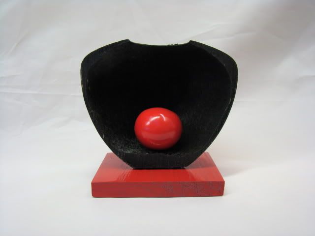
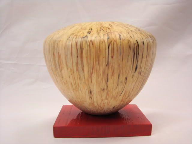
This piec represents the transition from dark to light. From the dark interior to the light exterior.Turned from spalted Silver Birch on a Beech base.110mm high.
DSC01404.jpg


DSC01405.jpg
 
Novel George, but the cynic in me says "did the other half split"

Maybe a non turner would not even contemplate such but I'm afraid it's the overriding first thought that has blocked further evaluation for me.
 
Now that's a different idea. I'm not sure how I feel about it. Seeing the lovely grain on the outside, I wish it was just a whole HF. But I do like the idea and I think it is thought provoking. I applaud your forward thinking George. Keep'em Coming ;)
 
Hi Chas.
The other half is not broken i am going to paint the inside of it red with a red ball and base.
Hi wizer.
I intended this piece to be thought provoking and i look forward to members opinions on it.
Thank you both for commenting.

Regards George
 
Nice idea again George,but my initial thought was that it was an after thought to do this,as the piece was cut in half to see how even the wall thickness is,been a turner :D
But after looking at it for a while i think it would have been good to have had both halves side by side,one showing the lovely wood and the other showing the inside :?:
 
Hello Paul.
I do not need to cut hollow forms in half to see what the wall thickness is i use calipers for that.
I do not know how to put the two pics side by side only one on top of the other.
Thank you for commenting,

Regards George
 
I wasn't been picky George,i just thouht you might have got the idea from cutting a piece in two,as most turners do from time to time.
Sorry if i upset you. :(
I did not mean put the two pictures on top of each other i meant to have the two halves of the piece side by side.
 
Sorry george this one doesn't work for me :( I think to display the interior of a form like this it needs to have perfectly even walls and be perfectly finished inside or textured in a uniform way. There is also a rough or fluffy piece in what was the opening visible in the picture. I also don't feel the glossy red plinth goes with either side of the piece or the relevence of the red ball inside.
There is a bit of promise in the idea though and it may well be worth developing further.
Sorry to sound so down on it but you asked for critique and I can only give it honestly.

JT
 
Hi Paul.
You did not offend me at all and i did not think you were being picky.
the idea of making this piece was to try and make something artistic if i dare say that.
One thing that may be of interest i had a mate woodturner phone me last night and say i am not sure about your latest piece and gave me various reasons why.
After our conversation about 10 minutes later he rang me up and said my wife just spotted spotted you piece on my computer and said how much she loved it.
Later in the evening my wife saw it and thought it was wonderful.
Does this mean it is a woman's thing or that we only judge things as woodturners and maybe only see woodtuning as turned pieces and have a closed mind for the beauty in them.

Regards George.
 
I like the idea but like Paul think it would be better to have the other half as part of the 'sculpture' coloured in the opposite way (outside painted) I think the plinth would be better a different colour as well.

Pete
 
I suppose one thing that defines most art is that half the viewers don't like it but are usually more vocal than the other half.
I like the form, I think it would be interesting to see the cut surface in red similar to an engineering cutaway
[e.g.
151624.jpg
]
 
Hi Mike.
I did think about doing that but would i be doing it to show the thickness of the wall or because it would improve the aesthetics of the piece i am not sure.

Regards George
 
You could try it with the remaining half, see what you think then sand it off if you don't like it. All the old masters seem to have 'first drafts' under the oil when x-rayed. A finish on an edge should be easily altered if you decide it doesn't work.
 
HI George

That Mr Sanger has a lot to answer for. :wink: :lol:

6 months ago I would have looked at this purely as a wood turner who prefers wood to be wood and said what a waste of a beautiful piece of wood and an excellent form.

These days I view items differently, yes I look at them as a wood turner and judge the form and wood against what I like but that happens second. Probably because the number of people doing, or at least showing, artistic items has grown and from trying them myself. I now look at each piece as a whole & think yes I like it or no I don't only then do I start to closely examine a piece using my turners eye, for want of a better phrase.

When I opened the thread and looked at the first picture I thought wow I like that the contrast in colours is striking and sets the ball in the centre of perfectly. I then scrolled down and saw the second picture and thought again a very nice piece. I then read the words and realised they were the same item, slow on the uptake today, and I think it works very well. The contrast between the black interior and the spalted exterior works really well and sets this piece of beautifully.

As a turner I have to say the wall thickness a bit thick on the sholder. :wink:

john
 
Hello John.

Thank you for you comment as you say i think a lot of us are trying to to look beyond the round and brown now.
I have just rushed out and had a look at the thickness on the shoulder and think if i could get it this perfect on all my hollowing i would be well pleased :lol: :lol: :lol: :lol: :lol: :lol:

Regards George
 
I like it!
I think I would mount both halves on the same plinth with one reversed,

one showing the finished grain, the other showing the artistic bit.

As far as putting pics side by side,
cut and paste each pic without hitting enter/return between them.

That should put them side by side.


like this.
then it just need a click on each to make them bigger.

If you are using photobucket click on the 'IMG thumb' (thumbnail) to highlight it, then control 'C' followed by control 'V' in the reply box.

Then for the next pic do the same but put the control 'V' directly following the previous entry.

(for side by side pics it's better to use the thumbnail, than 'IMG code' (full size pics)
otherwise size and space becomes a problem :shock:

John. B
 
I agree with JB in part, perhaps 2 of the same form with 1 like in the pic and another with the inside natural and the outside black. Placed on one plinth (spelling?) facing each other with a gap to see the ball in the middle. Perhaps you could also use thin fishing wire to suspend the ball in mid air between the pieces....hold on...i'll calm down now!
 
Thank you john it sounds like it would be too much for my old brain but i might give it a go.
Thank you Skeetoids (do you have a name)Some good ideas to think about.

Regards George
 
Back
Top