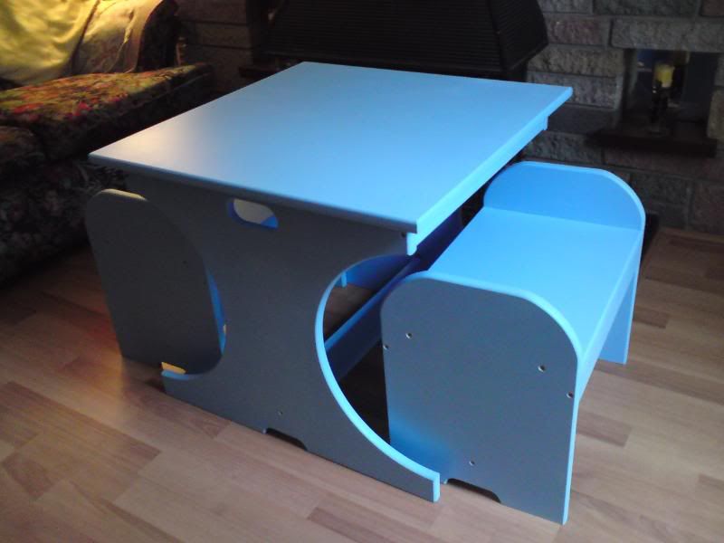
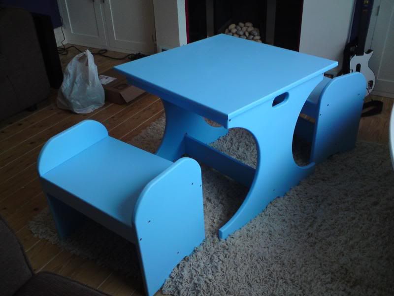
Toddlers desk & benches - FINISHED.

UKworkshop.co.uk

Help Support UKworkshop.co.uk:

This site may earn a commission from merchant affiliate links, including eBay, Amazon, and others.
Thankfully, I got the heatwave I prayed for. It rose to a balmy 2degrees by this morning so the paint had managed to dry ok.
DSC00021.jpg

DSC00020.jpg


I have to say I'm not 100% happy with how it's turned out. If I wasn't on such a tight deadline (Mother in law imposed) then I'd have given everything another coat of eggshell.

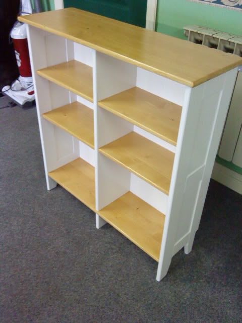
If I were to make another one (already had 2 orders from family) then I'd paint the 'legs' of the desk and benches an off white and make the tops from 'antique stained' pine, clear PU varnished, similar in style to this:
DSC00084.jpg


Not sure what it is, but being all one colour makes it look a bit too 'clunky'.

Over all, for a quick project (11hrs all in) I'd give it a 7/10. The MiL loves it tho. *Phew*. :lol:
 
Bryn, perhaps you feel it looks "clunky" because its in one colour. Maybe some stripes, stars etc. would have made it look less clunky. Perhaps another way would be to stick pictures on the uprights and then cover in polyurethane.
 
Shultzy":3tczv5t6 said:
Bryn, perhaps you feel it looks "clunky" because its in one colour. Maybe some stripes, stars etc. would have made it look less clunky. Perhaps another way would be to stick pictures on the uprights and then cover in polyurethane.

I do think it's because it's all in one dark colour. I was considering varnishing in some sort of alphabet track or simple board game layout around the top. Time, unfortunately, was against me. Hopefully I'll get chance to refine the design in future versions.

The MiL reassuringly told me not to worry as she was sure it'd be trashed before too long :roll:
 
Hi Pren,

Sorry, meant to reply sooner! Just been reading the thread again and seen the finished article! Nice work, looks the part! :) I seen you mentioned it looked a bit 'clunky', well, I would have said 'sturdy' and childrens furniture really needs to be that to put up with abuse. But, to lighten it a bit how about a few designs/shapes cut out of it? A few 'windows' to lighten it a little, shape of teddy bear head, flower etc.

Dont try do a design like I did in my crib, it looks grand, but its a f^&kin' nightmare to try A. paint (as the paint tends to gather in it and run, even with light coats) and B. sand between coats!! I shalt be doing that design again, its a one off!!!!! :twisted:

I was interested to read your painting technique. I was thinking of maybe making a few more of these cribs and getting sale for them! And obviously would like to keep the cost to an absolute minimum! I had been using tinned 'MDF sealer' to seal the edges, which, is quite pricey and really is only watered down PVA in a tin with a fancy name! (robs PVA/water mix idea! :D ) and I was using satinwood to finish the end panels, which also is quite pricey!! I'm going to try your method of 'sealer-emulsion-eggshell' and see how its goes!

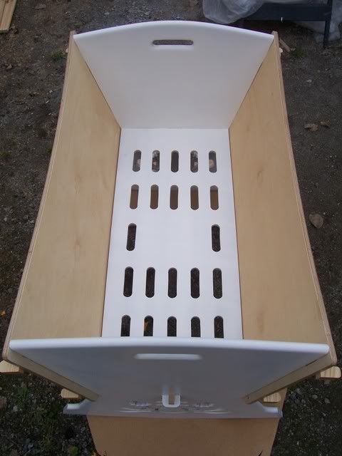
Anyhoo, heres a picture of the base as requested, its supported at the two ends via the slots/wedges and along the sides via a slip of timber fixed to the side panels, so, its essentially resting on them. Now, unfortunately I cant claim full credit to the design, but I'm going to offer a customised version, different cut out designs, colors, etc.

101_1451.jpg


The ventillation slots I think are maybe a little too wide. I cut them with a router cutter with a bearing, I might pop a guide bush onto the router and cut them with a plain bit and thus knock a few mm off. The blank space in the middle is for fixing an A5 sized instruction sheet to! :p

Actually, my crib goes well with that shelf unit you showed!! Did you make that?! (comes up with idea of making a small knock togther shelf unit with plenty of off cut, expensive, birch ply and MDF!! :D)
 

Latest posts

Back
Top