monkeybiter
Established Member
:lol: :twisted:



 by -mcluma-
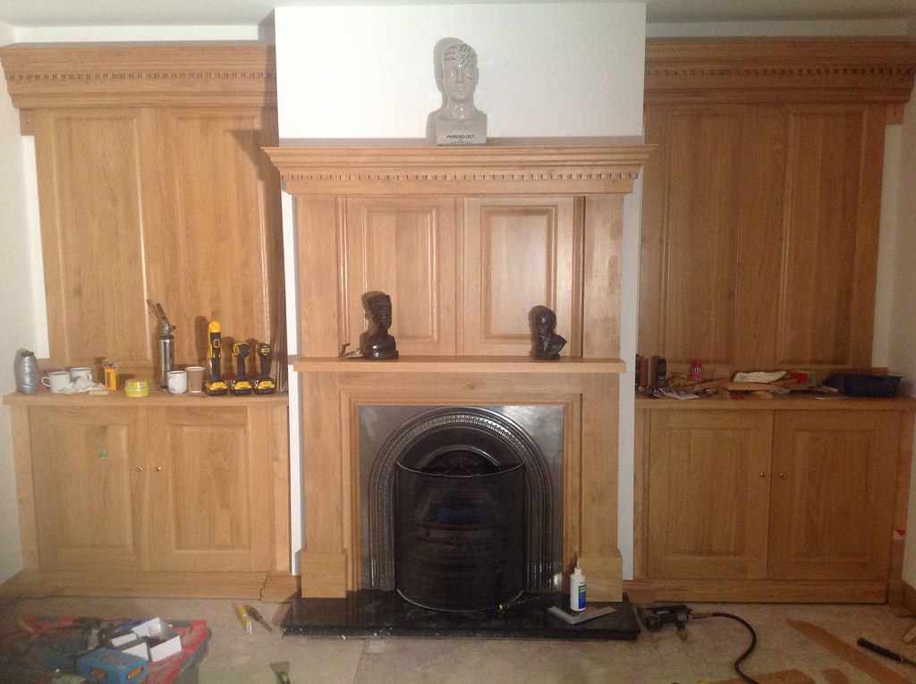 by -mcluma-
 by -mcluma-
 by -mcluma-
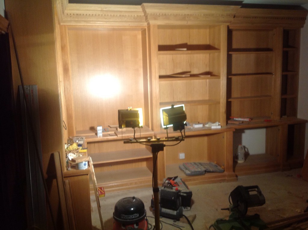 by -mcluma-
thick_mike":12paro5e said:MUCH better...you don't hang about do you?!
Enter your email address to join: