Side Table Design Phase

UKworkshop.co.uk

Help Support UKworkshop.co.uk:

This site may earn a commission from merchant affiliate links, including eBay, Amazon, and others.

billw

The Tattooed One
Joined
26 Apr 2009
Messages
1,700
Reaction score
901
Location
Birmingham, UK
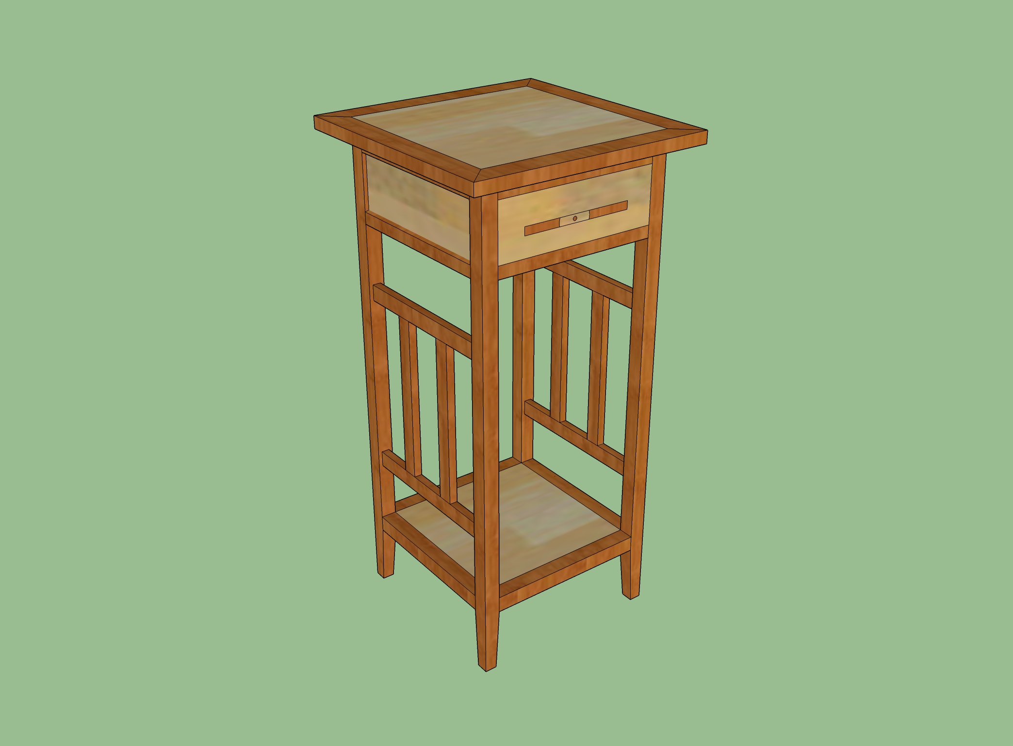
OK so I'm trying to figure out whether these dimensions work or not. The top is just over 15" each side, the legs are 30" tall. It's all in 1" timber at the moment.

This isn't the finished design, just trying to figure out whether it looks alright. There will be some art work done in between the slats along the side, in translucent resin. I'm not sure how easy it will be to replicate that in Sketchup!
1.jpg
 
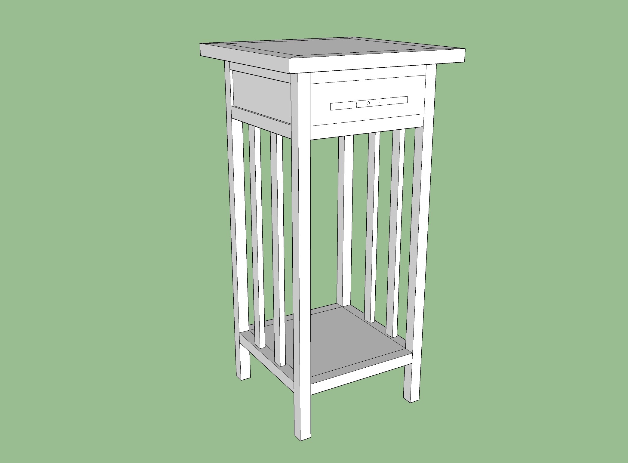
I don't think it is going to be possible to comment until the complete model is shown. The drawer (and aprons, presumably) will change the look fundamentally. At the moment it looks like a bad bar stool! :)
 
Updated!

PS please ignore my terrible attempt at a handle - it's supposed to be a 1" wide strip of a 7" record, so it's erm....7" wide I guess! Will be done in black with a white section to represent where the label would be.
 
Right, second time lucky. This is pretty much finished, it'll be predominantly done in sycamore or maple. I think it looks a bit too tall maybe.

2.jpg
 
It does look a bit spindley, not hugely though, what’s the large void above the shelf for?

Aidan
 
TheTiddles":mf0w8er6 said:
It does look a bit spindley, not hugely though, what’s the large void above the shelf for?

Aidan

It's not for anything really, maybe I should both shorten it and pull the shelf up a bit. At least this is giving me some good practice with Sketchup.
 
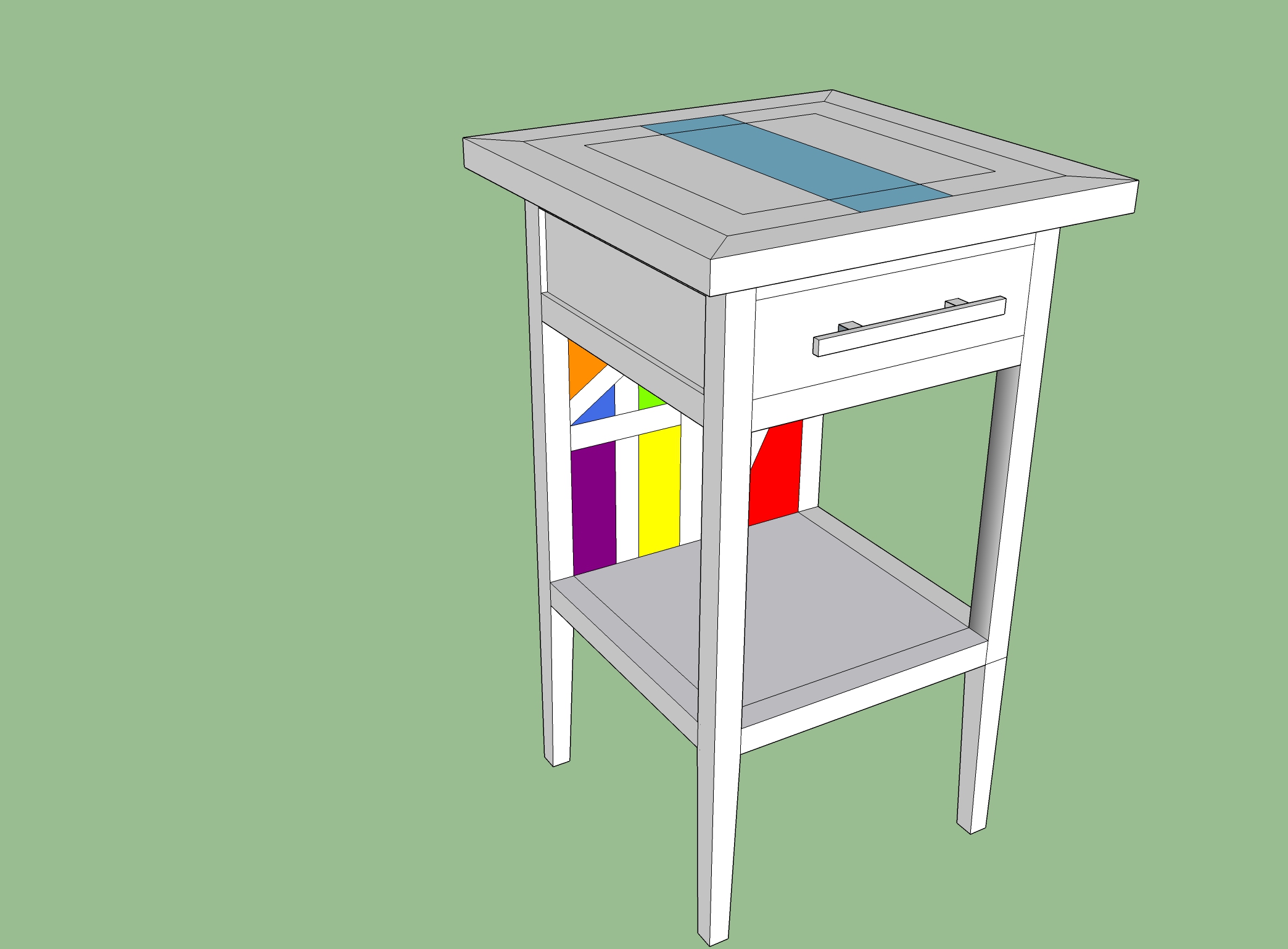
Right, suppose it might help to explain what I'm trying to achieve now! So I am designing a series of tables that are musically themed, my favourite band is New Order and they have a lot of artistic background from their record sleeves by Peter Saville. So the tops of the table will be "inspired by" 5 of the covers using resin. The one shown is quite simple, just a pale blue stripe and a black inlaid border (there's text too but I've ignored that for now)

The back of the underneath is inspired by a later series of covers which all followed the geometric pattern formula with colours in between. The alternative to doing this as a back panel would be to do it as the shelf instead, although that might get covered up too easily.

Again, the coloured blocks would be in resin, although probably translucent. Perhaps the top will be too (I've bought an LED panel to test out the possibility of backlighting the top) but that's possibly taking things a bit too far for now.

So here's what it might look like. I have reduced the height by 6", the proportions look far better now. it's 15.375" x 15.375" x 24". The odd dimensions are because 12" sleeves are 12.375" and I just added 1.5" all round as a border.

3.jpg
 
Resin doesn't expand and contract with changing humidity. Timber does. I think you are going to have issues with gaps opening up and cracks appearing.

And when you said New Order, you meant Pink Floyd, didn't you. The DSotM album cover with the light refracted through a prism would be an interesting motif to build into a piece of furniture.
 
MikeG.":zwijmyfh said:
Resin doesn't expand and contract with changing humidity. Timber does. I think you are going to have issues with gaps opening up and cracks appearing.

And when you said New Order, you meant Pink Floyd, didn't you. The DSotM album cover with the light refracted through a prism would be an interesting motif to build into a piece of furniture.

Hmmm I have never seen mention of cracking as an issue when I've watched videos of people filling gaps with epoxy, I'll go research that one. To get round that I guess the answer would be to make the resin blocks and then tenon them into place with no glue?

The multicoloured panel is inspired by the artwork for New Order's "Music Complete".
 
Filling cracks in wood with grain running in one direction is fine. However, you have cross-graining going on, with pieces crossing each other at right angles. Wood expands and contracts across its width, but not along its length, and as soon as you have pieces running at right angles to each other you have to make allowances for movement. That's the reason, for instance, that traditional panels are loose-fitted rather than glued into their grooves.
 
MikeG.":1mw8uzv8 said:
Filling cracks in wood with grain running in one direction is fine. However, you have cross-graining going on, with pieces crossing each other at right angles. Wood expands and contracts across its width, but not along its length, and as soon as you have pieces running at right angles to each other you have to make allowances for movement. That's the reason, for instance, that traditional panels are loose-fitted rather than glued into their grooves.

Gotcha, OK so loose fitting the resin panels might be the answer there then. I can just put them into grooves cut all round the panels so they'll be slightly inset rather than flush but that's no big deal.
 
When working with any wood you will need to consider movement but if you get ready for it with appropriate technique and avoid the temptation to rush in then it’s unlikely to result in a blue Monday and a lot of regret, but it is always possible for it to be ruined in a day. The crystal sections are very trendy at the moment, but maybe they’re here to stay, they can look a bit krafty if not implement well.

Aidan

Who couldn’t help himself
 
billw":2ymt5t1k said:
Right, second time lucky. This is pretty much finished, it'll be predominantly done in sycamore or maple. I think it looks a bit too tall maybe.

2.jpg

Well, if you don't make it, can I? :D
 
Back
Top