Oak Sidetable

UKworkshop.co.uk

Help Support UKworkshop.co.uk:

This site may earn a commission from merchant affiliate links, including eBay, Amazon, and others.

TheTiddles

Established Member
Joined
14 Oct 2007
Messages
3,027
Reaction score
843
Location
Wiltshire
A while ago I wondered if people on this forum were so lovely, that you could post a totally crappy project and they'd still say something nice, let's find out...
3668586931_04c8614ec9_o.jpg

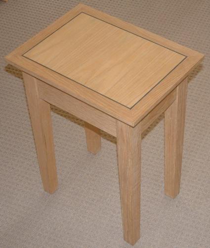
Here's a project for my in-laws, a simple oak sidetable, american white with a dyed boxwood inlay, the centre panel is venered MDF, the rest is solid. The finish is a neutral coloured wax applied with a total lack of diligence.
3669395822_6462889c70_o.jpg

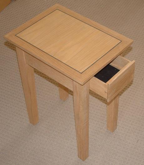
There's a concealed draw for remote controls, I like to throw in a little extra, even if it's the worst fitting draw in history

Aidan
 
Crappy project?

From here it looks like a nice simply designed piece well executed.
Does just what was required with no over the top flummery.
I like the thin dovetails in the drawer side-front joint.

Not every piece has to be a masterpiece.

Well done.

xy
 
big soft moose":nqu94jve said:
what a load of *******

its looks like something i might make ;)

That's a bit strong Pete!
 
hehe agreed.

To be honest Aidan I think it's really nice. Obviously you can't tell the draw doesn't fit well from the pic. But the inlay is nice and neat and the mitres look like they fit well. The veneered board seems to differ in colour from the rest of the wood. But I guess this is to be expected?
 
The problem is, Aidan, that you haven't given us any ammunition!

When I first saw the photos I thought they were the sketchup design! If the drawer doesn't fit you certainly can't tell from the photo. If the finish is poor.......sorry.......no way of telling. So, if you are really looking for criticism, here it is............


........take a decent photo, why don't you!

Mike
 
I think the banding round the veneered board looks great; it separates the colour of the real wood from the veneered board, making the differentiation less noticeable than it would have been without the banding.

Cheers

Karl
 
I was going to complain about the positioning of the drawer here (if you ask me, it should be on the wider face... :roll:) but, you did say this is for storing TV remotes (which makes sense) so, if the brief has been met and the client is satisfied, what else really matters? :)

Any mistakes along the way will have been learned from and won't happen next time, right? :wink:

I also agree with Karl's comments on the use of banding.
 
me too.

i got a "that would look nice in..." from the SWIMBO

any objections to copying it ? (edit: well try to :) )
 
To borrow a few words from Hamlet - "methinks he protesteth too much",

Unless, as Mike says, it's a bad photo then you look to be a far better craftsman than you give yourself credit for Aidan.

Or, you could be an ace at Photoshop :oops: :oops:

David
 
Thumbs up from me too!

Even if some faults can be seen close up, most people (i.e. people who aren't members of this forum) wouldn't notice. When I point out bad craftsmanship to my wife, she just thinks I'm weird:

DT
 
Nice job, clean design, I think we can all be a bit too judgemental of things we have made, I know I'm my hardest critic! As Tierney said if you point out something that might be glaring to you someone else wouldn't bat an eye at....
 
Well, they now want a sideboard/counter thingy to match. This one will be better planned, not made from scraps and might have a WIP thread if you're very lucky, then the true level of my skills deficit will be revealed!

Aidan
 

Latest posts

Back
Top