More wabi sabi as threatened

UKworkshop.co.uk

Help Support UKworkshop.co.uk:

This site may earn a commission from merchant affiliate links, including eBay, Amazon, and others.

Bodrighy

Established Member
Joined
6 Jan 2007
Messages
5,818
Reaction score
1
Location
Bromham, Wiltshire
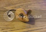
This was a piece of sycamore that was too soft to chuck in any way so was mounted initially with a screw chuck then, to hollow out, I used a glue chuck. The finial is made from some chopsticks that I got my hands on. The base is a large piece of oak burr that was too fragile and thin to do much with and the 'flowers' are the heads of natural edged goblets that parted the way with their stems (I don't throw anything out.) So in true wabi sabi style it is made from wood that is past it's best, thrown out eating utensils and broken goblets. The main form was too soft to completely sand back to a smooth finish in places so is sanded back to a rippled effect. The mouse is me pratting about with Fimo clay.
C&C welcome as always
sycamore chopsticks .jpg

sycamore chopsticks 3.jpg
 

Attachments

  • sycamore chopsticks .jpg
    sycamore chopsticks .jpg
    59.3 KB
  • sycamore chopsticks 3.jpg
    sycamore chopsticks 3.jpg
    61.7 KB
Great piece I like the idea of using the chop sticks as part of the finial and also the use of broken goblet parts.

But the mouse I think should have also been turned from wood :twisted: :lol: :lol: :lol: .

 
I think you are definitely on theme with these Pete, the pieces appear crisp, uncluttered and have a balance that I think comes from keeping things natural with the appearance of minimum of obtrusive input.

chewed.jpg
:lol:
 
I think the mouse, or something similar and light coloured, should be there but have to agree about the TV ariel, it makes it look a bit top heavy and draws the eye away.
 
Can't please all the people all the time LOL. Thank for the feedback. It's always good to here what people think, makes you look again at something

Pete
 
Just bear in mind these are opinions on what best pleases each individual who has commented. They are not criticisms.
In the end the only opinions that matter are those of the maker and the purchaser and they will always agree.
 
Grahamshed":3aesdpcu said:
Just bear in mind these are opinions on what best pleases each individual who has commented. They are not criticisms.
In the end the only opinions that matter are those of the maker and the purchaser and they will always agree.

Not a problem Graham. The only critique I have any problem with is the banal 'ooh isn't it lovely' that you get on some forums. Different opinions about shape, form etc all go to making me look again but that doesn't mean I will change the piece. If we all like the same things we would all be making identical pieces which would be very boring.

Pete
 
phil.p":29gh7fnd said:
I think it would have been nicer without the mouse and the tv aerial. Sorry.

I quite like the mouse, adds humour to the piece in my eyes.
TV arial, never sure myself, does seem a little overstated but having seen other pieces in the flesh they look OK, hence why I played around in image editing to see what it looked like without or with differing configuration.

I think it's the difference of looking at the pieces in the same light (symbolism) as Kanji 手 生 or in the form of western aesthetics.
 
A lot of my design ideas are influenced by oriental pottery and ceramics which vary a lot more than many think of. One of the areas that interests me uses old materials and often broken pots to recreate something. As in an area of design, I don''t like everything i see but often I find that I am thinking outside the traditional westernized ideal of 'perfection' that dominates a lot of peoples turning. The rules of three still apply in both camps but oriental work often has a simplicity that is then dominated with a single feature as in the chopsticks in this one. See what you think of this one made from a seriously split piece of mulberry, a scrap of ebony, a piece of oak I dug from the bottom of the firewood pile and a twig.

mulberry on old oak 3.jpg

mulberry on old oak.jpg

mulberry on old oak 2.jpg
 

Attachments

  • mulberry on old oak 3.jpg
    mulberry on old oak 3.jpg
    96.1 KB
  • mulberry on old oak.jpg
    mulberry on old oak.jpg
    73.5 KB
  • mulberry on old oak 2.jpg
    mulberry on old oak 2.jpg
    94.8 KB
To me it looks unbalanced, not a natural form you would choose to construct in daily use as it is inherently unstable.
But placed in an appropriate location that framed the vertical line then it would possibly look totally at home.
shelf.jpg
 

Attachments

  • shelf.jpg
    shelf.jpg
    40.3 KB
I really like the use of the goblet cups - and I think the mouse or something similar should be there. I think the TV aerial (sorry, chop sticks) parts are too long, though, and might look better if they were all slightly shorted but kept the graduated length look.
 
Back
Top