latest project

UKworkshop.co.uk

Help Support UKworkshop.co.uk:

This site may earn a commission from merchant affiliate links, including eBay, Amazon, and others.
A

Anonymous

Guest
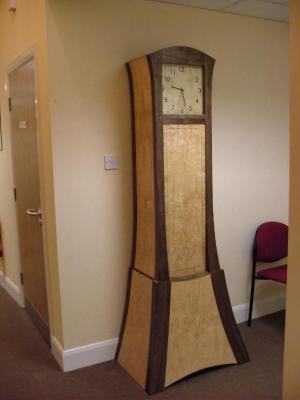
Just one picture my most recently completed project as AOL's webpage builder only seems to allow only one picture to be stored. I also can’t seem to get AOL to allow the image within this posting (despite following Adam's superb tutorial) so I’ve had to include an external link.

This is my first foray into vacuum laminating and veneering and is entirely my own design. I have learned a tremendous amount about the nature of flexible ply, veneers, glues and finishing. The most important of which is probably never to get epoxy anywhere near masur birch. Thanks to Chris (Waterhead37) for his tips on finishing which unfortunately couldn't be used due to the foregoing.

From the design point of view I have learned that a two dimensional design, particularly incorporating curves can look quite different when seen in reality in 3D.

Overall I am reasonably pleased with the final effect although with so many new tecniques and materials it can only be considered of prototype quality.

http://publish.hometown.aol.co.uk/odi16 ... and=AOL_UK

Thanks for looking.

Roy
 
Roy,

The link doesn't seem to be working :( . I had a **** of atime with the AOL setup and finally gave up just before turning my desktop into a portable if you know what I mean! :x

Cheers

Tim
 
Roy, I hope ypou don't mind but here it is.

medium.jpg


John
 
John

Mind? You must be joking! I'd just torn out my hair and was weeping quietly in a corner. Many Thanks!

Where did I go wrong?

Regards

Roy
 
Hi Roy, I downloaded your picture and posted it to my account at pbase http://www.pbase.com/. It is not free, currently 23 US dollars per annum for 200mb storage. I like it because it allows direct linking so the pictures work here and it automatically creates small, medium and large pictures as well as storing the original.

Glad to have helped.

John
 
Roy that is excellent. I've wanted to make a contemporary tall clock for years,but have never got around to it, not least because I don't know where I would put it. I have a picture of oneI have lusted after in (I think) an old FWW mag, but it's not on my database, so I would have to look through them all to find it. Yours is every bit as striking, terrific!
Cheers
Steve
 
A very nice design Roy, and even endorsed by SWIMO who was passing by as I perused your picture, she does like contemporary designs. I might have to have a go at something similar now when I get a chance. Thanks for the inspiration
 
Roy,

That looks great! You must be very pleased at the outcome.

I think that I would have preferred a somewhat less flared base for the design so that the vertical lines became curves a little less abruptly. All in all a very nice design from which to steal a few ideas!
 
Ooo, contemporary longcase. Excellent. I like the shape of the top especially, but maybe a tad less flare on the base as Chris says. Oh, I dunno though. I tell you what, crate it up, send it down here and I'll live with it for a bit and let you know. Shouldn't take more than 10 or 20 years to decide...
wink.gif


Cheers, Alf
 
Roy,
lovely looking clock, SWMBO was looking over my shoulder and now I'm getting those why cant you make anything as nice as that questions. :(

cd
 
Roy
The clock looks great-Nice job!
I know what you mean about a 2D drawing not quite turning out as you expect in 3D. My current project has been mocked up in pine and mdf to give me a chance to "correct" any design failures. Call me a cheat but I have some lovely timber I want to use and you can only cut the boards once! :shock:
cheers
Philly :D
 
Great looking clock, would also look good at my house :D .
One day I might be good enough to give something like that a go.

Neil
 
Back
Top