Interesting pieces of furniture - 17

UKworkshop.co.uk

Help Support UKworkshop.co.uk:

This site may earn a commission from merchant affiliate links, including eBay, Amazon, and others.
A

Anonymous

Guest
Been a while, but we have the 17th in the series of interesting pieces of furniture for your consideration which was sent to me by one of our members a while back.

The member said:

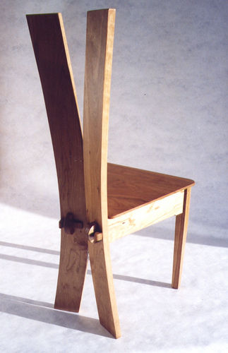
I thought this chair might be a good subject for your interesting pieces of furniture. Its called the 'Ogham Cherry Chair'

I love how the piece is minimalist yet elegant, although it doesn't look very comfortable (the maker assures us it is). Aparantly the lines marked on the back are from an ancient Irish script called 'Ogham', based on the names of trees.

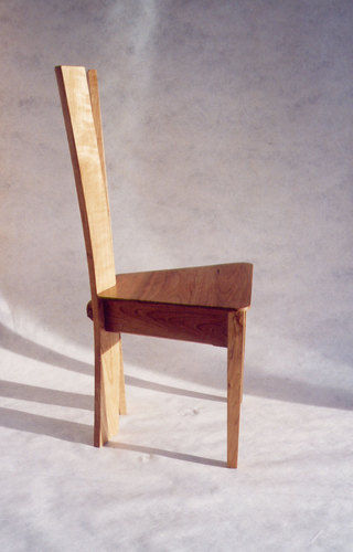
The maker describes how the back is actually two flat pieces cut on to a curve. When they are joined at an angle they create a nice curve for a chair back.

1815.jpg


1816.jpg


1817.jpg


All are welcome to comment on the pieces and please pm me with links to any photos that you would like featured here and a few lines explaining why


I will copy all items of furniture I post here into a single sticky thread in the Design Forum, thus creating a pictorial 'list' of interesting furniture here
 
OK I'll start the ball rolling here with an outburst that is sure to spark some disagreement.

Personally I think this looks like possibly the most uncomfortable (and therefore pointless) pieces of furniture I've ever seen. A completely flat unupholstered seat coupled with that back :?: fetch me an osteopath quick :roll: . Maybe I'm unduly biased, having reached an age where any chair that doesn't promise immediate relief for my aching back fills me with dread, but it doesn't do it for me I'm afraid.
Modern art posing as furniture. Not even very technically challenging to build by the looks of it.
I suppose it's possible that the photos simply don't do it justice, but I'm not convinced.
 
I think it's odd to have a knock down joint at the back but not the front, it also looks incredibly spartan and something that wouldn't be out of place in a prison - seems to be nicely made, but the design isn't for me.
 
Don't really like it. The flat seat and rails seem not to go with the rather graceful curves of the rear legs and back. Looks very uncomfortable.

Cheers :wink:

Paul
 
Looks bloody uncomfortable! - Plus there is something strange about the way it is photographed. In the second photo the back looks concave and in the third photo it looks convex - as viewed from the front
 
the timber that I have at my disposal is cut 'freestyle' with a chainsaw and I get marks on it like the ones on the back of the chair. Maybe I should leave them in in future rather than going to the effort of planing them out. I can then pretentiously tell everyone that it says 'kiti oyo, ezali malamu mingi te'*

Steve

(* lingala for 'this is a very bad chair') :wink:
 
Ohh Dear i seem to be at odds with people on here again, as I lOVE IT.

I am not going to judge the comport as I have not sat on it yet but I certainly would make some room for it in my house. The knock down joints on the back add interest to what would have been a very plain back.

Still each to his own eh :D
 
As per others looks damn uncomfortable to me.

Nice construction idea, needs a shaped seat methinks
 
I assume the marks on the back are the number of days before his or hers release.
 
waterhead37":28t8jmj5 said:
Looks bloody uncomfortable! - Plus there is something strange about the way it is photographed. In the second photo the back looks concave and in the third photo it looks convex - as viewed from the front
Blimey. It's not the way it's photographed, the two bits really are one convex and one concave. Was it from the museum of torture somewhere? Guantanamo Bay?
 
I find it generally remarkable how quick people are, and how many people there are, that merrily cast aspersions on another designer's work.

Yet as a judge of the recent design competition here, how many of the doubters, quibblers, nitpickers and gloomsters in these various 'design appreciation' threads entered that competition to show myself and the other judges how much better their design sensibilities and presentation skills are?

I think it's sometimes forgotten just how much bottle is required to put your designs out there for the rest of the world to criticise, with that criticism frequently lacking anything particularly constructive or helpful to say. Slainte.
 
I don't like to post in these threads seeing as how I administer them and do not want to show any bias, however, it would be nice to see some positive comments as well as the negative.

At least one member (and a few more) likes this chair as they suggested it. I would say that I too like this piece and would not comment on how comfortable it is to sit on since I have not sat on it!
 
Sgian,

Well I suppose thats true.

Us lot tend to be customer orientated (my customer is SWMBO) and so we look for boring things like comfort, fit for purpose, plus a bit of fresh concepts (in that order).

It seems to me that to be a hip "with it" designer ( and a hip judge too ) then you have to be a member of the cut up cow brigade. The more useless the article is to use, the more the emperor's advisors rave about it.

By the way, at the Notts bash I saw a beautifully designed chair made be Keith Smith and it was very comfortable too.
 
Back
Top