Pekka Huhta
Established Member
About five years ago I spent some time in Glasgow and fell in love with Charles Rennie Macintosh's designs. They have been an inspiration for a lot of Finnish designers at turn of the century, and I thought I wanted to have a go on art nouveau, with a dash of Finnish design at that time
I have posted two earlier threads about my "library",
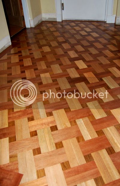
my-first-try-on-parquet-flooring-t49326.html
small-bookshelf-wip-t65448.html
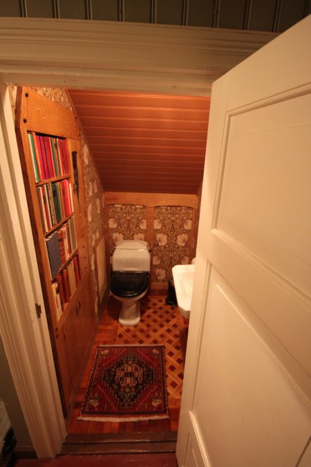
The "library" is just a 1,5 m2 toilet under the stairs. It was a very easy project: if I just did not feel like doing anything, I could just shut the door and let the room wait for inspiration. The panelling on the back wall hides a small door to the storage space under the stairs, aka "Librarian's apartment".
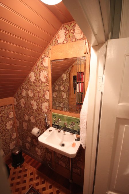
I had an old reclaimed mirror, which was far too big for the toilet. I ended up cutting it into pieces and soldering a smaller version together. The tiling behind Lefroy Brooks tap was designed by me: I made a mold for the tiling and a local vitreus tile factory manufactured the two tiles for me.
And naturally you need a bookshelf in the toi... library, how could you live without one.
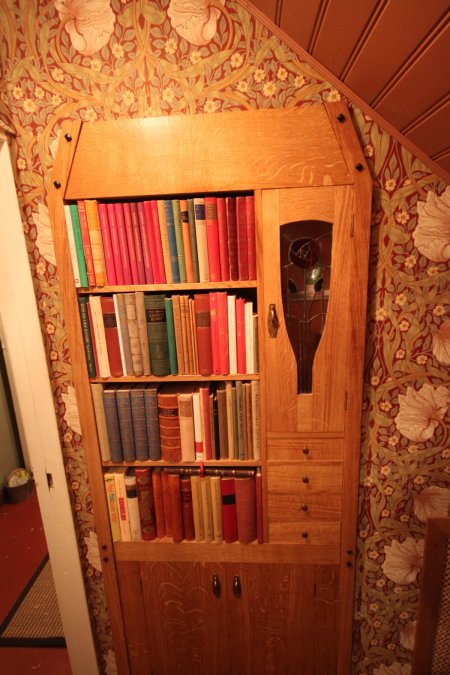
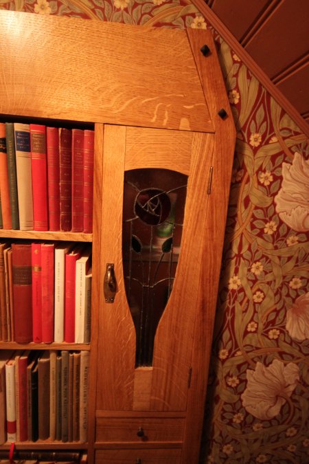
For the bookshelf I made a tiffany glass door. A slightly crude copy of "Mackintosh rose". That was my first try on glasswork.
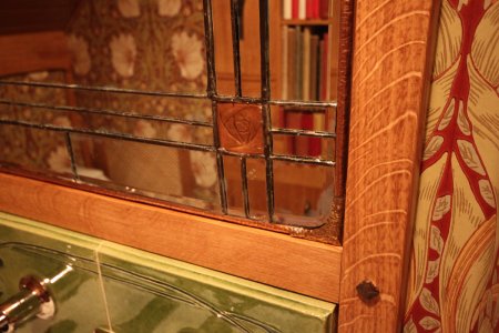
As said, the mirror was far too large, but I ended up cutting it to pieces and soldering a smaller version out of it. A sthe mirror had rounded corners, I had to chase a separate copper and brass frame around the mirror. At the same time I ended up making a copper variation of the same Mackintosh rose as on the glass door of the bookcase.
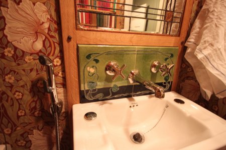
The design of the tile was a tough one. I wanted some art nouveau whiplash curves to it, but they just are such a pain in the buttocks to draw. I hope I got some Art Nouveau felling into it, at least many features of the design are either copied or at least "inspired by" original art nouveau tile designs.
We tend to have a bidet shower head fitted to toilet taps around here, as there seldom is space for a whole bidet. It took some amount of soldering to fit one of those to the Lefroy Brooks tap, but to my surprise everything turned out fine.
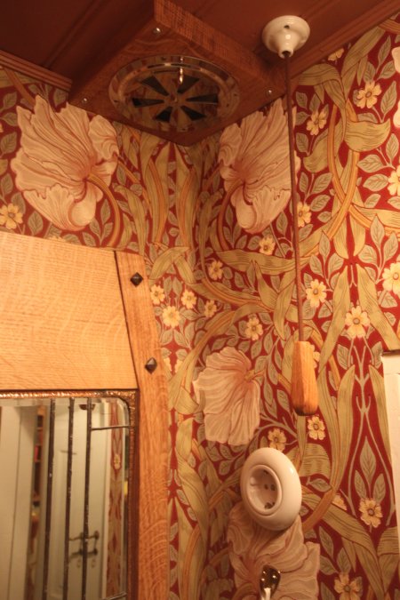
There is a "fart fan" on the ceiling, I just had to cover the ugly plastic thingy behind an oak plinth and a chromed valve.
It was a long project, I have drawn the first sketches for it in 2008. At the moment it feels like it really was worth it.
Pekka
I have posted two earlier threads about my "library",
my-first-try-on-parquet-flooring-t49326.html
small-bookshelf-wip-t65448.html
The "library" is just a 1,5 m2 toilet under the stairs. It was a very easy project: if I just did not feel like doing anything, I could just shut the door and let the room wait for inspiration. The panelling on the back wall hides a small door to the storage space under the stairs, aka "Librarian's apartment".

I had an old reclaimed mirror, which was far too big for the toilet. I ended up cutting it into pieces and soldering a smaller version together. The tiling behind Lefroy Brooks tap was designed by me: I made a mold for the tiling and a local vitreus tile factory manufactured the two tiles for me.

And naturally you need a bookshelf in the toi... library, how could you live without one.

For the bookshelf I made a tiffany glass door. A slightly crude copy of "Mackintosh rose". That was my first try on glasswork.

As said, the mirror was far too large, but I ended up cutting it to pieces and soldering a smaller version out of it. A sthe mirror had rounded corners, I had to chase a separate copper and brass frame around the mirror. At the same time I ended up making a copper variation of the same Mackintosh rose as on the glass door of the bookcase.

The design of the tile was a tough one. I wanted some art nouveau whiplash curves to it, but they just are such a pain in the buttocks to draw. I hope I got some Art Nouveau felling into it, at least many features of the design are either copied or at least "inspired by" original art nouveau tile designs.
We tend to have a bidet shower head fitted to toilet taps around here, as there seldom is space for a whole bidet. It took some amount of soldering to fit one of those to the Lefroy Brooks tap, but to my surprise everything turned out fine.

There is a "fart fan" on the ceiling, I just had to cover the ugly plastic thingy behind an oak plinth and a chromed valve.

It was a long project, I have drawn the first sketches for it in 2008. At the moment it feels like it really was worth it.
Pekka


