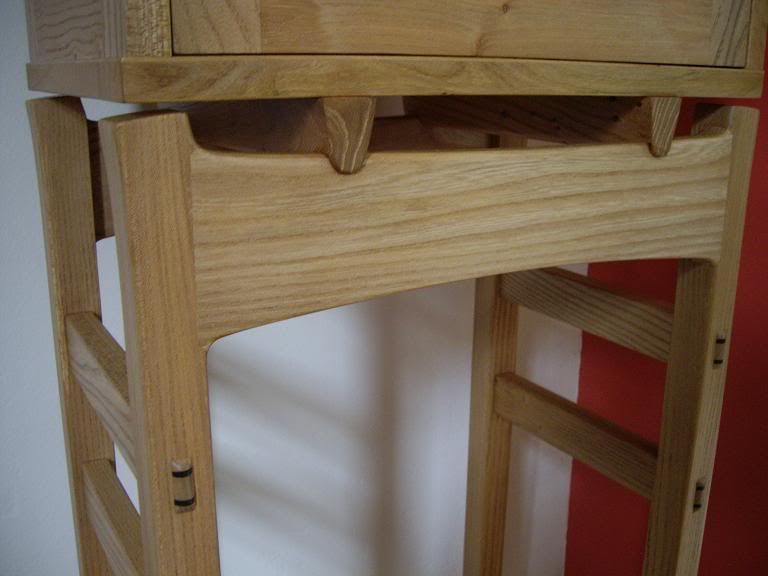
If I could offer one or two personal observations. This is a nicely executed piece but for me, there's simply too much 'going on' as you've too many colours and detailing in a relatively small piece. For timbers you've got mahogany, ash and lacewood on the outside, with the inlay and splines in ash...too much here. I'd have made the top out a decent piece of well figured mahogany veneer and just had ash splines...no inlaid banding. When it's opened up you appear to have a different timber again on the underside of the lid (maybe it's the lighting) and then what immediately hits the viewer is the purple lining, followed by the ash inlay and then the mahogany of the carcass work...again, far too much going on IMO.
In a small piece like this, I think two primary materials are all that's needed with maybe a different one on the inside for the lining. I'd also go for a muted colour for the bottom of the box and tray, I usually always use a green baize, which seems to go with most timbers. One final point...the handle or lack of. A routed 'lift' will always be just a 'routed lift'...I'd go the extra mile to make the handle detailing just a little bit special, this looks like it's been done as an afterthought.
In a small job like this, everything becomes 'concentrated' so simplicity and constrained detailing always (for me anyway) works better. Remember, less is more :wink: - Rob
 ccasion5:


