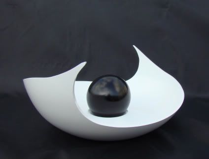
Carved Bowl "for critique"

UKworkshop.co.uk

Help Support UKworkshop.co.uk:

This site may earn a commission from merchant affiliate links, including eBay, Amazon, and others.

George Foweraker

Established Member
Joined
17 Jul 2009
Messages
702
Reaction score
0
Location
Burnham on Sea Somerset.
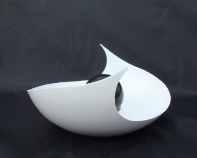
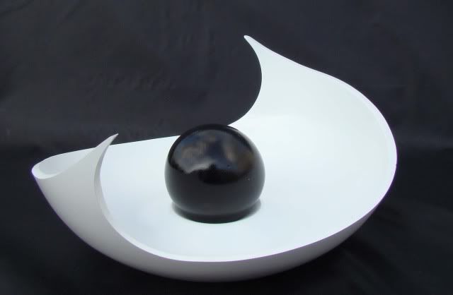
This piece is turned from Beech 220mm x 110mm carved and painted.
white1.jpg


DSC01422.jpg


DSC01421.jpg
 
I like this piece George but not as much as your last one, I think it's because the white painted bowl looks almost plastic. However, I think the shape and form of this piece is excellent and appeals to my sense of abstraction.

I would really appreciate it if you wouldn't mind posting your own comments on this piece (perhaps everyone should do this with future posts?!!). I have read a few posts where the creator gives there own opinion of the piece and it really added to the whole experience for me.

You clearly have so much more skill than me and it would be very encouraging to hear your own interpretation.

Thanks for sharing your art.
 
Hello Lee.
Unlike Mark Sanger i dont have any philosophy behind my work i just keep trying to create something different.
I wish i could give clever reasons for what i make i am sure it would make me sound more artistic.
I just go with the Flo and enjoy what i do.
Thank you for taking the time to comment i wish i could give you a smarter reply.

Regards George
 
That's fine George, I respect your approach as I'm a bit like that myself. I really don't like thinking too much about my pieces (like that actually means anything?).

My workshop is the one place I can go and afford not to think, I find it very peaceful and relaxing to turn in this way. Sure I make a lot of mistakes but i'm learning all the time.

Did you happen to take any pics of the bowl before you painted it?
 
Hi George,

I love the look of this piece - in it's own way mesmerising.
You're certainly a very skilled man, with a great eye for art and a knack for foing with your Flo. :D:D

I'm still only learnig woodturning just now, but hopefully one day I'll be able to turn something close to as brilliant as yours.

Gerry
 
Hello Gerry.
You are very kind and i am pleased you like my work.
There is no reason why you will not be able to produce good work just keep at it and it will come to you.
I think the important thing is not to be in a hurry take your time and make every piece as good as you can within your ability and every piece better than the last.

Regards George
 
Thanks for the advice George.

I don't know if I'm doing the right thing or not, but I've tried to apply some of the things I was taught as an engineer (all those years ago.....) when turning metal.
e.g. Gently does it, small cuts to start, get a feel for the material & to a certain extent let the material decide the finished piece.

Any advice is always welcomed (as the better I become, the more time I'll spend out the house - in turn keeping the Mrs happy!! :lol: :lol: )

Gerry
 
I love the shape, design etc but the white colouring is a bit off putting, too in your face for me personally. Again that is personal taste (if I have any) I think I admire your courage in cutting into what was probably a perfectly formed bowl in the first place. Something I keep thinking of doing but chickening out of.
Are these curved bowls becoming a signature?

Pete
 
Guess we'll have to wait for the next one Pete.

George, I'm actually excited to see your next piece, i've even been sciving off at work to check the forums there too!

Keep 'em coming G-Force!
 
Hi George,
I think that the shape of the piece works really well, and appreciate the workmanship (skill) that has gone in to producing it.
As others have already stated, not sure I'm convinced about the bright white colouring, which seems to take over as the main focus rather than the piece itself.

Malc :D
 
Hello Pete Lee and Malk.
I am pleased you like this piece .I did this piece white with the black ball to make it striking i wanted it to jump out at you from the black background.
It would have been easy to have done it black and played safe as everybody likes black but that is not what it is about for me.
Because it is white and in your face you have all commented about it so i think that is a good result.
When i put things up and nobody has anything to say about them then i know i have gone wrong if that makes any sense,
Keep on commenting good or bad they all count .
Thank you.

Regards George
 
Hello Paul.

Sorry i nearly missed you there mate.
I am pleased you like it.
I dont know if you like the colour my reasons are as above i also saw some really nice porcelain pottery that was white recently and i thought i would try it.

Regards george
 
Yes George i do like the colour,shape and finish.
Put in the right settings,with some subtle lighting i think it gives a very pleasing visual effect :D
Great looking piece :D
 
Hi George, this is a huge improvement on the first one you posted the other day. The white bowl is a great idea 8) it really suits the piece. The symetrical bowl also works much better than the random cut outs of the last one.
The only slight criticisms I have are that I think the 'wave' shape of the cut needs to be more pronounced, in that the dip down from the points almost looks like poor saw control rather than intentional(I'm guessing it is intentional as both sides do it). Also the sphere seems to be sitting in a huge hole, it sort of makes it look a bit weird,couldn't you just have made the inside of the bowl with a definite centre and left the sphere loose?

Look forward to seeing the mk. 3 :D

JT
 
hello Johnny.

The dip downs when you see this in real life look OK i think any more pronounced would have been too much.
The sphere is sat in a hollow and slightly smaller which makes a shadow under the sphere.
Yes i could have left the sphere loose but i wanted to give it lift off the bottom of the bowl.
Thank you for commenting as always very much appreciated.

Regards george
 
George Foweraker":3v63eo64 said:
The sphere is sat in a hollow and slightly smaller which makes a shadow under the sphere.
Yes i could have left the sphere loose but i wanted to give it lift off the bottom of the bowl.

What I meant by it looks a bit weird is the sphere looks distorted and heavy at the bottom due to sitting in the big hole, you are effectively hiding the tiny contact area and making it look heavier rather than giving it lift. A sphere sitting on a surface will always cast its own shadow giving it the lift and light appearence you want.

JT
 
Back
Top