Strong colour

UKworkshop.co.uk

Help Support UKworkshop.co.uk:

This site may earn a commission from merchant affiliate links, including eBay, Amazon, and others.

doctor Bob

Established Member
Joined
22 Jun 2011
Messages
5,171
Reaction score
1,881
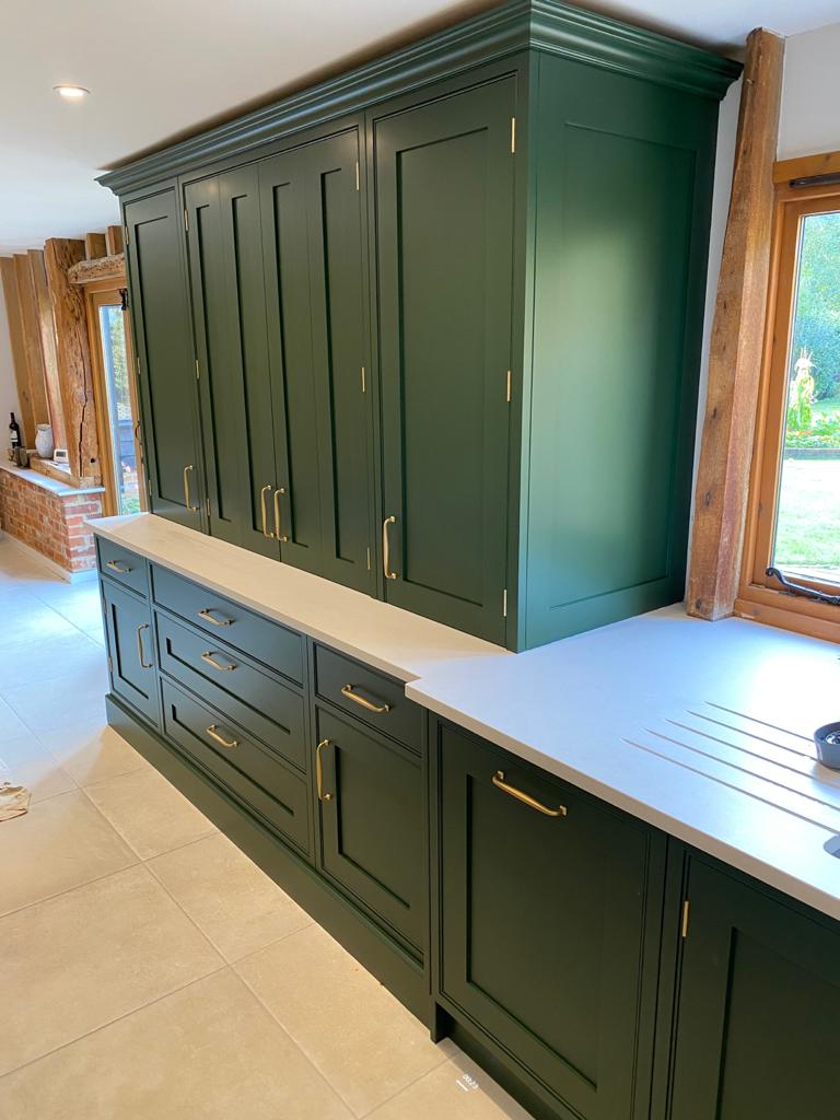
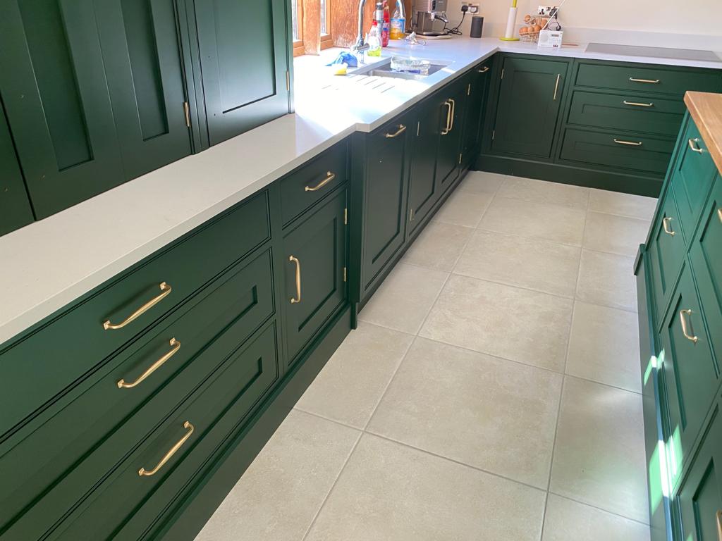
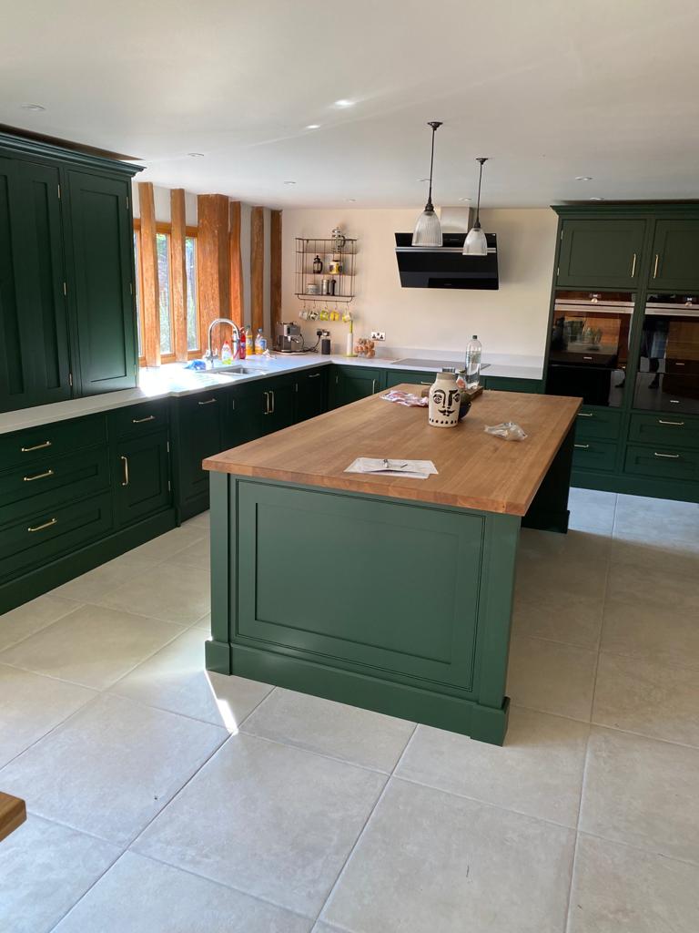
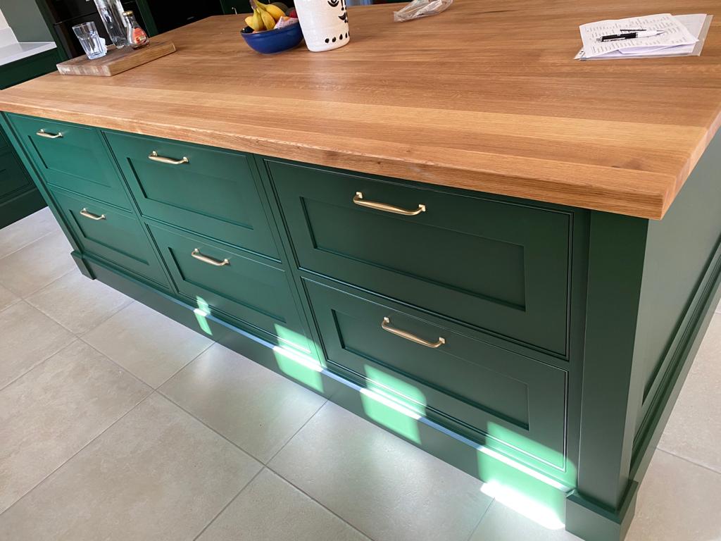
This client was brave with colour, wasn't sure to start with but love it now it's fitted.
IznhFRK.jpg


n5ks5Oh.jpg


S3WYLnI.jpg


cwst9mT.jpg
 
The green works perfectly with the wood - needs more wooden worktop to my mind. Interesting that this is unusual - it looks timelessly upmarket. Is it British Racing Green specifically, or just a close approximation? I would certainly have a Bently in that colour.

I am really suprised this isn't more of a thing.
 
Colour looks fabulous.
Units / cabinetry top notch. Really good.
Floor needs proper stone.
Lights over the Island are far too small and weedy.
 
I like the beading, the colour isn't my thing though, but I can see the finish looks really high quality, I like the cornice a lot that's a nice detail, also good to see what look like brass hinges.
 
I like it! I think the traditional look of the units themselves complements the traditional-esque colour massively which makes it work despite being a very brash choice. I don't reckon it would look right without the inset panel doors, bead mouldings, and proper cornices which most people don't bother doing anymore.
 
The colour works for me, I think it's the brass handles that make it look different. Is brass back in? Love how fashions change.
 
I like it! I think the traditional look of the units themselves complements the traditional-esque colour massively which makes it work despite being a very brash choice. I don't reckon it would look right without the inset panel doors, bead mouldings, and proper cornices which most people don't bother doing anymore.

I know it's the fashion but to me those plain panel doors (I won't call them shaker style ;)) are screaming out for some kind of Ogee mould or a scotia around the edge of the panels to go full on traditional because of the cockbead and cornice but that's just me, I like the traditional/Victorian look.
 
No bottom rail on the dresser cabinet face frames. I'm guessing there must be appliances, coffee machine or similar sitting on the worktop when the door is opened.
 
No bottom rail on the dresser cabinet face frames. I'm guessing there must be appliances, coffee machine or similar sitting on the worktop when the door is opened.
We never put a bottom in these, want to see worktop and as you say appliances slid in.
 
Excellent, I like. I'm currently making myself a dining table where I'm going to pair dark green with oak. I'm going to have to find the exact shade of green, though, otherwise it will upset my biorhythms.
 
I wouldn't have chosen that colour, but having seen it I would have been rewarded if I had been brave enough. it looks fantastic. Agree with AJB about the flooring and lighting.
 
I'm curious about the narrow gap above the upper units and the cornice. Is this just as it appears to be......open to the back of the cupboard........or is there a blanking-off piece in there, joining the top of the unit to the ceiling? If there isn't, that's spider paradise!
 
I always try and avoid going up to the ceiling with anything.its a pain as it's often miles out of level and cracks if you try. spiders gotten live somewhere!
would you have made them a bit shorter?
 
Me? If it's blanked off behind it'd be fine by me. Otherwise, drop it 3 or 4 inches so you can reach in with a feather duster.
 
I'm curious about the narrow gap above the upper units and the cornice. Is this just as it appears to be......open to the back of the cupboard........or is there a blanking-off piece in there, joining the top of the unit to the ceiling? If there isn't, that's spider paradise!

I'm not a fan of boxing in, can look very odd especially with lighting up there. This project is 50mm of the ceiling as it was only a 2300mm ceiling. Enough to get a feather duster in if required.
We have LED lighting behind the cornice.
I'll take cornice to the ceiling in a newish house but as stated before barns can be very wonky.
Other issues with taking kitchen furniture to the ceiling are airflow requirements for appliances especially built in fridges and american fridges.

Of course if asked to box in we will do.
 
Last edited:
Most impressed with that Doctor Bob, and I love the colour, well I would, I already have it in my bedroom and have found that gold/brass goes extremely well with it. I’ve picked out the edge of a picture frame in gold paint and it really goes very well indeed. Ian
 
Love yer werk Doc Bob!👌
Is the ironmongery Brass or brushed Nickel? Either way it looks nice.
Presumably the pan drawers are half the depth of the worktop?
We have a 2300 ceiling and a larder cupboard that finishes 150mm shy, that's a PITA to clean the top of, they'll love you in a couple of years😁
Personally I can't see anything wrong with the colour, style, type of lights or the execution. All good stuff.
 
Looks great. Sometimes it takes a bold decision. I am curious about the paint you used. I am assuming its sprayed with a kremlin or something it is a nice sheen level.

Very nice job.

Ollie
 
Back
Top