Let's discuss furniture design and fine work

UKworkshop.co.uk

Help Support UKworkshop.co.uk:

This site may earn a commission from merchant affiliate links, including eBay, Amazon, and others.
A useful intro to furniture design could be "1000 Chairs": Sit pretty: 1000 Chairs. Bibliotheca Universalis. TASCHEN Books
Not to be confused with 500 chairs which is a tedious trudge through "post modern" extravaganza
My favourite on vernacular is Irish Country Furniture

There's nothing wrong with country furniture, but to be critical of derek's stuff and many other sort of blatant statements here and tout painted simplistic utility furniture is sort of like saying you like ethnic foods, and you're a foodie....especially "fine italian food like the pizza burger!"
 
This is a great thread. So much can be learned from discussing design ideas.

Derek, your coffee table is just my cup tea! 🤔 I'm nearing the end of a pair of nightstands of a similar design. And recently finished a contemporary console table. Modern furniture can look so simple due to the lack of ornate mouldings etc. But looks are often deceiving. The simpler the design, the more accurate the execution needs to be... nowhere to hide crappy joinery.
 
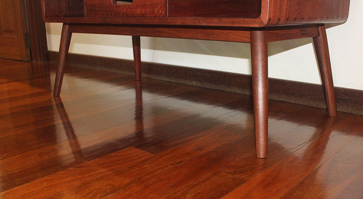
I believe Jacob was initially referring to my screw on legs. Thats Ok, they are screw on I don't have a lathe and a very small workshop. I struggled to find suitable Oak legs, Its a hobby. We needed a coffee table and it fits the bill. I hadn't seen any of a similar design till I saw these posts and though it was rather a coincidence but perhaps design ideas sit in the back of the mind from some long forgotten recollection. I took the feet off an old table, they are from a company in England long since closed down "Armstrongs" They do a really good job and are easy to fit a give a little extra interest as well as a bit of recycling.
 
Nice build @Mal-110

Coffee tables are an interesting design problem. I like a large lounge, if the coffee table is then in the middle of the lounge, you can't reach it to put your coffee on. If you have it close to the sofa/chair, it's then a pain to get in/out of the sofa and looks odd.
Inevitably coffee tables end up being used to play board games with friends / family - they can be an awkward height to sit down at.

Then there are lots of other choices - drawers, open shelves, glass top etc.

Right now we don't have a coffee table due to our kids and it getting in the way of their fun, but I look forward to having one again when they're older - hopefully built by me if I ever get my workshop finished :D
 
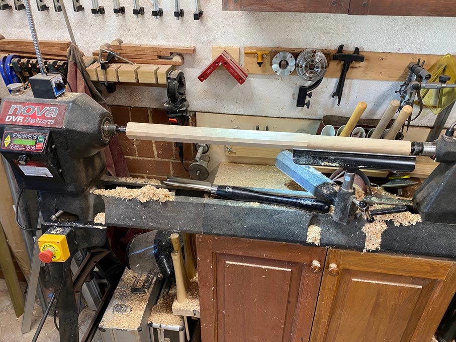
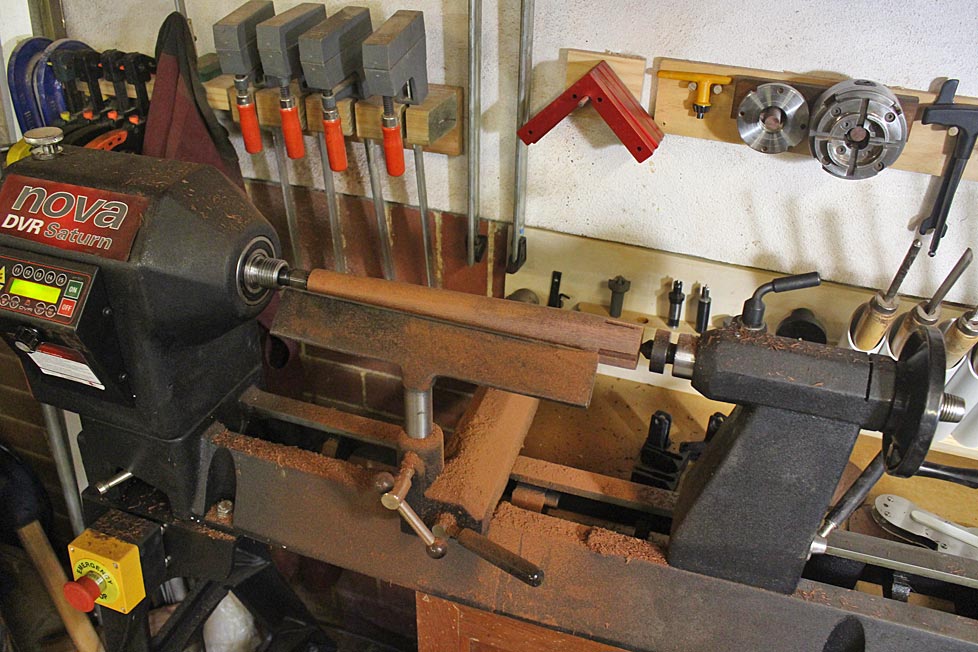
Jacob, what screw on legs? That is not something I have used.
AnotherCoffeeTable6_html_5a91e849.jpg


AnotherCoffeeTable9_html_2cdff40a.jpg


BuildingTheThreeCorneredStools_html_m24eb3146.jpg


BuildingTheThreeCorneredStools_html_m7e8174.jpg


Perhaps you would show us something you have built to contribute to the discussion?

Regards from Perth

Derek
I feel bound to say that the legs are mainly what puts me off Derek's coffee table. They remind me of some 60s/70s items. I'm sure they're not screw-on, and I am in total awe of his craftsmanship. It's merely a personal taste thing.
 
When I worked as an antique restorer, I never had a bit of Mackintosh to repair. However, I knew someone who did, and he said that the quality was pretty shocking, lots of nails etc. However, they look fantastic and are some of the most valued pieces of furniture ever made in these isles.
I am very much into sustainability, and one aspect of this in furniture making and design is how long your pieces will last. The longer the better, obvs.
Quality of materials and craftsmanship is important, of course. But if no-one loves it, it will end up in landfill. If it's loved, people will keep it even if it's a bit wobbly!
 
I know that you are not fond of Christopher Schwarz, but he is one of the few "personalities" that in my mind have a good eye for design (especially when it comes to chairs) and actually tries to teach about it.

yeah, nothing to do with design in that case. He does a pretty good job of following decent designs and referring to people who are area experts when appropriate.
 
I never had a bit of Mackintosh to repair. However, I knew someone who did, and he said that the quality was pretty shocking, lots of nails etc. However, they look fantastic and are some of the most valued pieces of furniture ever made in these isles.
He was a remarkable architect - but not a woodworker! The café chairs were style statements, and a beggar to sit on because obviously the backs are too upright. Perhaps to dissuade the Edinburgh ladies from lingering too long ...?

Here's a modern British star, still going strong after many years: David Colwell – DESIGN CONSCIOUS
 
On the drafting tables of the engineers he put notes saying: "Is your construction unnecessarily ugly?"

this is an excellent story - and what's implied in it is that something good is being given away for no reason. I've noticed engineers over the years on the US forums have sort of a dismissive attitude.

"that could be better engineered".

"the steel now is superior to anything old, and everything old is inconsistent".

"A2 steel is better than the steel used in English tools"

And so on.

And it usually comes with a disregard for the aesthetics of things as being unimportant. People look at things, and they feel things and conscious or not, most are influenced by the look and feel of things and will develop preferences. And perhaps even get pleasure out of something they're not consciously thinking about, or be rubbed the wrong way.

I have a degree in mathematics. I almost never think of quantifying or qualifying something that can be later quantified and being dismissive of what is demonstrably preferable just because it's pleasing to us, or some of us.

In my reporting documents, I often think of how they can be laid out simpler but not so simple that anything is lost, and as time has gone on, this has become the norm. Fortunately. When I started, a lot of the applied mathematics professions had an old guard of "we can make it sloppy, it's only the answers that matter".

Well, except engineers are undoubtedly not making things only for other engineers, and my clients are rarely not external users.

If incrementally including, considering, improving design elements isn't part of the process of making, something is lost. I didn't see that at first, and it was easy to pretend because the first few steps are a really steep incline that you could ignore it forever, but at some point everyone will make something really well and then see that it's still ugly. And other people will see it, too.

15 years ago, I was not at all wired to think like this - everything was utility. Now even something as simple as grinding curvature in the top of a bevel edge chisel both for function and to get rid of the staleness of flat planes only on manufactured tools is pleasing, to look at it, and see it go from "eh...not quite" to I can't see it better than that is a pleasure, and even if it's somewhat self taught and learned, the skill gets better faster and it's less "first level thought" and more feel.
 
We were taught to do it; "slotted screw edge joint". Nothing crude about it.
It was used a lot but unnoticed as the screws remain out of sight until the thing is broken up. I've got a sample piece saved from a staircase I demolished. I wouldn't have noticed it except the edge jointed boards had slipped out of line but stayed together, which would only be possible with a slotted screw edge joint
This is the board. Was a step.
IMG_5143.JPG


Then I saw it had slipped sideways which means only one possibility - slotted screw edge joint
IMG_5144.JPG


IMG_5145.JPG


IMG_5146.JPG


There was a trace of glue but must have been washed away by damp etc.

It's quite practical:
Start with some sturdy screws screwed in with just an inch or less out, these were 12 gauge
Drill holes to match screw heads, but offset.
Chop a slot the width of the shank
Put the two boards together with screws in the holes
With one board in the vice knock the other board to drive it and the screws along the slot
Then here comes the clever bit:
Knock it back again and separate.
Tighten the screws by half to one turn
Put the boards together again, with glue, and hammer them into line again
What is supposed to happen here is that the screw heads re-engage the cut the head makes in the side of the slot first time around, but pulls tighter, as you have just tightened the screws.
 
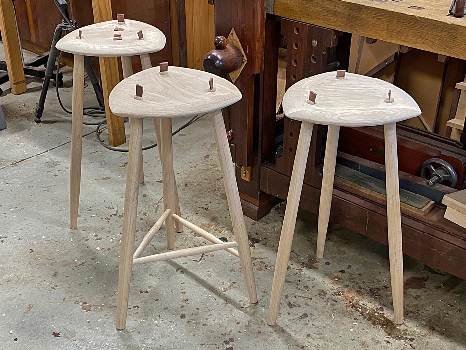
A finely worked coffee table in the style of screw-on leg flat-pack furniture, whereas your stools like very traditional/minimalist and made in a practical way.

Actually I'm just finishing off a pair of Reitveld Red & Blue chairs which I promised as Christmas presents last Christmas. The painting more of a problem than the making. Some clever details involved though, but zero display of craft skills. I'll post a photo later.
Work in progress.
The design is from this book. It gives a lot of detail and history, with "correct" measurements and variations.
Believe it or not they are quite comfortable. I guess you need to be not far off Reitveld size!
I've nailed the back and seat with copper roofing nails instead of the books recommended screws, which don't look nice. Apparently Reitveld nailed them originally.
The frame is quite sophisticated with 16mm dowels at each crossing. Because of the layout they lock where three cross over.
I've got to touch up the enamel colours where necessary and then follow up with the black water based last as it will be easy to clean from the enamel.
Then wax polish the black.

IMG_5141.JPG
IMG_5140.JPG
IMG_5139.JPG
IMG_5138.JPG
IMG_5136.JPG
IMG_5135.JPG


https://www.holland.com/global/tourism/holland-stories/mondrian-de-stijl/gerrit-rietveld.htm
 
Last edited:
Work in progress.
The design is from this book. It gives a lot of detail and history, with "correct" measurements and variations.
Believe it or not they are quite comfortable. I guess you need to be not far off Reitveld size!
I've nailed them with copper roofing nails instead of the books recommended screws, which don't look nice. Apparently Reitveld nailed them originally.

View attachment 149594View attachment 149595View attachment 149596View attachment 149597View attachment 149598View attachment 149599
It's very Mondrian.
 
I often look at furniture in magazines, by furniture-maker/ designers. and I am often dismayed, by how bad the designs are. Much of it is showing-off technical skills that aren't necessarily needed for the piece to be functional or pleasing . There is often a compulsion to throw everything into the mix.

Design can be taught, and you can usually tell those who have had training. And then there are those who seem naturally able to design things, that turn out to be, both pleasing to look at, and functional. Much as the photographer Henri Cartier-Bresson was able to take photographs, as a child, that far surpass the snap-shots that most of us will ever take

The designer doesn't have to be the skilled maker either. The architect , Ernest Gimson. employed others to make his furniture. no doubt aware of the limitations of his own abilities and the economics of the situation. But his designs , combined with the skills of someone like Peter van der Waals I find to be truly exceptional.

Laying aside some of those elements of good furniture design, such as: fitness of purpose, or following a clients brief - the one that strikes you first is the look. - even before you have walked across the room.
When we are making anything there is often a failure to ''see the wood for the trees' And being blind, to how something truly looks, can be a real problem. I find that, that first glance you give a piece, in the morning when you open up the workshop, is invaluable. If something doesn't look right - then change it - no amount of verbal justification will make it any better.
 
....The architect , Ernest Gimson. employed others to make his furniture. no doubt aware of the limitations of his own abilities ....
Of course he did. Simple division of labour.
But it helps if each knows as much as possible about the others' trades.
When skilled woodworkers are not aware of the limitations of their design abilities you hit the same problem. I name no names!
Which is why it's always good, if in doubt, to copy rather than to expect some sort of natural ability to emerge
 
Last edited:
The designer doesn't have to be the skilled maker either.

I think this is a modern online thing, to believe that someone is soup to nuts. We're trying to be that as much as we can be as hobbyists so as to get all of the experiences we can and not get cheated out of anything. But specializing and speed and need for what a pro is good at more than them doing something they're superb at and five things they're good at probably prevents it.

Warren Mickley in the states pointed me to a piece that he did the carving on. it's wonderful. He didn't make the whole piece of furniture as far as I know because the person paying him was probably the maker, and then he said "the finisher ___" to explain the effect that a finisher did, which I thought was interesting.

It would take me five years of hobby carving to duplicate what he did and I don't have the stomach to give up other things, but it did kind of give a hint of "if you want the piece to look like this and you do all of it, realize that you're trying to learn to do the fine skills of probably at least three different professionals".

which leads back to the simple things - the proportion, the understanding of some of the little details and most of all, just avoiding a big easy to avoid issue with the looks of something - which will happen on its own with little trimming and learning here or there. Except that kind of thing is almost completely missing from the forums.

----

I agree with what you say about the stuff in magazines - and some of what I've seen around here in historic houses and tourist attractions where makers are allowed to more or less loan their recent pieces until they sell. A lot of it looks different, which I think is the draw - to be able to have something unique. There are a few extremely wealthy families here who specialize in finding and preserving very fine furniture, and they aren't the buyers of that.
 
Work in progress.
The design is from this book. It gives a lot of detail and history, with "correct" measurements and variations.
Believe it or not they are quite comfortable. I guess you need to be not far off Reitveld size!
I've nailed the back and seat with copper roofing nails instead of the books recommended screws, which don't look nice. Apparently Reitveld nailed them originally.
The frame is quite sophisticated with 16mm dowels at each crossing. Because of the layout they lock where three cross over.
I've got to touch up the enamel colours where necessary and then follow up with the black water based last as it will be easy to clean from the enamel.
Then wax polish the black.

View attachment 149594View attachment 149595View attachment 149596View attachment 149597View attachment 149598View attachment 149599

Sort of a random question here, but is Newman an English surname?
 
Back
Top