Derek Cohen (Perth Oz)
Established Member
I've included this here as it was mostly made with handtools.
After the completion of the box for the bridle plough plane, I was left with the smaller section on the left.
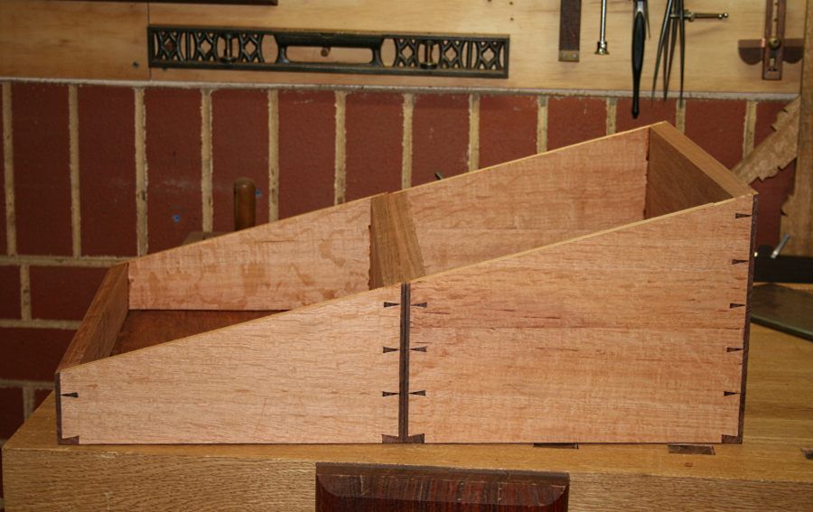
It occurred to me that this could form the basis for a lapdesk, that is, an interpretation of a campaign lapdesk. I love the simple, clean lines of campaign/military furniture, and the thought of building a piece with secret spaces promised to be fun.
There are many really interesting campaign pieces. For example ...
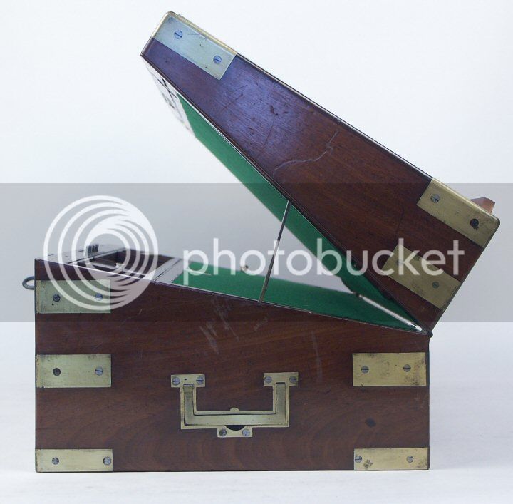
I would call my pieces "campaign-inspired". They are not exact copies of originals, as Chris Schwarz is currently building. Instead they are my interpretations of this furniture type, taken in a contemporary direction. An example are the military chests I built close to 2 years ago (see http://www.inthewoodshop.com/Furniture/ ... hests.html ).
Now I have a lot of pictures, so brace yourself. The thing is, I need some advice. I completed 99% of this build, and then had second thoughts whether I should ad the last element. I shall leave that for last.
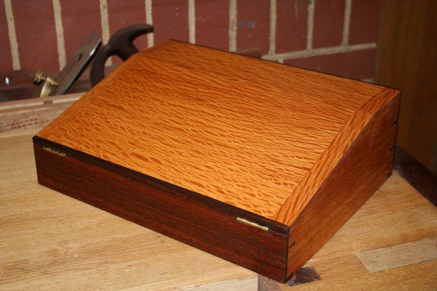
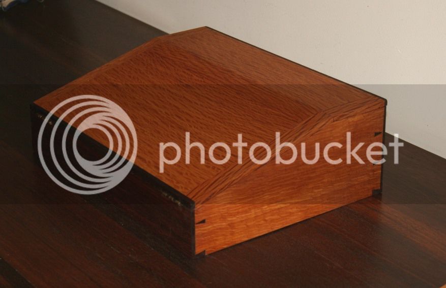
Let's start here. A pic of the outside, to be compared with the remnant above (15" long and 11" deep) ..
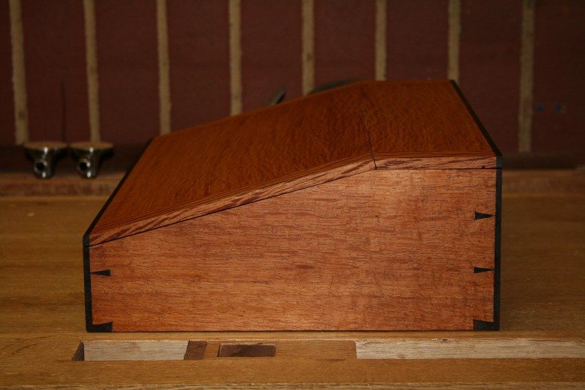
The body is clothed in West Australian She-oak, finished in Organoil Danish Oil and wax.
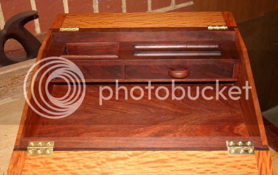
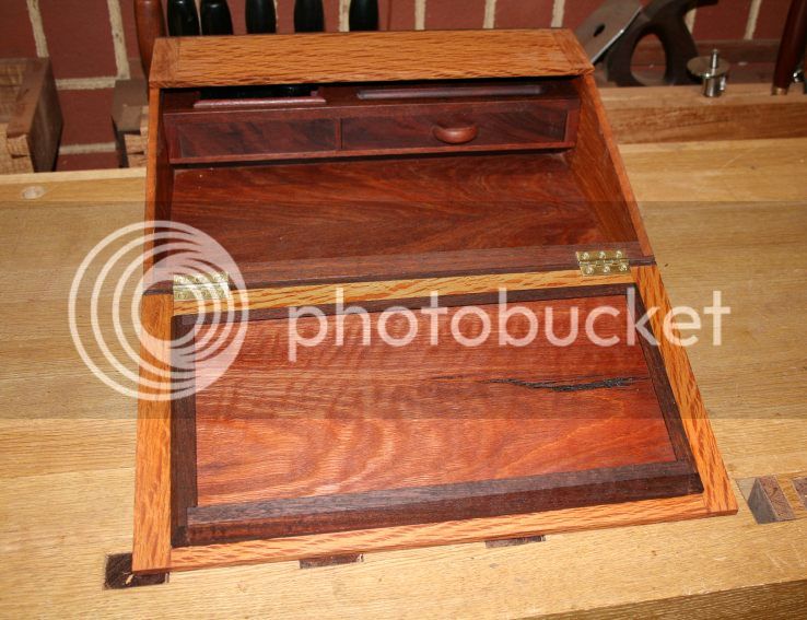
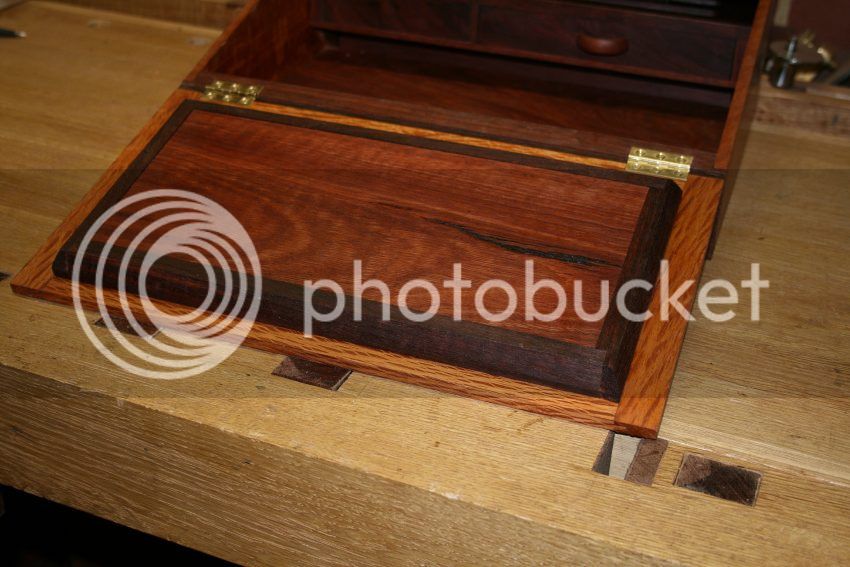
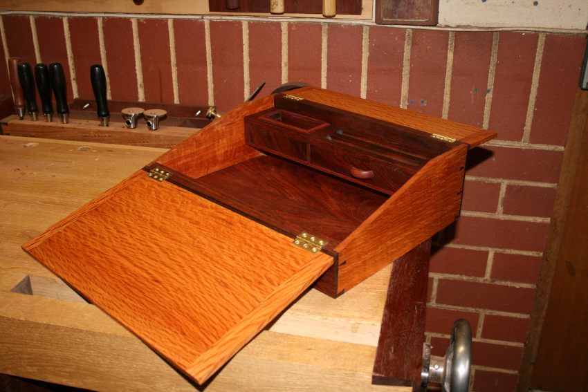
There are two lids, one for the pen-and-ink section and another for the main storage area (which is empty at present - more later) ..
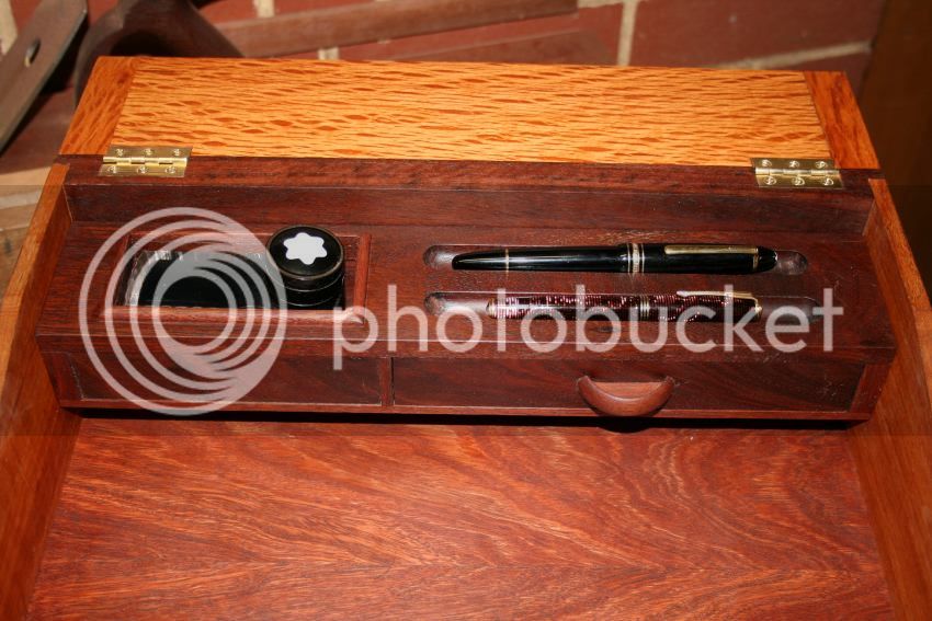
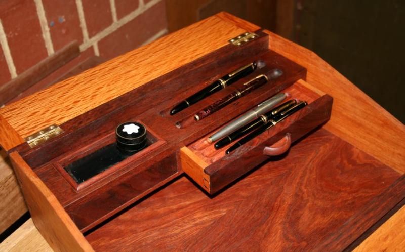
There is a drawer for some of my fountain pen collection (they all get rotated for daily use in the notes I take all day long), a tray for pens in use, and an ink well ...
There is space for a iPad ..
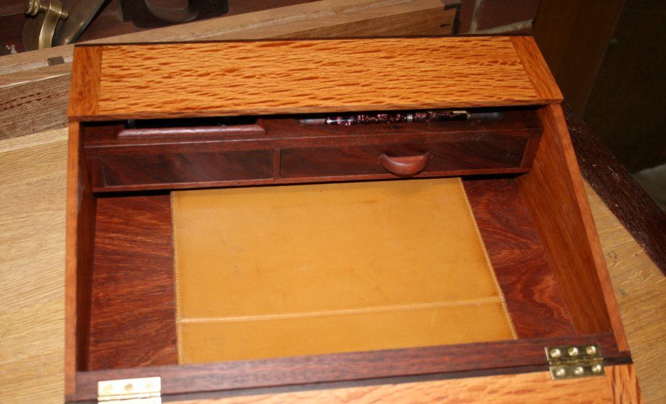
The fun in building this lapdesk was in creating the secret hiding places. There are 4 in all. The first is hidden very securely under the console. To get to this one must remove the console. It is secured on steel pins (in the corners). Lift the console straight up and a hidden panel is revealed ..
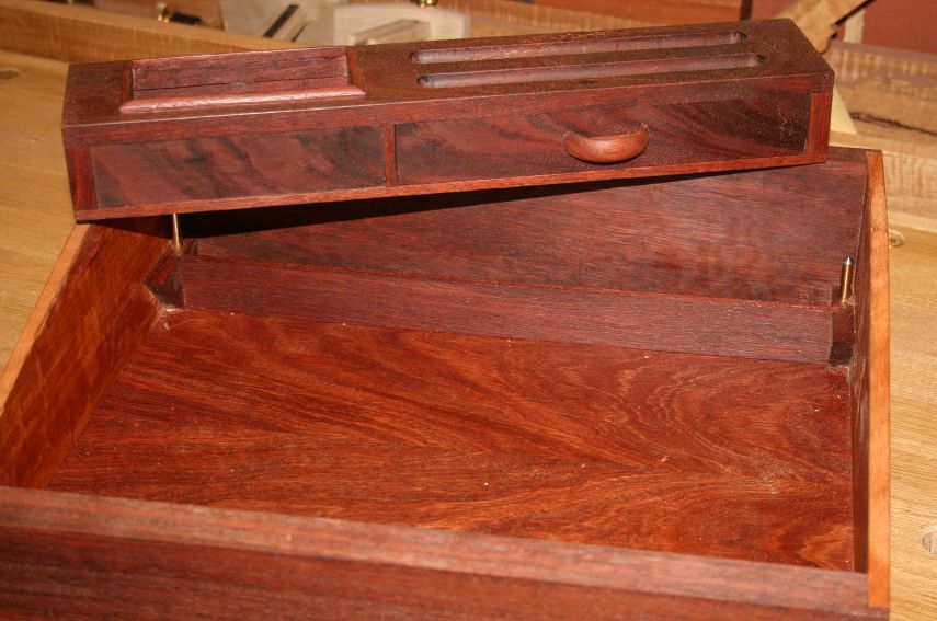
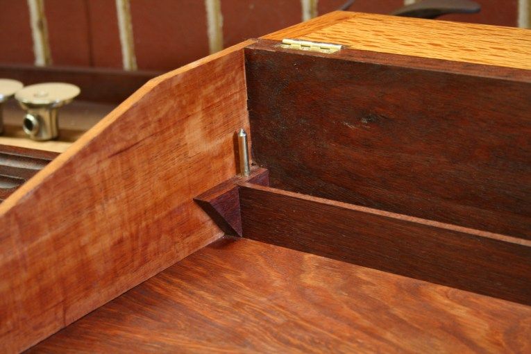
The inkwell in the console is walled internally ...
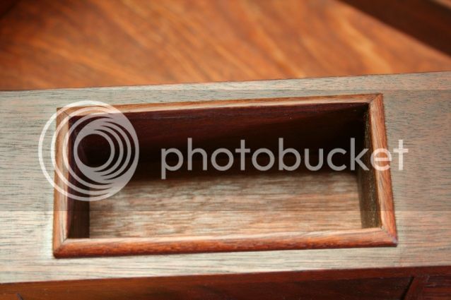
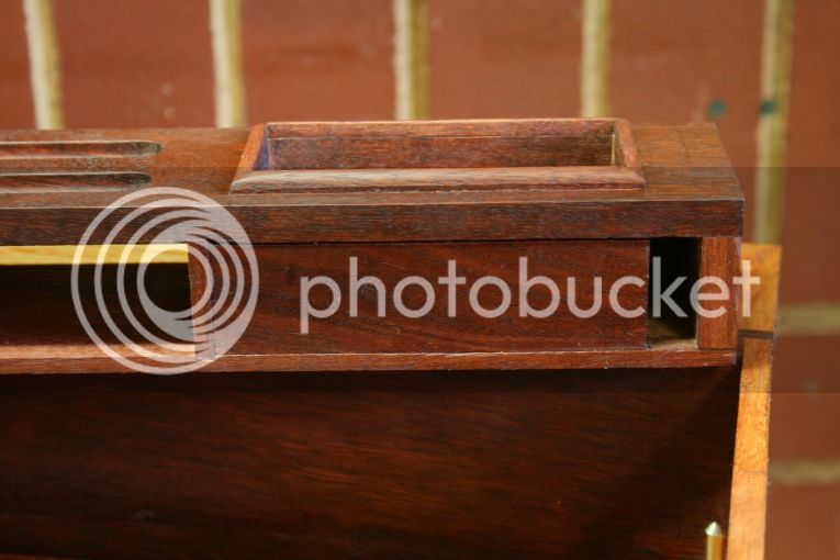
Now, at the rear of the console there is a slot wide enough to hide the key(s) to that important chastity belt or safety deposit box (whichever is more important) ..
The drawer ...
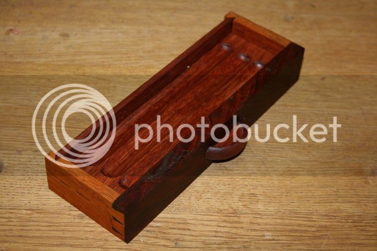
... has a false bottom. This is accessed from the rear of the drawer.
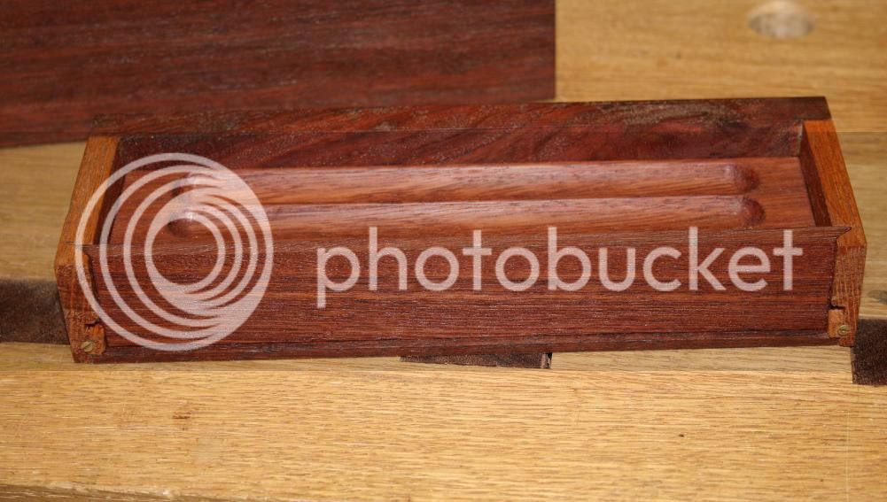
Slide away the rear panel ..
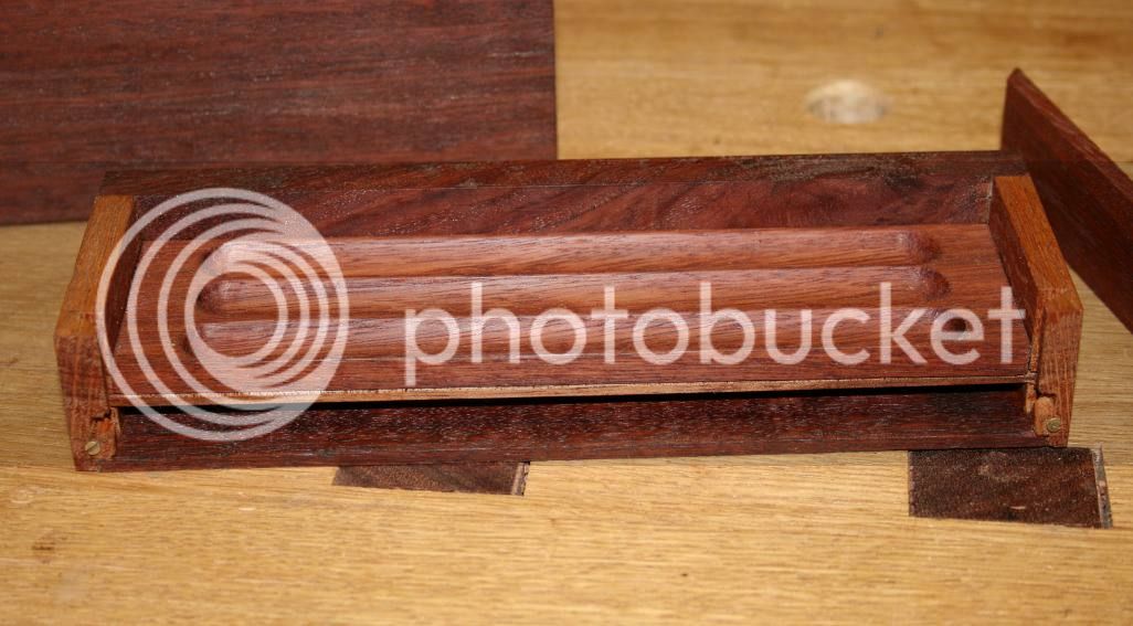
You can also remove the pen tray ...
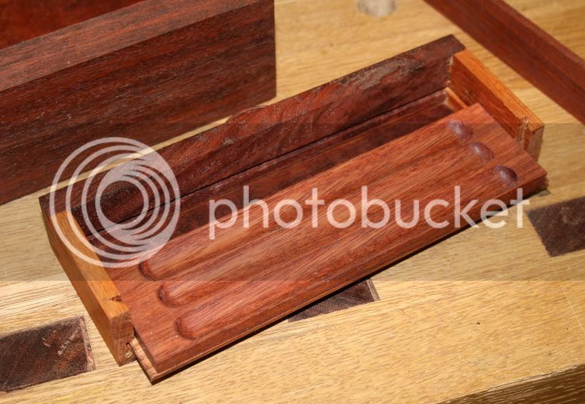
Now that is three of the hiding places. The fourth?
This introduces the dilemma I have. Sometimes less is more and adding one more item makes the piece too busy, too complex. I have presented the pictures in the order I assembled the lapdesk, and it may be a result of this that I am feeling this way. Do I include the last section or not? I would value your input here.
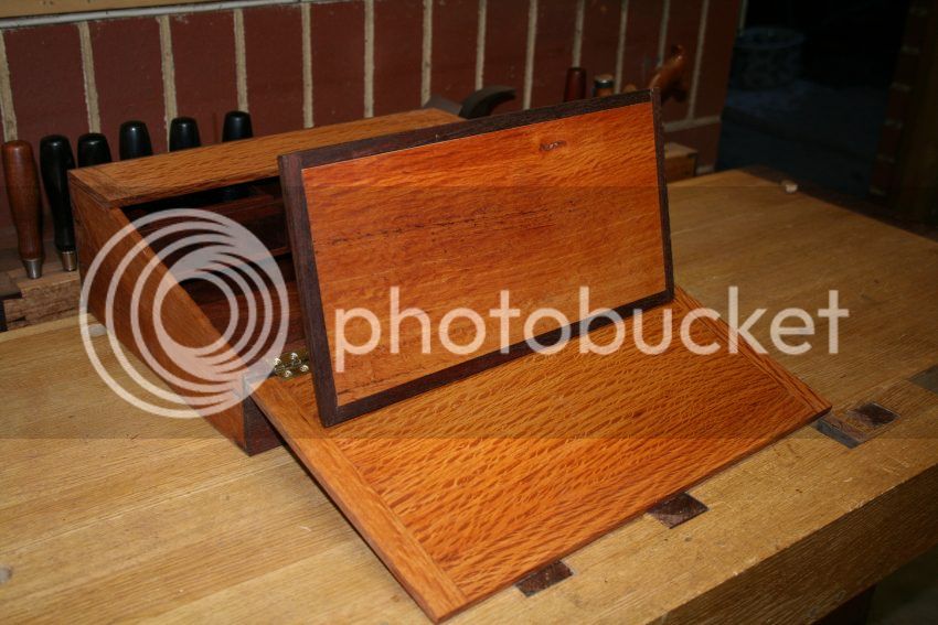
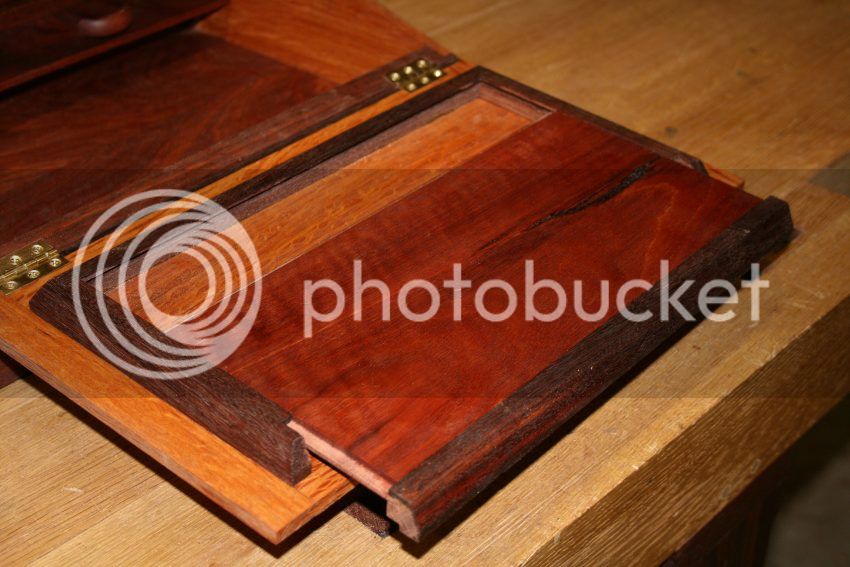
There is a central cover that was designed for three purposes. The first is that it offers an additional writing surface. This is Jarrah - I thought a wood to link in with the console. Some thought went into balancing the figure with the parts of the console.
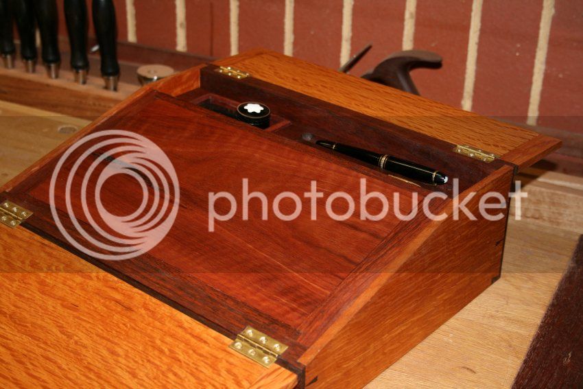
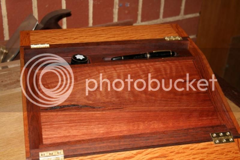
The second purpose of the cover is that it hides what lies within.
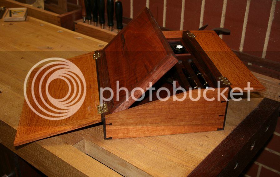
And hidden inside the cover is another drawer ..
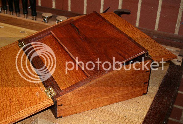
The hinges have not been installed as I am not sure whether to keep it or not .....
Regards from Perth
Derek
After the completion of the box for the bridle plough plane, I was left with the smaller section on the left.

It occurred to me that this could form the basis for a lapdesk, that is, an interpretation of a campaign lapdesk. I love the simple, clean lines of campaign/military furniture, and the thought of building a piece with secret spaces promised to be fun.
There are many really interesting campaign pieces. For example ...

I would call my pieces "campaign-inspired". They are not exact copies of originals, as Chris Schwarz is currently building. Instead they are my interpretations of this furniture type, taken in a contemporary direction. An example are the military chests I built close to 2 years ago (see http://www.inthewoodshop.com/Furniture/ ... hests.html ).
Now I have a lot of pictures, so brace yourself. The thing is, I need some advice. I completed 99% of this build, and then had second thoughts whether I should ad the last element. I shall leave that for last.
Let's start here. A pic of the outside, to be compared with the remnant above (15" long and 11" deep) ..

The body is clothed in West Australian She-oak, finished in Organoil Danish Oil and wax.

There are two lids, one for the pen-and-ink section and another for the main storage area (which is empty at present - more later) ..

There is a drawer for some of my fountain pen collection (they all get rotated for daily use in the notes I take all day long), a tray for pens in use, and an ink well ...


There is space for a iPad ..

The fun in building this lapdesk was in creating the secret hiding places. There are 4 in all. The first is hidden very securely under the console. To get to this one must remove the console. It is secured on steel pins (in the corners). Lift the console straight up and a hidden panel is revealed ..


The inkwell in the console is walled internally ...

Now, at the rear of the console there is a slot wide enough to hide the key(s) to that important chastity belt or safety deposit box (whichever is more important) ..

The drawer ...

... has a false bottom. This is accessed from the rear of the drawer.

Slide away the rear panel ..

You can also remove the pen tray ...

Now that is three of the hiding places. The fourth?
This introduces the dilemma I have. Sometimes less is more and adding one more item makes the piece too busy, too complex. I have presented the pictures in the order I assembled the lapdesk, and it may be a result of this that I am feeling this way. Do I include the last section or not? I would value your input here.
There is a central cover that was designed for three purposes. The first is that it offers an additional writing surface. This is Jarrah - I thought a wood to link in with the console. Some thought went into balancing the figure with the parts of the console.


The second purpose of the cover is that it hides what lies within.

And hidden inside the cover is another drawer ..

The hinges have not been installed as I am not sure whether to keep it or not .....

Regards from Perth
Derek


