Kitchen Table Design

UKworkshop.co.uk

Help Support UKworkshop.co.uk:

This site may earn a commission from merchant affiliate links, including eBay, Amazon, and others.

AndrewG

Established Member
Joined
23 Dec 2010
Messages
42
Reaction score
23
Location
Cambridge
Hi all,
I am planning to make a small kitchen table to fit in my Mum's new kitchen.
The spec was a table about 24" wide by 50" long and 30" ht with a pine top (she wants a scrubbed finish, I think I will want to oil it - but that discussion can come later!)

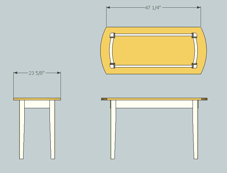
The feature is going to be curved ends with curved apron, along with rounded outer edges to the legs that are slightly tapered on the inside two faces. So having roughed out something in Sketchup that I am beginning to like, I thought I should offer it to the wider community for any comments you might have.......

I like the idea of a painted apron/legs (Cream) though not sure if that is right for this design, will need to see if my Sketchup skills can be extended to adding materials/colour to get an idea. The line on the top could be an inlay, if I have the nerve to rout into the finished top.

Kitchen Table.JPG


Kitchen Table - view.JPG


I've not posted very often so far so bear with me if I can't get the images inserted right

Andrew
 

Attachments

  • Kitchen Table.JPG
    Kitchen Table.JPG
    27.7 KB
  • Kitchen Table - view.JPG
    Kitchen Table - view.JPG
    24 KB
I've only just seen your design and must say it looks good, only one thing though, you say you are thinking of painting the curtain and inlaying the top, I think that would be a slight mis-match, why not use the same timber for the curtain and inlay the same wood as the top inlay near the bottom of the curtain, I think that would tie it all together.

Andy
 
My only thought was that the overhang looks a bit small. You could project the top 3" or so, beyond the aprons along the sides, and more at the ends. Otherwise they look a bit stubby.
 
That looks rather elegant.

Given that kitchen tables tend to be functional pieces of furniture subject to quite hard use, the inlay might not be such a good idea. A plain, simple top with a bomb-proof finish such as several coats of exterior-grade varnish might be better, so it can be swabbed down if needs be.
 
phil.p":1tmrs2ht said:
If it's to be used rather than looked at, leave an overhang on the end that you can get a large pan or bowl under.

And it provides a place to clamp (hand) mincers and pasta makers!

BugBear
 
bugbear":72vyblpk said:
phil.p":72vyblpk said:
If it's to be used rather than looked at, leave an overhang on the end that you can get a large pan or bowl under.

And it provides a place to clamp (hand) mincers and pasta makers!

BugBear
Absolutely!
You can have a big overhang at the end - say 10" or more. This is handy for seating at the end - the legs don't get in the way and it's easier to move chairs about. But the drawers would have to be in the sides.
There is no need to have the legs exactly at the corners, as you will see if you look at a few tables - the essential first step if you are planning to make one! It's worth looking at IKEA, many designs are excellent even though they are cheaply made.
 
Thanks guys for the suggestions, comments and encouragement!

Andy - I see your point about not too many different woods/colours. The painted frame is being guided by the fact that the selection of pine at the builders merchant was disappointing and I have some 2 1/2" poplar that is ideal for some quarter sawn legs.

Jacob - yes it does look a bit stubby. This came from not wanting too much overhange where the draw came out...But then as you say the draw could be in the side and legs shouldn't be at the corners

Phil and Bugbear - Ok more overhang, but it is only a small table and after finishing the top with care I probably don't want to watch as she clamps the mincer down for the first time!

CC - Yes functional means lose the inlay (sigh) and I fear now I have the pine for the top, it would be bound to go through a knot

So I have removed the inlay, increased the overhang, removed the draw, added some colour....

Tablev2d.JPG


I think you have nudged me in the right direction - A simpler design but the pine top will have more appeal than the flat colour suggests.

Tablev2c.JPG


Well the wood has been acclimatising behind the sofa this week - poplar looks good, pine rather bowed. I hope to get started this weekend and promise to post the final results if/when I get there.

Many thanks
Andrew
 

Attachments

  • Tablev2c.JPG
    Tablev2c.JPG
    25.8 KB
  • Tablev2d.JPG
    Tablev2d.JPG
    22.1 KB
Thought you might be interested to see how the project turned out.
Table1.jpg

Design wise three things changed during the build:

- The top is Iroko not Pine
My origonal pine top would not stay flat and looked weedy at less than 3/4" thick. In need of some 1.5" stock quickly, a local carpenter offered me two Iroko boards he had left over. Lesson learnt about builders yard pine. Iroko dust can be nasty so I did all the sanding outstide with dust mask on and had no problems.

- The long sides of the top now have a slight curve
The slight curve follows the grain, and removed the edge you might catch yourself on sliding into your chair

- The legs are rounded on all sides towards the bottom, ending as a 1.5"dia circle
After tapering they just looked a bit chunky still. Now they are a bit on the ballerina side but I think it works

The large overhang and delicate legs give it, I think, a more old fashioned feel. Prehaps less contemporary than the fitted kitchen but more in keeping with the antique dinning room table and chairs next door.

A down side of the greater overhang and narrower frame, is that it is harder to tuck a chair between the legs at the ends. However the table is really for four so not a big issue.

Now to get it delivered and see if the 'client' approves

Table2.jpg

Table3.jpg
 

Attachments

  • Table1.jpg
    Table1.jpg
    157 KB
  • Table2.jpg
    Table2.jpg
    110.7 KB
  • Table3.jpg
    Table3.jpg
    66.5 KB
Looks superb! The subtle curve to the sides of the top are just right - enough to add elegance without being exaggerated.
 
Thanks CC - I am never sure whether changing the design during the build is a good or bad thing. But in this case I am glad I did.
 
Andrew,

Having made a comment on your original design I must now say how nice I think the end product turned out.

It is clean, neat and functional, the top is not too 'busy' and the curves fit perfectly.

Now after all that practice you need to do another with inlaid top, inlaid apron, drawer, etc, etc, etc,

Andy
 
Thanks Andy - I am pleased I simplified the design this time. I would like to try some inlay on a project but can see it takes confidence to take a router to a nearly finished table top.
 
AndrewG":p45l0de5 said:
Thanks Andy - I am pleased I simplified the design this time. I would like to try some inlay on a project but can see it takes confidence to take a router to a nearly finished table top.

Andrew, just practice on a piece of scrap first to make sure your router is set properly and to get the feel of holding it tight to the table as you move round, go slowly and make sure it is in contact at all times, oh and did I say practice first? well if I didn't, make sure you practice first.

Andy
 
Back
Top