Kitchen design finally started

UKworkshop.co.uk

Help Support UKworkshop.co.uk:

This site may earn a commission from merchant affiliate links, including eBay, Amazon, and others.

martlewis

Established Member
Joined
11 Nov 2006
Messages
425
Reaction score
6
Location
Chesterfield, UK
Hi all,

Finally found time, and money, to begin my kitchen project. I've done some rough sketchup models of how SWMBO wants it to look, she wants traditional wood farmhouse style :-k without modern appliances on show.

My SU skills are pretty basic but it's the actual design i want feedback and ideas on before I start buying an building. The range cooker pictured is a given as it's already bought, the fridge lives in a larder cupboard just outsde the kitchen, the waser and dryer are to go in the 2 cupboards to the right of the butlers sink with they type of doors that swing open then slide down the side of the unit, if you know what i mean. Also considering a cupboard on the worktop corner furthest from cooker to hide microwave.

The tall cupboard is 2 slide out larder units.

Feedback definately welcome...

Kitchen1.jpg


Kitchen2.jpg


Kitchen3.jpg


Kitchen4.jpg
 
Just a couple of thoughts.

1.Oven/hobs that close to a doorway are dangerous, someone coming into the room could catch an overhanging pan handle.

2. Buttlers sinks need a good support under then, this will reduce the height of your slide out recycling bin, you will also have to allow for the trap projecting around 200mm below the sink.

3. There is quite a lot of wasted space between the two tall larder units, I would go for one large larder with a pair of doors, racks on the doors and just plain shelves inside. Or depending on the available width use two 400 larders or a 300/400 combination if she wants a slideout larder.

4. As its quite a small room the bridging units over the window & door make the room seem even smaller so I would do away with them particularly if you are using dark wood.

5. Butt joint the worktop

Wall cupboards look short or the gap between W/T and cups is large, either that or you have low ceilings :wink:

6. The worktop space is quite limited so keep the M/W as a movable item rather that restricting it to one place. Alternatively go for an integrated one in the lower half of a wall cab (why do integrated Microwaves cost so much more that free standing??)

Jason
 
Some good points i'll work on. The heights of the wall cupboards are just rough sketches, they'll be full shop bought cabinets so taller than they look. Your're right about the bridging units over the window and door, removing them definately.

As for the cooker, that's where the old one was when we moved in and where the gas feed is. Not sure where else it could go but I did want some worktop on both sides of it. Trying to keep cost down by not paying to have the gas supply moved but it may have to happen.
 
There seems to be alot of wasted space in the corner where the cooker and the dryer will meet. Approx size of a 600mm unit
 
Re-measured the height of the room, it's about 1 foot taller than I drew it so that sorts the height issue with the wall units. Am now willing to pay for the gas moving and thing maybe the cooker on the opposite wall perhaps in the middle of the worktop?
 
Do you really need all those wall cupboards? If you don't then don't put them in - they take up a lot of space and make the kitchen feel much smaller.

I always try to persuade customers to reduce the number of wall cabs because they are often unnecessary (but everyone has them :roll: ) and it can make the room feel much more open and airy without them.

Cheers

Tim
 
Cookor on the other wall would work better then you can get a magic corner unit to make the most of the space in the corner.

Depending on what kitchen range you go for you can get 900mm high units rather than the standard 720mm which would give a bit of extra storage, either scribe a flat cornice/pelmet to the ceiling like this or just leave a small 12mm or so gap like this

Jason
 
Already have the range cooker as pictures, it's 900mm high which sets the height for all my units. If I put the cooker in the middle of the worktop on the other wall then I think I'll do away with all the wall units on that wall.
 
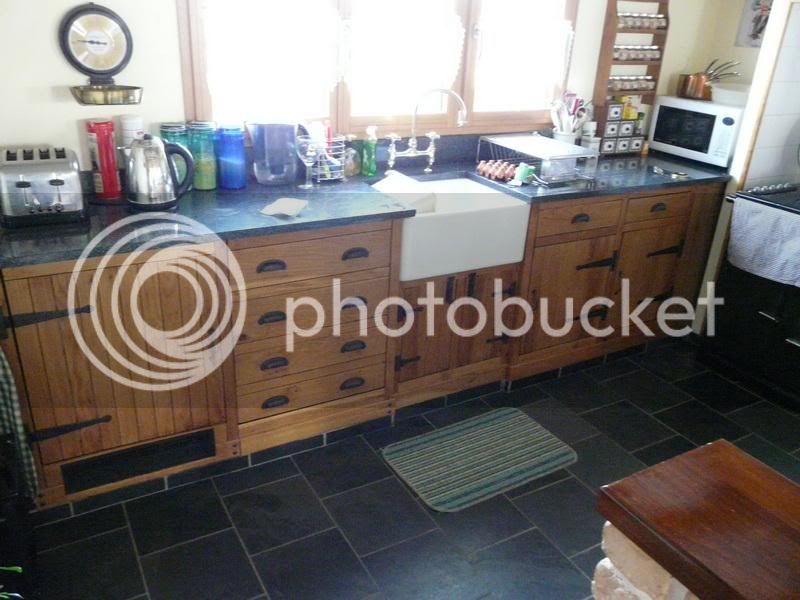
Speaking from experience, as i have built my own kitchen 4 years ago, I see the following.

P1000354.jpg


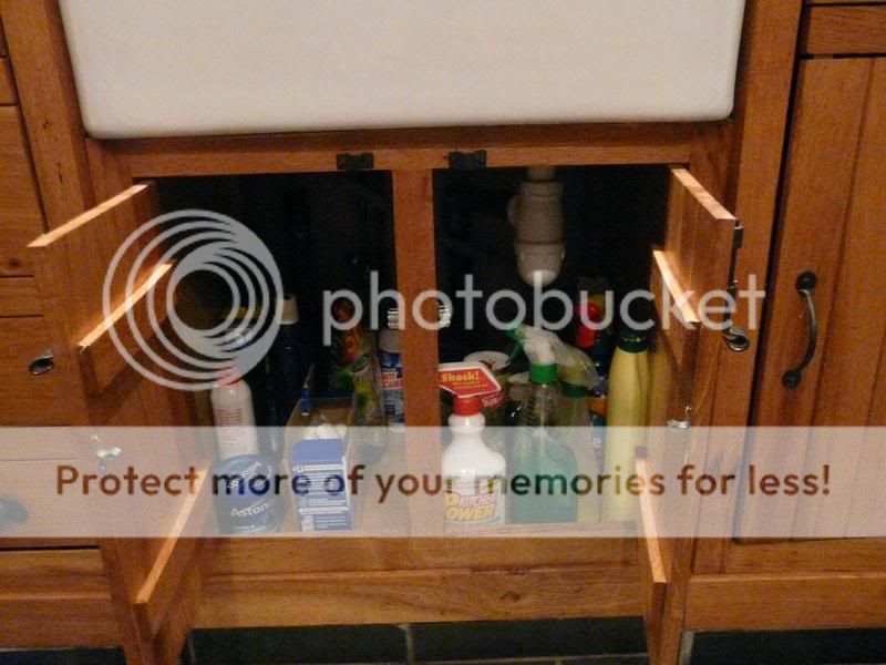
I don't think there will be enough space under the sink. |Rembember you have a waste.

P1000378.jpg


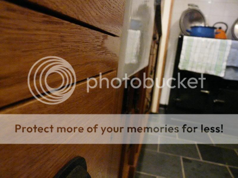
Also It's good to have the cupboard under the sink set back about 1 inch so that drips from the sink go on the floor and not on the cupboard.
P1000377.jpg


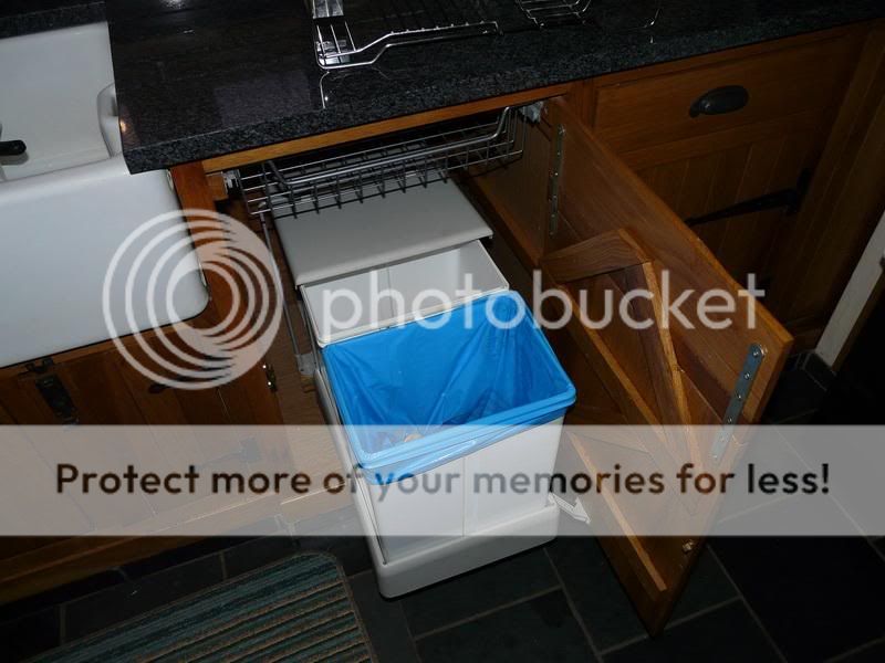
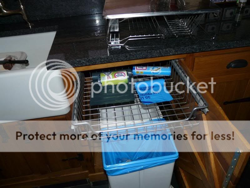
I put my bin on the right hand side of the sink. It automaticaly comes out when the door is opened and there are 2 bins 1 for recycling.
Plus I added a pull out draw for the bin bags.

P1000375.jpg

P1000376.jpg


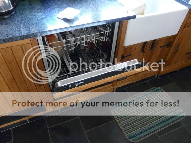
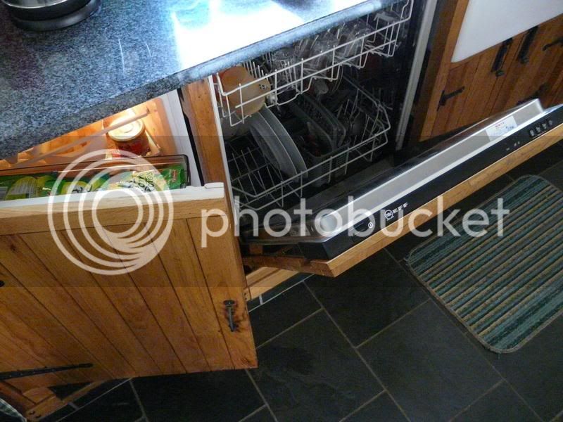
I also have an intergrated dishwasher


P1000355.jpg


and integrated fridge. You can see from an earlier photo I made a grill for below the fridge to allow for ventilation.
P1000356.jpg


Last I would put the drainer on the right of the sink. Just a preference..
 
Some excellent ideas and the pics are inspiring, hope you don't mind if I rob a few of the ideas :)

Just threw some ideas together for the floor level units, this time using modular design so I can move them around! Another thing is that I remembered where the gas meter is... So the washer has moved and the meter will be in the cupboard under the sink, saves wasting space in a full size cupboard.
Kitchen5.jpg


Kitchen6.jpg


Kitchen7.jpg


We like the drainer on the left, like you say, personal preference.

Also considering not having the tall larder and instead having a breakfast bar and possibly a couple of cupboards above with downlighters.

We are always short of cupboard space so need as many as possible, hence I'll be drawing wall units tomorrow!
 
Hi can't help with design, still struggling with trying to get mine right.
One tip i can give though is to only draw the outside walls at full height, leaving the other walls in place but only 4 or 6 inch high. It makes viewing the design from differing angles a lot easier.

HTH

Steve
 
that looks much better. I think a breakfast bar would be too cramped. You can never have enough storage in a kitchen.
 
MDF_HAKA, I just use Section Planes when I want to make a wall see through, that way I can put stuf on walls and view from any angle and hide any wall I choose.
 
Back
Top