Help design my dining table.

UKworkshop.co.uk

Help Support UKworkshop.co.uk:

This site may earn a commission from merchant affiliate links, including eBay, Amazon, and others.
rafezetter":1tnm8dsq said:
...... if you build E with turned legs I'm coming round and setting fire to it, just saying - I'll remove it from the house of course and possibly dance around it naked while it burns, but that depends largely on the weather.........

:lol: :lol:

E doesn't have turned legs. They're 4 bandsaw- cut faces.
 
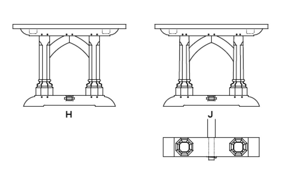
Just bumping these later additions, because J is starting to tickle my fancy (with or without the arched braces):

uVNQvAJ.jpg
 
rafezetter":3g19u3uc said:
Well to be fair to Rob, I only saw the top row to start with and thought the same for a good full minute at least and uttered "is this a trick question?"

Glad I wasn't the only one! :lol: :lol: :lol: - Rob
 
phil.p":2odvqv1s said:
AndyT":2odvqv1s said:
This one is described as mid sixteenth century and has legs which are chamfered rather than turned, like you mentioned for your design E (though oddly, the centre back leg is different)...

Possibly designed to sit against a wall? :?

I was going to say the same thing - the 6 leg is a wall server not a mid room sitter - the rails would be far too annoying, and the mid back leg is a givaway.
 
rafezetter":66vipckn said:
Oh, well with those chairs I'd say G - the mid arch might not be to other peoples tastes but will blend the table to the house and show the table was done with the house as a whole in mind - nice synergy (ooooh get him!)

That was my initial thinking, but I have to say the more I look back at the pictures, the more I find myself agreeing with AndyT's sentiments, and being drawn to the simplicity of F over the fussiness of the other designs.
 
MikeG.":30jre968 said:
rafezetter":30jre968 said:
...... if you build E with turned legs I'm coming round and setting fire to it, just saying - I'll remove it from the house of course and possibly dance around it naked while it burns, but that depends largely on the weather.........

:lol: :lol:

E doesn't have turned legs. They're 4 bandsaw- cut faces.

Shame, it would have given me a chance to learn what "oak smoked" marshmallows tasted like...

Well done spotting the taper for H & J, Manglitter - I was scratching my head again - and I think the tapered version would add just that touch of elegance that it was indeed made by a superb craftsman (and give those in the know that nice warm smugness feeling).

With luck I might have finished wading through Mike's house WIP in time to read the table WIP :)
 
I've just remembered something about that second design from Andy's post (it won't show up as a quote) and it has an inherant weakness - as I learned when I was asked to go back and do a repair F.O.C. for a couple who had bought a table shaped like that from a reclamation place I was involved with.

The top is prone to see-saw along the mid line as the wedges used in the construction dry out and shrink - load it up both sides with 5 people, food, leaning elbows and whatnot and you're just going to accelerate that no end.

Now - the table I had to fix was pretty old, but I assume Mikes house is well insulated compared to a cooler draftier house pre 1980's.
 
rafezetter":y68vw0m3 said:
......With luck I might have finished wading through Mike's house WIP in time to read the table WIP :)

:shock: Wow, that's some effort. Good luck! I think a Dutchman holds the record: it took him 8 days to read the lot, if I remember correctly.
 
Well, I'd just like to pipe up again and say what an interesting thread this is.
Mike gives us some interesting food for thought (and a spot the difference puzzle!) and the conversation immediately livens up.
We can all say what we really think, secure in the knowledge that
a) Mike is thick skinned enough to take all our comments in the right spirit
b) Although he'll read what we offer, he'll still produce something better than any of the suggestions, and
c) He'll show us in detail how he does it.

Sometimes the forum goes a bit quiet. This reminds me why I am still here!
Nice one Mike =D> =D>
 
rafezetter":3uywwwla said:
I've just remembered something about that second design from Andy's post (it won't show up as a quote) and it has an inherant weakness -......The top is prone to see-saw along the mid line as the wedges used in the construction dry out and shrink......

Yes, I worried about this a little. Some of my earlier designs had a brace or 2 running longitudinally, but with 2 legs at each end I can't see a neat way of doing that any more. I'll just make the shoulders on the two rails and the stretcher very large, and make sure that the wedges are tapped home every so often. Designs H&J would have a foot over 160mm wide, which will help a little too.
 
AndyT":lhujqbnk said:
Well, I'd just like to pipe up again and say what an interesting thread this is.
Mike gives us some interesting food for thought (and a spot the difference puzzle!) and the conversation immediately livens up.
We can all say what we really think, secure in the knowledge that
a) Mike is thick skinned enough to take all our comments in the right spirit
b) Although he'll read what we offer, he'll still produce something better than any of the suggestions, and
c) He'll show us in detail how he does it.

Sometimes the forum goes a bit quiet. This reminds me why I am still here!
Nice one Mike =D> =D>

Very kind of you Andy.

I'm not all that thick skinned, actually, but I absolutely do not take comments on design personally. Design is what I do all day every day (well, you know.....), and that means I get it wrong a lot. Not wrong, really, so much as understanding that people have very different tastes and perspectives, and we can't always get to the bottom of that immediately. I also know better than most that designs that can look pretty dull on paper can come to life in reality, and that details are really important. So all design comments are 100% welcome (I did after all start the thread asking for design suggestions), even if people were to say..."nah, make it out of glass and stainless steel". Another thing to remember is that the chairs are going to be what people see. It will be really difficult to see anything of the table other than its top because of the forest of chairlegs, seats and backs, and therefore the overall impression of the suite is going to be carving, upholstery, and wood colour, and the table legs are only really going to be noticed by me and fellow woodworkers.

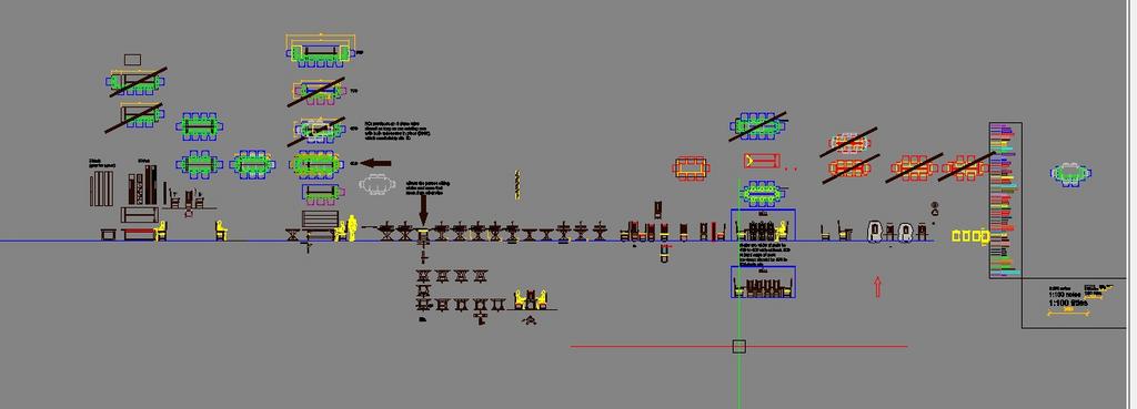
This is a project with a long gestation period. The other half of the design team (!) here has dragged a promise out of me that I'll finish the utility, kitchen and lounge before I do any work on the dining furniture. This thread will go quiet, but I'll digest the comments over a period, continue to tweak things and explore alternatives, and maybe even mock a couple of different table ends up in pine. Just to give an idea of how much fiddling about with the design I have done already, here is a screenshot:

W9VM2NV.jpg


One thing you can be certain of is that there will be a detailed WIP.
 
MikeG.":1rmndeqn said:
Design is what I do all day every day (well, you know.....), and that means I get it wrong a lot.

Most of the architects I deal with daily would never admit that they got something wrong, and some often disregard practicality or structural implications with no consideration given to logic or cost, as if they dont care how things get built on site... as long as the completed project looks how they envisioned... which can make my job all the more challenging!

Probably makes you pretty unique among architects, having practical skills and experience :D


edit: Forgive the rant, I've had one individual winding me up a treat over the last couple of days!
 
I was wandering through my collection of semi-architectural books yesterday evening, and came across this, and vaguely remembered this thread. You haven't built the dining table yet have you MikeG? If you have then this is academic, but hey, why not.

It's from Robert Lorimer's house in Edinburgh, published in 1913 Country Life. Arts and Crafts Gothick revival is where I have it mentally logged, but terminology can be disputed for ever. Souldn't be too tricky to make, I'm sure.

54 Melville Street Gothic Dining Room.jpg


Funnily enough we have some architectural detailing by Lorimer's son Hew in our house in the Borders. But that's another thing.
 

Attachments

  • 54 Melville Street Gothic Dining Room.jpg
    54 Melville Street Gothic Dining Room.jpg
    131.1 KB
That's an interesting mix of a hay-rake stretcher -type arrangement, and a sort-of semi pedestal thing under the feet/ legs. I think you've got your terminology bang on, BTW, and it's one of my favourite periods of recent architecture and furniture design.
 
Back
Top