Help design my dining table.

UKworkshop.co.uk

Help Support UKworkshop.co.uk:

This site may earn a commission from merchant affiliate links, including eBay, Amazon, and others.
I've just come across this, which is pretty close to what I am proposing, but lacking the upholstery and some of the carving.

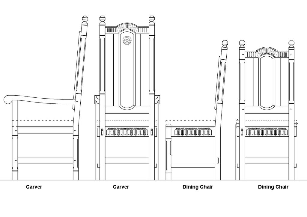
I'm just not seeing these as interwar "Jacobethan". This is pretty similar to my design, but where they have a raised panel in the back I would have padded upholstery, and there would of course be a cushion, whether loose (tied) or fixed (nailed).
 
Fair enough; your job, your house, your call!

The one thing I would come back on though is the angle of the chair seat.

A flat chair seat is an instrument of totrture! As the sitter's back reclines so they're pushed out of the seat, without necessarily being consciously aware of it they'll be bracing their legs throughout the meal to compensate and keep themselves seated. That or they'll slump and spill soup down themselves!

All it takes is a three to five degree slope to the seat and the experience is transformed. I've seen chairs with flat seats that are made too low in order to compensate. This works in that the sitter no longer has to brace their legs, but they then tend to lean forward slightly so they don't get any lumbar support.
 
I'll have a good think on that, custard. In support of your case, we sit at the kitchen table for half an hour at most, whereas dinner parties can have people seated for 4 or 5 hours at a stretch. Hell, that joint is already a compound angle. It's no more difficult to add in another angle.

Or........I could slope the seat within horizontal side rails. I'm going to have to think that through a bit.......

Or.......I could slope the foam in the cushion.........
 
I said I'd shut after my last post but here I am again, I promise this is the very last comment!

One option for a table is a Gimson/Barnsley hayrack style,
Barnsley Hayrake.jpg


hayrake-dining-table-main.jpg


Plenty of these were made during my time at the Barnsley workshop. The chairs they were often mated with were "Clissett" style chairs that are still made today by Lawrence Neal,

http://www.lawrencenealchairs.co.uk/gallery.html

I used to make this style of chair myself (I've even rushed a few although nowadays I'd recommend subbing out the rushing), there's a learning curve but it's really not that steep, and after you've made one or two they're way faster to make than any jointed chair. But more important than expediency is the aesthetics, it's interesting that both Gimson and Barnsley originally paired this style of chair with their hayrake and gothic inspired dining tables. Also the market is pretty clear on what it values, original Clissett chairs are expensive and sell really quickly, anything remotely Jacobethan (barley twist or not!) sticks around in antique shops until it grows roots even at firewood prices!

Incidentally Clissett sloped his seats with two simple mechanisms, firstly the sag of a rushed seat holds you in, and secondly he shortened the back legs a whisker to tip the whole chair ever so slightly backwards.

Okay, now I really have said my piece, good luck!
 

Attachments

  • Barnsley Hayrake.jpg
    Barnsley Hayrake.jpg
    42.1 KB
  • hayrake-dining-table-main.jpg
    hayrake-dining-table-main.jpg
    71.6 KB
Yeah, I love the hayrake stretcher. I've not seen one that chunky before, and it looks great.

Don't go, custard. I don't take any offense at all about people not liking my design choices. I'm an architect. I get designs wrong all the time!! You only learn from conversations like this.

I had considered just chopping 5 or 10mm off the back legs, but wondered about A/ that showing in the outward lean of the lower half of the leg, and B/ slightly less stability (albeit these heavy chairs should be safe from even the most errant and enthusiastic youngster).
 
As someone who knows sweet FA, diddly squat about furniture.... I like B)

Can I ask what software you use to design these?

When it comes to building these, hope you do a WIP :wink:
 
I now use Draftsight, after finally tiring of Autocad's ridiculous price. It's a freebie, and every bit as good as Autocad in 2D.
 
to add my tuppence worth, I like C from the top row and I think that the difference in height twixt carvers and ordinary chairs looks wrong.

but I do like that hayfork stretcher style
 
flying haggis":27pv1t4v said:
......I think that the difference in height twixt carvers and ordinary chairs looks wrong.....

I think you're right. I want a difference in height, but that's too much as shown.
 
Really interesting that no-one (on either forum) has gone for E. D is winning by miles.

Let me chuck another couple into the mix. They are very subtly different:

uVNQvAJ.jpg


These legs are derived from the crown post in a classic English roof from the 17th century and earlier.
 
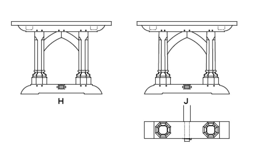
I have no idea when it comes to historical styles, but taking the chairs out of the equation I prefer option B or D for aesthetics. However based on the style of chairs you're going for I'd go with option J with the slight taper to the legs over options F, G and H, but it would maybe match even better if the chairs had a similar taper incorporated somehow.
 
Aesthetically I like D the most, but A is the best design. I'm probably on my own here but A is the one I'd go for :D

p.s looking forward to this WIP
 
I know absolutely nothing whatever about furniture design and history, so I'm not going to comment about any of the design issues at all Mike - EXCEPT that having had an accident in 1966 (or 7, can't remember exactly) resulting in a back problem which has slowly but surely worsened I DO consider myself an expert on back ache and chair back angles.

So to echo custards comment a page or two back, do PLEASE reconsider the question of chair seat to back rest angle. I do appreciate enough to know that adding such angle is a real PITA, and adds a lot of work, but I promise you that for me (and I suspect many others) to sit at that dinner table on the chairs you show would be real torture, I promise.

HTH, and I'm NOT trying to upset your applecart!

But SO often I find chairs where the look of the thing has taken first place, rather than sitter's comfort/posture (e.g. the new chairs in my GP's Waiting Room. She was NOT impressed when I told her, and IMO anyway, they DO look nice. But they're torture to sit on for longer than about 10 mins)!
 
custard":2jzbs5l1 said:
I said I'd shut after my last post but here I am again, I promise this is the very last comment!

One option for a table is a Gimson/Barnsley hayrack style

Classic piece, stunning in fact - Rob
 
Hi Mike

Sorry I'm a bit late on this one, but I'd favour design F.

Here are my reasons:

It's the best match for the chairs.

A table with a leg at each corner is the fundamental, proper type of table. It's stable and strong. You can eat off it, you can dance on it, there's no risk of it tipping over. It's even stronger if the legs are braced lower down, as they would be, and made of hefty oak.

Although your first row of designs are attractive, and a bit like roof construction, they are less table like. And I don't mean this as a slight at all, but I suspect you might want to make them just because you can do the more complicated angles and curves. (Hell, if I had your skills, I'd want to make them, just for the satisfaction of being able to.) But they may be even heavier than a big heavy oak table needs to be, and so a bit less practical in the end.

Casting around to add a few more options into the mix, I found these two, from the book "Furniture in England, The Age of the Joiner" by Wolsey and Luff.

This one is described as mid sixteenth century and has legs which are chamfered rather than turned, like you mentioned for your design E (though oddly, the centre back leg is different). It shows that boldly chamfered legs can look rather good; I suspect that you would enjoy making them.

tables1.jpg


I noticed that it has no overhang at the end, so would only suit people sitting at either side - I think this is because it was made for use with a pair of long benches rather than individual chairs.

This one does overhang, and leaves the floor clear for chairs, in a way which will probably be ok if you don't need the long stretchers at floor level to keep the rushes under control.

tables2.jpg


It's described as late sixteenth century and comes from Wardour Castle in Wiltshire.

I hope this helps; I'm sure the results will be impressive.
 

Attachments

  • tables1.jpg
    tables1.jpg
    247.7 KB
  • tables2.jpg
    tables2.jpg
    245.1 KB
AndyT":10843y03 said:
This one is described as mid sixteenth century and has legs which are chamfered rather than turned, like you mentioned for your design E (though oddly, the centre back leg is different)...

Possibly designed to sit against a wall? :?
 
phil.p":csisv2rz said:
AndyT":csisv2rz said:
This one is described as mid sixteenth century and has legs which are chamfered rather than turned, like you mentioned for your design E (though oddly, the centre back leg is different)...

Possibly designed to sit against a wall? :?

I don't think so - there's visible wear (from people's feet) on the back stretcher. It's a bit odd to modern eyes to have one leg not match, but I think it's a rather nice feature now!
 
MikeG.":160vn9u7 said:
woodbloke66":160vn9u7 said:
Unless I'm missing something Mike, the end elevations on A,B,C & D all look to be the same? - Rob

:)..........yeah, you're missing something Rob..... :lol:

Well to be fair to Rob, I only saw the top row to start with and thought the same for a good full minute at least and uttered "is this a trick question?"

Based on the other designs you have in your house I'd go for D - if you build E with turned legs I'm coming round and setting fire to it, just saying - I'll remove it from the house of course and possibly dance around it naked while it burns, but that depends largely on the weather.

G is also a possibility with the arch to echo sections of the house but F seems entirely too austere.
But that's just my tastes of course.
 
MikeG.":1yaiadul said:
If it helps get the picture of the overall feel I am after, here is the current state of play with the chairs:

epSPb3f.jpg


The dentil-like design at the top rail is actually likely to be a thumbnail carving as per the seat-support rails, but I got lazy with my drawing.

Oh, well with those chairs I'd say G - the mid arch might not be to other peoples tastes but will blend the table to the house and show the table was done with the house as a whole in mind - nice synergy (ooooh get him!)
 
custard":ex2h5fyy said:
One guideline for chairs is that they're an awful lot easier to use if they're 5kg or less, in particular children, infirm or elderly users find it more difficult to move their chair inboard of the table as the chair's weight increases. Made from Oak I think these chairs will be well over this guideline.

If your diners are all hale and hearty then of course this is a non-issue, but I thought I'd flag it in case they're not. There's a restaurant near me that has this style of chair throughout, it also attracts an older clientele. Not a good combination as the waiters are run ragged helping the diners move their chairs in and out every time they want to get up or sit back down.

Another point. The table designs (apart from maybe E) look like they're solidly in the gothic revival tradition, so mainstream Arts and Crafts. But the chairs are different in that they look like the *******ised "Jacobethan" designs that were popular during the inter war period. Add in some barley twist turning and they'd be spot on!

It's not me who has to live with them so my opinion counts for nil, but I find they don't sit that well together.

And a final point, you can pick up large sets of very well made, 1930's "Jacobethan" Oak chairs, for an absolute song at local auctions or on Ebay. Making chairs always eat up loads more time than you expect, so that could save hundreds of hours of work. Especially as the chair seats should really slope down towards the back, if not the sitter will tend to slide out of them. That one change will add a lot of work and complicate the build quite a lot. This will be especially so in this case as you'll likely end up with cushions on them for comfort, and cushions are even slippier!

Next time you go in there Custard, you could suggest they put casters on them? That could be an interesting solution.
 
Back
Top