Competition WIP - Rocking Chair

UKworkshop.co.uk

Help Support UKworkshop.co.uk:

This site may earn a commission from merchant affiliate links, including eBay, Amazon, and others.

bouncymat

Member
Joined
20 Apr 2009
Messages
17
Reaction score
0
Well i think i may have bitten off more than i can chew here but i'm going to give it a go anyway.

To start off here is the original brief.
"Level: Intermediate (probably)
Brief: A rocking chair on the theme of a pair of flowing lines."

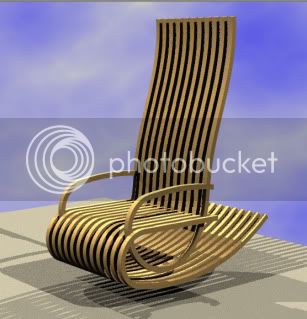
I do not want to make a traditional style of chair or copy anyone elses design so i have spent a lot of time sketching and have settled on a design. Here is a quick mock up of that design in CAD.
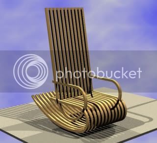
rockingchairdesign.jpg

something feels a bit wrong about it but i'm not sure what.

The materials are not shown and a lot of other details are missing but this shows the basic shape.

I am currently making samples of the laminate to help me chose which wood to use (thinking sycamore and something else) and making a model to check if i have the geometry correct (i have been getting a little confused trying to sort it all out but i think i have it now!)
 
Isn't it funny i have scoured the internet but i've not seen that design before.
I do see what you mean, hopefully playing about with the model will help me sort out these problems.
 
I've sat in that chair, or at least, in one of its predecessors. It's fantastically comfortable. I wish I'd bought one when they were a mere grand!

S
 
Yes, the back rest does look a little odd... However, I look forward to following this. :)
 
Excellent, good design, I assume you know how to bend some wood then!

I think the others have picked up what you're not quite sure about with your design, which is that it seems a little pitched forward. If you have the visual pivot point further to the rear and back less upright then I think it will look fine. The only other thing that might be troubling you and I reckon it's visual only rather than in practice, is that the curve at the front will make you feel like you're going to trap your feet underneath.

But like I say, visual, this wouldn't happen in practice I don't think
 
I agree with what has been said and will add one thing. It may be that the arm (left) as you sit is well, not in the right place. I have had a second look, closed one eye at a time and yep it's still not in the right place. Other than that it looks good.
 
i'll have a go at that back rest, reckon a few curves ought to sort it out!

back to the drawing board
ps.
the arms are in the right place but the render does seem to have done something strange with the shadow.
 
The only rocking chair I have ever owned ( a huge sample of 1!) had the seat sloped back when at rest ie not parallel with the floor. Thus when you rock backwards and forwards you do not slide out of the chair on the forward rock. With your design it appears to me that the seat is parallel to the floor. Thus when you rock forward you will need to restrain your body weight tipping forward and sliding you off the seat.

Course if the chair I used to own was a unique item and all others have parallel seats feel free to ignore me :D

Good looking design - are you planning to laminate the strips at all? My only other concern, although I am a fat 18 stone, would be the strength of the front curve if you add a rocking motion to my body weight....

Steve.
 
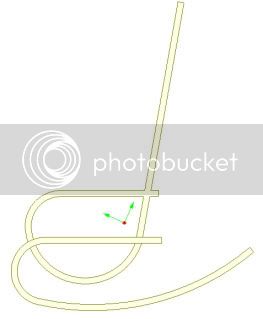
The chair is not shown at rest, it is in the rocked forward position.
The red dot shows the center of gravity (not sure about the arrows!)
Untitled-1.jpg

so when at rest the chair would be rocked back.

The strips will be laminated, i am curently making samples which i will post later today.

Weighing in around the 17/18 stone mark myself i am confident that these strips will be strong enough when complete (thickness TBC).
 
Uncannily similar to the first sketch I did for my conservatory furniture!

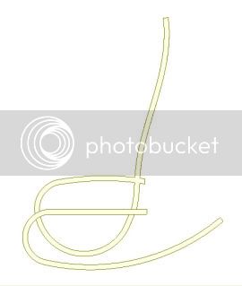
My only comment on the design, which I otherwise like quite a lot, is that the straight back looks quite incongrous in a piece of furniture which is otherwise all about curves. 'twere it me, I would make the back curved too.........in two directions like a flattened "S".

Mike
 
Thats's it!! Loads better!!

A curve on the seat and then stop playing.......get on and build it!!!

I can't zoom in and see what you are doing with the free end of the arms.........it would be nice if they threaded through a gap rather than crashed into a solid "frame" member.

Mike
 
Oh, yes. That definitely looks better with the changes you've made to the shape of the back. :)
 
I agree looks better. I was also thinking the back may be a bit on the high side judging from the scale of the seat the back looks like it would be above head hight and may look better dropped to shoulder type height.

Jon
 

Latest posts

Back
Top