Blanket chest

UKworkshop.co.uk

Help Support UKworkshop.co.uk:

This site may earn a commission from merchant affiliate links, including eBay, Amazon, and others.

Corset

Established Member
Joined
5 Mar 2005
Messages
669
Reaction score
116
Location
Nottingham
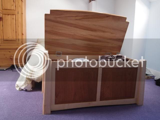
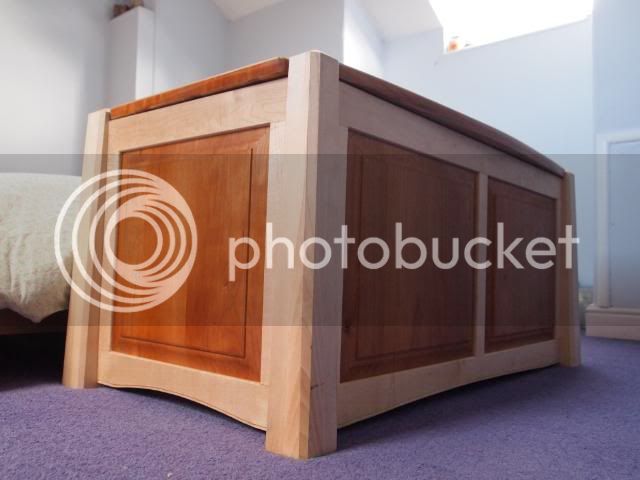
A while ago my friend got married and I got to be best man. I wanted to make him and his wife something different so I made this chest. Due to the tight time pressure I never got to photograph it. Finally he has sent me some photos. I thought i would share.
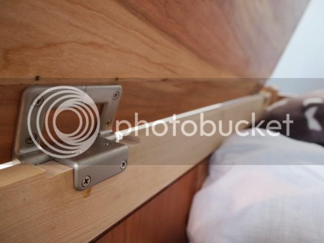
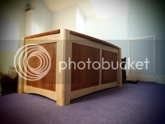
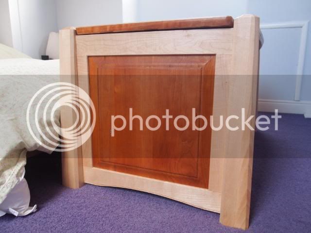
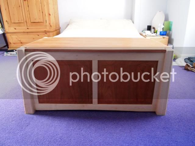
It is made of sycamore and cherry. Its simple frame and panel construction with some tapered legs. The lid is my first foray into veneering and are some shop cut veneers onto baltic birch ply with sycamore lipping. I chose the torsion hinges which while a bit ugly mean that no-one will be losing any fingers.
It came out a bit bigger than it seemed on sketchup!!
Any comments welcome.
Owen
P5151775.jpg

P5151777.jpg

P5151778.jpg

P5151779.jpg

P5151783.jpg

P5151782.jpg

P5151782.jpg
 
Very nice. The angles at the corners and the slight arch under the horizontals make such a difference. And the hinges look very practical and in keeping with the rest.
 
Corset":2aiuuqho said:
Looks a nice piece. I definitely don't like the hinges, some nice 75mm solid drawn brass butts would have been better IMO, but the most glaring thing for me is that board at the front which seems to be the wrong way round :? - Rob
 
Very nice Owen, nice contrast with those two woods and seems to blend with the pine in the room also, like the legs they make that box look rooted =D>
 
Thanks for the input. As said I am not keen on the hinges myself but they hold a very heavy lid safely and I was not keen on the many stays on the market.
Woodbloke
The boards do seem a bit strange in the photo but I spent a lot of time matching them as they are not from continuous pieces of wood. I used a lot of off cuts and that arrangement looked best. Is that what you mean? or is their a structural issue??
Owen
 
Corset":2pjlb0i8 said:
Woodbloke
The boards do seem a bit strange in the photo but I spent a lot of time matching them as they are not from continuous pieces of wood. I used a lot of off cuts and that arrangement looked best. Is that what you mean? or is their a structural issue??
Owen
Maybe it is the pic...if you used a lot of offcuts to try to get a match, then it becomes very difficult and you need to try and get the best match available. Nothing wrong btw in using all available timber, it's something I do all the time as I collect odds n'sods of elm from Yandles for use in my cabinets and I find that having loads of different, varying grain patterns allows me to choose the grain pattern more easily - Rob
 
Thats ok. Wood can be quite personal in terms of layout. What I think best may be wrong to everybody else. It wouldn't be the first time :lol:
I was a bit concerned I had made a structural gaff.
Owen
 
Really like the design although, I'm not sure why you decided to run the curve on the front rails to the full length but, on the end rails, the curve stops short of each leg? I'd have kept them similar on all four rails.

I understand why you went for the hinges. You might have wanted to consider stays instead but then, it's sometimes difficult to tell how certain stays might interfere with the overall design of your piece... There's certainly nothing wrong with what you've done. :)

Are the legs also tapered on the outer faces or, is that just an illusion? I like that.
 
Have to say I agree with Rob the front panel look wrong. Shouldn't the grain run horizontally not vertically?
Great looking piece overall though - really unique and a great keepsake for your friends
Mark
 
The legs are tapered on all outer edges which was interesting to get right. I liked the shape of objects that do that.
I should make clear the frame for the panels on each side was glued up seperately and they attached to the legs. I am aware that normally they would mortise straight into the legs but I was concerned that I would mess the glue up, up. So I cheated.
There is no escaping the eye on this site :lol: and indeed the curve should stop short on all sides however I got carried away with the spokeshave and took too much off on the front curve so the back had to follow.
Owen
 
Nice work Owen, brave of you to place it under the microscope :wink:

The arches (wherever they end) add a touch of lightness.
 

Latest posts

Back
Top