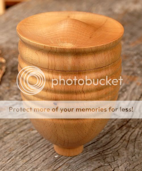
As everyone liked yesterdays box so much..........

UKworkshop.co.uk

Help Support UKworkshop.co.uk:

This site may earn a commission from merchant affiliate links, including eBay, Amazon, and others.

johnny.t.

Established Member
Joined
29 Oct 2008
Messages
1,714
Reaction score
0
Location
Norfolk, near the sea.
........I made another :D ,Beech this time, 5" tall 3 3/4" wide at the widest point(the top!). :lol:
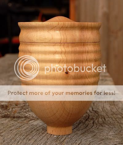
beecehbox002.jpg

beecehbox003a.jpg


Let me know what you think.. :shock:

JT
 
Still not sure about the foot but apart from that I like this one a lot more. As usual can't fault technique, finish etc. :lol:
Pete
 
Much nicer. I like the ripple and the lid very much. The foot doesn't quiet do it for me, I think it needs to be shorter and a bit wider.
 
It would work for me without the foot, still not a preferred shape but can envision that for some it would hold an attraction being different from the norm. I think the closer figuring of the Beech works better.
 
That one works much better IMHO. The lid has a bit of shape to it which gives it a lot more interest. Go on, lose the foot completely, you know you want to.

Walter

edit: -Beech was a better choice of timber too.
 
much better JT

the foot does work imo maybe just a slightly sharper transition would be better.

I would have liked to have seen the ribs (gentle beads) carry on into the side of the lid- and then the transition into the top with its gentle curve or maybe just a simple dome would also work.

Are you getting enough sleep? [-X don't turn when your deprived :lol: :roll:
 
Yes this one is a lot better with this type of wood.
You seem to have a good join on the bottom opening.Can't see the join :shock:
 
Hi Johnny,
I must agree with other replys this is a much nicer style but I personally would have preferred the foot to flare out to make it more stable.
Your first 3 part box was interesting and I started thinking out of the box and wondered if you could use the tubular section as a napkin ring and then devise a roll for each end???
Hows your head recovering? I have had a couple of weeks away on Hols and have missed the buzz of the forum.
Best regards,
Ian
 
I like this, the dome on the lid looks as if something is emerging from the box!

I agree with George that the foot works, but could do with being a sharper transition.

A significant improvement of the last one, but still quite original and quirky (in a good way).
 
Don't get me wrong, I love the originality and the design is a real development from the last one, but the foot just looks like a spigot that is meant to fit into something else. It needs to have a shape that gives it a purpose or it needs to go. (IMHO)
 
Thanks for your input chaps :D .
Now the foot,it is important,it raises the whole thing and gives it that just balancing look :?

George,the transition from foot to side is crisp! The only way to make it more so would be to score a line! And what is this sleep stuff you talk about :lol: :lol: Its in short supply ATM :lol:

Paul :roll: :lol: yes this ones just 2 parts :lol:

Ian, just a cool scar left on me head :lol:

Brittleheart":yigys32h said:
..........the foot just looks like a spigot that is meant to fit into something else. It needs to have a shape that gives it a purpose.......

Why? The tiny base is the look I wanted and after all cylindrical is a shape :lol:


I am very happy with this piece and may do a bigger one still.

JT
 
johnny.t.":f5bnamrd said:
T
Brittleheart":f5bnamrd said:
..........the foot just looks like a spigot that is meant to fit into something else. It needs to have a shape that gives it a purpose.......

Why? The tiny base is the look I wanted and after all cylindrical is a shape :lol:

Hi Johnny

Just my opinion, If you are happy with it you need take no heed of my ramblings. Look forward to seeing the next one.

Walter
 
Back
Top